All articles with 'charting' Tag
What a Monday it is. Most of the us woke up to find that whatever we have been accumulating for the last few years in investment gains has been wiped out (BSE Sensex at 2 year low, Dow slips below 10000). Not a very pleasant way to start the week, but then may be this […]
Continue »![Excel Links of the Week [Sep 29]](https://chandoo.org/wp/wp-content/uploads/2008/09/excel-links-sep-29-simple-todo-list.png)
Time for sharing another round of excel related articles around the web. List of all data visualization and analysis excel add-ins, The list includes some of the really useful add-ins. Handy bookmark if you work with data visualization alot and need to know where to find good stuff to add to your excel capabilities. Designing […]
Continue »Visualizing Sex & Love – 10 Infographics You Must See

Dont think of me as a perverted spreadsheet user, I like visualizations in any form or shape. There is so much data even about human relationships like love and sex. This article shows 10 of the most visually beautiful and insightful of the infographics on sex and love. Click on the titles above images to […]
Continue »As mentioned earlier we have moved to Seattle this Sunday. It seems like a great place already. Just that everything is more expensive than we are used to in Columbus. But I guess that is the premium we have to pay for being in a big city. On to this week’s edition of excellent excel […]
Continue »
There are few charts in excel that are as revolting as a radar chart. The purpose of a radar chart is to compare m options across n parameters so that audience can be convinced that option A is better than say option B. But, I am yet to come across a radar chart that tells […]
Continue »Visualization Challenge – How to show market share changes?

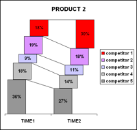
One of our readers Jennifer mailed me with this excel charting problem she is having. I thought why not ask other readers for their advice on this. So here it goes: The Charting Challenge – Visualizing Changes in Market Share Here is an excerpt from her email: The gist of my problem is how to […]
Continue »Power Outage & 99 Excel Tips to keep you Busy
We have a major power outage in Ohio due to a wind storm on Sunday. AEP, Our electric provider says that power would be restored to my area by this Friday midnight, that is almost 6 days without power. I will not be able to blog regularly during this period. So here is a list […]
Continue »Infographics of the week [Sep 12]
![Infographics of the week [Sep 12]](https://chandoo.org/wp/wp-content/uploads/2008/09/best-pie-charts-car-logos.jpg)
Donations made to Presidential Candidates – US Elections 2008 What would you get when you take 1.4 million rows of presidential election donations made to Obama’s and McCain’s campaigns? One possibility is the above visualization. The folks at Pitch Interactive created the above visualization. The half pies in the middle represent the overall donations made […]
Continue »
Gauges are a familiar metaphor, everyone can understand them, you can see them everywhere – near your stove, ac, car, gaming console, pc – you name it. So, when you are preparing a chart to tell a point, gauge chart like the one above can be effective. (I know charting pros like Jon Peltier wouldn’t […]
Continue »![Cool Info-graphics of the Week [Sep 5]](https://chandoo.org/wp/wp-content/uploads/2008/09/anatomy-of-a-great-speech-obama-acceptance-dnc.jpg)
Once every week Pointy Haired Dilbert celebrates the art of chart making by sharing 4-5 of the best info-graphics featured in various web sites. Click here to see the visualizations featured earlier. Anatomy of a Great Speech – Obama’s acceptance speech at DNC Presentation Zen captures Obama’s symphony like acceptance speech in a graph shown […]
Continue »
With each passing day the amount of information contained in a single spreadsheet, slide, document is growing. Thanks to demanding bosses, clients and colleagues, we are now supposed to provide all the relevant information in as much less space as possible. This is where micro charting or light weight data exploration has become a rage. […]
Continue »
Often it is easy to get carried away with a tools features. Excel is no exception. But here is a list of grotesque charts that you should never make, not even on your last day at work. 1. Leave the radar charts for Spidermen why? You can hardly conclude anything by looking at them They […]
Continue »Here is a quick excel tip to make your charts look professional by showing symbols in the axis labels instead of text. Just follow these 4 simple steps: First identify the symbols you want to show on the axis or as data label from symbol fonts like webdings, wingdings or a custom dingbat font like […]
Continue »My polar clock using donut charts in excel started a conversation and readers have been awesome enough to download the excel and create their own clocks to show time. Even though the idea of this blog is share the little that I know with you, it is amazing how much I have learned from you […]
Continue »If your reports include hourly distribution of data like, Customer footfalls in your store Page views of your site Customer service calls to your toll free numbers here is an interesting charting idea to show the data around the clock (literally) Update: Visualization pros Jon Peltier and Jorge Camoes took a critical look at this, […]
Continue »

