All articles with 'charting' Tag
Brick Charts in Excel – an Alternative to Gridlines
Grid lines provide great help in understanding values in a chart. Here is a handy trick you can use in the next bar chart to spice it up. Here is how you can get this type of chart (we will call it a brick chart) First we will make a regular bar chart Now, let […]
Continue »What is camera tool and how to use it? [spreadcheats]
![What is camera tool and how to use it? [spreadcheats]](https://img.chandoo.org/excel-camera-tool-thumb.png)
Camera tool is your way of creating visual reference in an excel sheet. It is one of the useful and hidden features of excel. Here is how it works. You specify a rectangular area in your workbook and camera tool creates a mirror image of that area as a drawing object. You can move it or resize it. And whenever the contents of original rectangular area changes (charts, drawings or cell values) the mirror image changes too.
Continue »Are you making Blow charts? [charting tips]
Here is a simple question you should ask when you set out to make a new chart. Are you making a BLOW chart? Blow? what blow.. you may ask. BLOW stands for Blinding Light of Obvious Wisdom. In other words, a blow chart tells nothing. It is there just for the heck of it. I […]
Continue »How to present changes in Market Share using Charts?

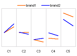
Most of us are comfortable with numbers, but we are confused when it comes to convert the numbers to charts. We struggle finding the right size, color and type of charts for our numbers. The challenge is two fold, we want to make the charts look good (we mean, really… really good) but at the […]
Continue »
Yesterday I have learned this cool excel charting trick and I cant wait to share it with you all. The problem: I have too many charts & want to show one based on selection You have made 3 charts to show your company performance in the last 8 years. But you don’t want to clutter […]
Continue »![Adding Box Plots to Show Data Distribution in Dashboards [Part 6 of 6]](https://chandoo.org/wp/wp-content/uploads/2008/10/box-plot-excel-dashboard-visualization-thumb.png)
This is a Guest Post by Robert on Visualization Techniques for Excel KPI Dashboards. This 6 Part Tutorial on Management Dashboards Teaches YOU: Creating a Scrollable List View in Dashboard Add Ability to Sort on Any KPI to the Dashboard Highlight KPIs Based on Percentile Add Microcharts to KPI Dashboards Compare 2 KPIs in the […]
Continue »Making Pie-charts look Sexy – The CNN’s tax burden analysis chart

There is always a debate about how good or evil pie charts are. While visualization purists believe pie charts should be avoided at all costs, newbies find creating and using pies very easy and often over do it. I have blogged few techniques involving pie chart visualizations like in-cell pie charts, speedometer charts, donut clocks […]
Continue »
By now everyone and their grandmother must have known about how Republican National Committee has spent $ 150,000 on Sarah Palin’s clothing and make up. I am a big fan of clothes. So much that I wear them everyday. But not all of us have a committee or fund raisers to dress up ourselves, none […]
Continue »5 Beautiful Visualizations [Oct 24]
![5 Beautiful Visualizations [Oct 24]](https://chandoo.org/wp/wp-content/uploads/2008/10/awesome-graphs-of-the-week.jpg)
Every week, Pointy Haired Dilbert celebrates the art of chart making by sharing 4-5 of the most beautiful visualizations floated around the web in the last few days. Take a look at them and have some inspiration and fun 😀 Map of most popular social networks in each country This is a simple world map, […]
Continue »Sports Statistics Dashboard in Excel – Few More Alternatives

First of all, thanks everyone for making the should you always start barcharts at zero? discussion lively. Almost everyone felt that we should start bar charts at zero. After spending sometime with my initial test cricket statistics dashboard, I have created few alternatives. You can see them below. But somehow I feel that I haven’t […]
Continue »
It all began with my Excel Dashboard Tutorial – Making a dashboard with player statistics. I have used bar charts with axis whose minimum is not zero, to create a dramatic effect in the charts. See below: Jon Peltier commented saying that, Rule #1: Bar and column chart value axes should start at zero. Since […]
Continue »Sports Dashboards in Excel – A Tutorial

One of my favorite cricket player, the GOD – Sachin Tendulkar has become highest test run scorer. What do I get if Sachin becomes highest scorer, you may ask. In order to celebrate this occasion I have created a cool sports dashboard in excel with some of the top test cricket players’ statistics. And, you […]
Continue »
Yesterday is Blog Action day and tons of bloggers posted about single topic – poverty. It is a topic very close to my heart for various reasons. It is a very sad thing not to have food or shelter or healthy living conditions. But man has thrived in all those situations just because he learned […]
Continue »![KPI Dashboards – Compare 2 Decision Parameters [Part 5 of 6]](https://chandoo.org/wp/wp-content/uploads/2008/10/excel-dashboard-visualization-tips-thumb.png)
This is a Guest Post by Robert on Visualization Techniques for KPI Dashboards using Excel. This 6 Part Tutorial on Management Dashboards Teaches YOU: Creating a Scrollable List View in Dashboard Add Ability to Sort on Any KPI to the Dashboard Highlight KPIs Based on Percentile Add Microcharts to KPI Dashboards Compare 2 KPIs in […]
Continue »
In Petal Charts – an Alternative to Radar Charts I have suggested using a radar chart tweak to replace the radar charts. Both PTSBlog and Information Ocean have posted their critical reviews of these petal charts. So as a penance for proposing petals, I am going to provide a tutorial on creating a comparison table […]
Continue »

