All articles with 'charting' Tag
Best Month Ever (and a charting tip inside)

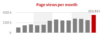
Let us take a minute and bask in some glory, for, our little community at PHD had the most fantastic month ever. That is right, January 2010 is so far the best month since I started blogging. We have broken all sorts of previous records on content, conversations, connections, traffic and revenue. In January, we […]
Continue »Flu Trends Chart in Excel [Yes, we can edition]
![Flu Trends Chart in Excel [Yes, we can edition]](https://chandoo.org/img/p/flu-trends-chart-final-th.png)
Last week I have reviewed Google’s flu trends chart and told you that is it is very well made. Out of curiosity I made a similar chart in Excel. In this post, I am going to share the experience and results with you. Interested? Read on…
Continue »Use “Playbill” font to make your incell charts realistic [quick-tips]
![Use “Playbill” font to make your incell charts realistic [quick-tips]](https://img.chandoo.org/c/use-playbill-font-incell-charts.png)
Most of you already know that using the REPT formula along with pipe (“|”) symbol, we can make simple in-cell charts in excel. For eg. =REPT(“|”,10) looks like a bar chart of width 10. Despite the simplicity, most people don’t use in-cell charts because these charts don’t look anything like their counterparts. But you can […]
Continue »Flu Trends in a City chart from Google is Awesome!

There is nothing awesome about flu. In fact, it is anti-awesome if you have flu. I have been fortunate enough not to get it ever (it is another story that I have cold almost 364 days of an year).
Don’t worry if you are afraid of it, Folks at Google are not letting you down. They are using google search terms to predict flu trends and present the information in a beautiful chart.
Today I want to tell you why this particular chart on flu trends made by Google is awesome…
Continue »Product Recommendation – Excel Dashboard Training Kit

If you want to make better charts and create lasting impressions, chances are you have heard about Jorge Camoes. He writes at excelcharts.com (previously charts.jorgecamoes.com). I have been reading Jorge’s blog for over 2 years now and have linked to his excellent articles on PHD several times. Jorge also has an Excel Dashboard Training Kit, which teaches us how to make a dynamic and comprehensive excel dashboard. The dashboard training kit is a culmination most of his lessons implemented in a practical way using Excel.
In this article, I review the product and tell you why you should get a copy of it.
Continue »A Brief History of Microsoft Excel – Timeline Visualization

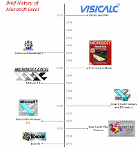
Timeline charts are great for providing quick snapshots of historical events. And hardly a day goes by without some one making a cool visualization of a time line of this or that. Time lines are easy to read, present information in a logical manner and mostly fun.
So yesterday, I set out to mimic the iconic gadgets of all time in excel, just for fun. Then it strike me, why not make a visual time line of Microsoft Excel ? So I did that instead.
Continue »Sales Dashboards – Visualizing Sales Data – 32 Dashboard Examples & Implementations

Sales reports and dashboards are very common in any company. There are several ways in which you can visualize sales data to understand the trends and sales performance. So in November, I have asked you to visualize sales data using sample data. The visualization challenge #2, sponsored by Zoho Reports generated a huge buzz around the community and fetched 32 incredible entries. The response was so overwhelming that it took me almost 24 hours to write this post. Thanks everyone for participating and making this a huge learning experience for everyone. Personally I have learned several useful dashboard and charting tricks. I will be sharing some of these lessons with all of you in the coming weeks.
Continue »Best of Pointy Haired Dilbert – 2009

Ah, you thought I will let you go to the next decade without a “year in review” post? No so fast my friend, not so fast.
[This post is a bit long by our standards, but full of gooey excel goodness. So get a cup of coffee or choco and get going]
And if you are in a rush, here is my wish – Happy New Year 2010 🙂
Continue »Make a Quick Thermometer Chart to Compare Targets and Actuals

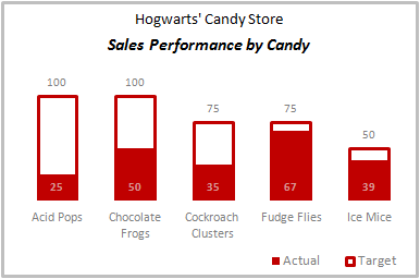
Comparing values is one of the reasons why we make charts. So today I am going to teach you a handy little trick to make a thermometer like chart to compare targets with actuals. This type of chart is very useful when you have a bunch of sales targets and you want to measure how the performance has been.
Continue »How to hide “0” in chart axis [quick tip]
![How to hide “0” in chart axis [quick tip]](https://chandoo.org/wp/wp-content/uploads/2009/12/hide-zero-chart-axis.png)
Have you ever wondered how you can hide that 0 (zero) at axis bottom? Like shown beside. You can use custom cell formatting codes (or custom number formatting codes) to do just that. Just go to axis formatting and from the number tab set the axis number format to something like #,##0;-#,##0;; Read the rest of the post to learn more.
Use Shapes and Images to make Prettier Charts [Dashboard Tricks]
![Use Shapes and Images to make Prettier Charts [Dashboard Tricks]](https://chandoo.org/img/c/use-shapes-to-make-better-dashboard-charts.png)
One of the annoyances of charts is that they all look like boxes (except for pie charts, they just look wrong). Boxes might be ok when you are making 1 or 2 charts. But a whole dashboard of boxes can look little rigid. So how can we make the charts peppy without loosing any effect? Like these charts below:
Very simple, we use drawing shapes in MS Excel to draw whatever we want and overlay the chart on top.
Continue »50% off on ExcelUser’s Dashaboard Kit [2 days only]
![50% off on ExcelUser’s Dashaboard Kit [2 days only]](https://chandoo.org/wp/wp-content/uploads/2009/12/exceluser-dashboards-th.png)
Charley at Excel User is running a sale on the excel dashboard kits. It is too good to be true. You get the plug and play dashboard kits for half the regular price. Go here to avail this offer and read on, if you are not sure what the dashboard kit is.
For a long time now, I have been an advocate of Excel User’s dashboards. Charley is a pioneer when it comes to excel based dashboard reporting. He has popularized several techniques like using sumproduct formula, using camera tool etc. I have been such a fan boy of his work that I even interviewed him once on this blog.
Continue »Group Smaller Slices in Pie Charts to Improve Readability

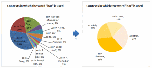
Jon Peltier can stand on his roof and shout in to a megaphone “Use Bar Charts, Not Pies”, but the fact remains that most of us use pie charts sometime or other. In fact I will go ahead and say that pie charts are actually the most widely used charts in business contexts.
Today I want to teach you a simple pie chart hack that can improve readability of the chart while retaining most of the critical information intact.
Continue »Recently I have conducted a survey on my blog to find out your pulse on PHD. Quite a few survey respondents have told me that PHD needs a topic-wise archive so that you can learn excel easily. So over the weekend I have prepared a webpage where you can find topic-wise posts on excel and […]
Continue »Format Charts Faster in Excel 2007 [quick tips]
![Format Charts Faster in Excel 2007 [quick tips]](https://chandoo.org/img/c/quick-chart-formatting.png)
Most of us use chart formatting options to change the way grid-lines, data series, labels, axis, titles, plot areas look. Chart formatting is one of the areas where people spend most time. Today I want to teach you a quick productivity hack to speed up chart formatting. In excel 2007 and above, when you click […]
Continue »

