All articles with 'charting' Tag
Introduction to Panel Charts using Excel – Tutorial & Template

In this article we will learn what a Panel Chart is and how you can construct a panel chart in Excel.
What is a Panel Chart?
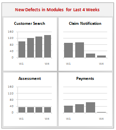
A panel chart is a set of similar charts neatly aligned in panels to help us understand some data which has multiple variables in it. Panel charts are also called by names “trellis displays” or “small multiples”. They are an effective way to display multi-variable data.
Here is an example panel chart showing the total defects per module over the last 4 weeks.
Continue »Change Data Labels in Charts to Whatever you want [Quick Tip]
![Change Data Labels in Charts to Whatever you want [Quick Tip]](https://chandoo.org/img/q/custom-data-labels-example-chart.png)
We all know that Chart Data Labels help us highlight important data points. When you “add data labels” to a chart series, excel can show either “category” , “series” or “data point values” as data labels.
But what if you want to have a data label that is altogether different, like this:
Of course you can point data labels to any cell. In this quick tip, we will learn how to do this, read on…
Continue »What are your favorite colors for charts?

Ok, it is Friday again. That means poll time. I would like to know what color choices you prefer for your charts?
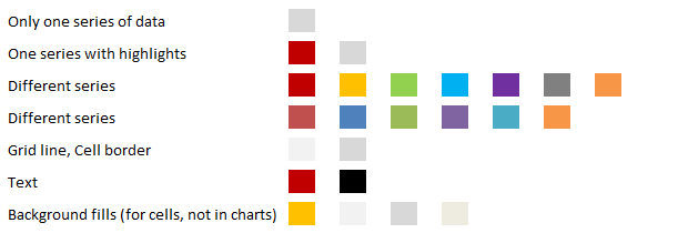
My Favorite Colors for Charting are,
These are the colors I use when making charts in Excel 2007 (it has capability to set any color for chart elements).
Continue »Making a Dynamic Dashboard in Excel [Part 3 of 4]
![Making a Dynamic Dashboard in Excel [Part 3 of 4]](https://chandoo.org/img/ed/moving-objects-with-vba.gif)
In this post we are going to look at a simple example of the VBA behind the Dynamic Dashboard. Essentially we will learn to write macros for doing this. Read the rest of this post to find code samples and downloadable files to play with.
Continue »How to pick a chart type – Charting 101

Bar chart or Line? Scatter plot or box plot? These are the questions we ask ourselves when we set out to make a chart. Because, “Selecting right chart for our data” is very important to tell our story.
In this article, we will learn how to “select the right chart” based on our data and situation.
Continue »Survey Results in Dot Plot Panel Chart [followup on Incell Panel Chart]
![Survey Results in Dot Plot Panel Chart [followup on Incell Panel Chart]](https://chandoo.org/img/vp/incell-dot-plot-panel.gif)
In a follow up to last week’s how to visualize survey data in excel, we will explore how you can create an incell dot plot panel chart. Please follow the links in the article to get more commentary and insights from established persona in the visualization world (including Stephen Few, Naomi, Jon etc.)
Continue »
We all know that legend can be added to a chart to provide useful information, color codes etc.
Today we will learn how to make the chart legends smarter so that they provide more meaning and context to the chart, like this:
This type of legend can be more useful than a plain legend as this provides more useful information without taking up too much space.
Continue »![How to Visualize Survey Results using Incell Panel Charts [case study]](https://chandoo.org/img/cb/survey-results-panel-chart-example.png)
A panel chart (often called as trellis display or small-multiples) shows data for multiple variables in an easy to digest format. It lets users compare in any way and draw conclusions with ease.
Today, I want to discuss how the principles of panel chart can be applied to visualize a complex set of survey results. For this we will use the recent survey conducted by Gartner on how various customers use BI (Business Intelligence) tools.
Continue »My First Podcast!!! – Listen to know some cool charting and dashboard stuff

Just weeks before Christmas, Ross McLean, who runs Methods in Excel (a very cool and useful Excel blog) asked me if I can join him for a small podcast interview on things we both love – excel, charts and talking. I couldn’t be more happier to accept his offer. We did the podcast and life kept busy both of us for a while. That is until yesterday, when Ross made the podcast available online for all of us.
Please go here to listen to my first podcast interview.
Continue »Introducing PHD Sparkline Maker – Dead Simple way to Create Excel Sparklines

Sparkline or Microchart is a tiny little chart that you can place on dashboards, reports or presentations to provide rich visualization without loosing much space. In excel 2010, MS introduced a beautiful feature for creating sparklines from data in spreadsheets. For earlier versions of Excel (that is 2007 and before) there is no native support […]
Continue »Super Timesaver Tip – Add “Select Objects” to Quick Access Toolbar

Here is a very quick, very short excel tip. Add the “select objects” tool to Quick Access Toolbar. In excel 2003 and earlier, this button is available in the bottom left corner (on the drawing toolbar) so that whenever you are working with charts or drawing shapes, you could easily select multiple objects and drag, […]
Continue »![Making a Dynamic Dashboard in Excel [Part 1 of 4]](https://chandoo.org/img/ed/excel-dynamic-dashboard-final-th.png)
In this and next 3 posts, we will learn how to make a Dynamic Dashboard using Microsoft Excel.
At the end of this tutorial, you will learn how easy it is to set up a dynamic dashboard using excel formulas and simple VBA macros.
Continue »
I have a new community project for all the members of PHD. It is a simple yet intuitive challenge. Make your own country’s flag using Excel Charts. To start the project, I have made the Indian flag using a bar and pie chart. Go ahead and see the rest of this post to findout how this chart is made and then participate in the “flag project” by making your own country’s flag. All the best.
Continue »Annual Goals Tracker Sheet [awesome ways to use excel]
Marko, who is a long time PHD reader and an excel ninja sent this via email, I work at an insurance company in Slovenia. At the beginning of each year we have a conversation with our superiors to review our work in the past year and to set new goals (main activities) that we’re gonna […]
Continue »What is the most useless feature in Excel? [poll]
![What is the most useless feature in Excel? [poll]](https://chandoo.org/img/l/surface-charts-excel-whats-the-point.png)
What do you think is the most useless feature in MS Excel? I know there are a ton of cool, extremely useful features in excel. But it also comes with a few really un-necessary features. For me, the most useless feature seems to be a 3D surface chart. I have tried to figure why this […]
Continue »

