
Creating In-cell charts with markers for average (or target) values
Today, lets talk about an interesting extension to the idea of in-cell charts. Adding average or target markers to the chart.
Adding a marker (like average or target or last year value) can enhance your charts greatly and provide more context. Lets understand how to add marker symbols to in-cell charts.
A better chart to visualize “Best places to live” – Top 100 cities comparison Excel chart
Recently, I saw this chart on Economist website.
It is trying to depict how various cities rank on livability index and how they compare to previous ranking (2014 vs 2009).
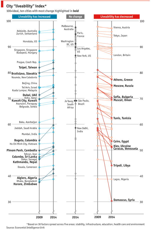
As you can see, this chart is not the best way to visualize “Best places to live”.
Few reasons why,
- The segregated views (blue, gray & red) make it hard to look for a specific city or region
- The zig-zag lines look good, but incredibly hard to understand % changes (or absolute changes)
- Labels are all over the place, thus making data interpretation hard.
- Some points have no labels (or ambiguous labels) leading to further confusion.
After examining the chart long & hard, I got thinking.
Its no fun criticizing someones work. Creating a better chart from this data, now thats awesome.
Mapping relationships between people using interactive network chart
Today, lets learn how to create an interesting chart. This, called as network chart helps us visualize relationships between various people.
Demo of interactive network chart in Excel
First take a look at what we are trying to build.
Looks interesting? Then read on to learn how to create this.
Story of my first ever 200KM bike ride (plus an Excel dashboard with ride stats)

Ok people. Let me tell you that this post is almost not about Excel. It is about how one Excel blogger’s (yours truly) dream of long distance cycling came true. So sit back, grab your favorite drink and read between sips.
So what is this all about?
Last Sunday (27th July) & Monday (28th), I finished my first ever 200KM bicycle ride. I rode for a little more than 12 hours, burned 5,179 calories & rode 206 kilometers.
It is definitely one of the most memorable, tiresome & uplifting experiences in my life. So naturally, I want to share the story with you.
How fireworks animated chart is made [video tutorial]
On July 4th this year, I published an animated fireworks chart for you. Many of you liked it. Quite a few wanted to know how its made.
So here is a video explaining the construction of fireworks.
(You can see this video on our YouTube Channel too)
4th of July Fireworks – an Excel animation for you
To all our readers & friends from USA,
I wish you a happy, fun & safe 4th of July.
For the last 4th of July (2013), we (Jo, kids & I) were in USA. We went to Washington DC to meet up a few friends for that weekend. And we had one of the most memorable evenings of our lives when we went to national mall area in the evening to watch beautifully choreographed fireworks. Kids really loved the amazing display of fire-crackers and enthusiasm.
While we all are back in India this time, it doesn’t mean we cant celebrate 4th of July. So I made some fireworks. In Excel of course.
Here is a little Excel animation I made for all of us.
4th of July Fireworks – Excel animation
First watch this quick demo (<15 secs)
CP013: Is this a FIFA worldcup of late goals, lets ask Excel [How to analyze data to answer questions like these…]
Podcast: Play in new window | Download
Subscribe: Apple Podcasts | Spotify | RSS
In the 13th session of Chandoo.org podcast, lets turn our attention to on-going FIFA worldcup and ask an important question.
What is in this session?
A week ago, we discussed “Has it been a late goal FIFA worldcup?” and used various charts & analysis techniques to answer the question. In podcast, lets tackle the same problem, understand various approaches to answer questions like these & shares some lessons for all the analysts.