All articles with 'charting principles' Tag
Excel Links of the Week [Excel Dashboards Edition]
Over the weekend I spent some time to update the Excel Dashboards page. It now features more articles, downloads and resources for those of you making Excel Dashboards. Go ahead and check out the page here and let me know your feedback.
Moving on to this weeks excel and charting links worth checking.
Continue »What is the most embarrassing charting mistake you made? [weekend poll]
![What is the most embarrassing charting mistake you made? [weekend poll]](https://chandoo.org/wp/wp-content/uploads/2008/10/making-sports-dashboards-in-excel-sml.png)
This week’s poll is very simple. What is the the most embarrassing charting mistake your made?
For me it has to be that one time when I made a sports dashboard using excel. I have adjusted the axis scale of a bar chart so that my favorite cricket player (Sachin Tendulkar, who else?)’s records are emphasized. In a matter of minutes I have received several comments from all over world pointing out the mistake. Even though, the intention was to highlight the achievements of master blaster, the axis adjustment was obviously a mistake.
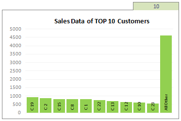
Continue »Top X chart – Show Top X values of a chart Interactively

Two charting principles we hear all the time are,
- Sort your data in a meaningful order before plotting it.
- Show only relevant information, not everything – because un-necessary information clutters the chart.
Today we will learn a dynamic charting technique that will mix these two ideas in a useful way. I call this a Top X chart.
Continue »Dashboard Best Practice – Google Analytics Intelligence Report

Yesterday while checking my website analytics reports on Google analytics site, I have noticed a new beta feature called “Intelligence”. Out of curiosity I clicked on it. It took me to a an intelligence alert dashboard. Ok, lets just back up for a minute and understand what “intelligence dashboard” is before moving on. In the […]
Continue »
Yesterday I read about interaction plots on junk charts where he points out the merits of an interaction plot. Interaction plots show interaction effects between 2 factors. For eg. you can show how your product sales have changed between year 1 and year 2 using an interaction plot like the one shown aside.
Continue »Visualization Lessons from Eiffel Tower [Chartbusters in Paris]
![Visualization Lessons from Eiffel Tower [Chartbusters in Paris]](https://chandoo.org/img/cb/eiffel-tower-visualization-lessons.png)
Ever since I was a child, I was fascinated by Paris (and Eiffel Tower). Recently, I had opportunity to visit Paris, albeit for just a few hours (I had a 12 hour lay-over in Paris between flights). I went to see the Eiffel Tower and it looked just as beautiful and majestic as it did in my imaginations.
During my visit to Eiffel tower, I took the stairs to 2nd floor and along the way they have a handful of visualizations explaining the tower. I found them quite interesting and well made. Here, I have listed down 4 simple, yet very effective visualization lessons for all of us.
Continue »Nightmarish Pie Charts [because it is weekend]
![Nightmarish Pie Charts [because it is weekend]](https://chandoo.org/img/cb/pie-chart-on-piecharts.png)
Nothing like a weekend making fun of something worthless. So we will pick on some of the plump, overloaded and visually disgusting pie charts featured on various extremely popular websites. As a bonus, you get to see my hand-drawn pie chart on the usage of pie charts.
Continue »Dynamically Grouping Related Events [Excel Combo Charts with Pizzazz]
![Dynamically Grouping Related Events [Excel Combo Charts with Pizzazz]](https://chandoo.org/img/n/dynamic-event-grouping-charts-th.gif)
Yesterday we have posted how to use excel combo charts to group related time events. Today we will learn how to change the event grouping dynamically using form controls.
This effect can be easily achieved with a cup of coffee, one combo box form control and the good old IF formula. Read more to learn how to do this.
Continue »Using Combo Charts to Group Related Time Events [Charting Goodness]
![Using Combo Charts to Group Related Time Events [Charting Goodness]](https://chandoo.org/wp/wp-content/uploads/2009/08/excel-combo-chart-th.png)
In his latest book, Now You See It, on pages 165 and 166 of the book, Stephen Few discusses how grouping related time intervals can facilitate analysis of data. As an illustration he explains that when viewing data of daily website visits, it helps in separating weekdays and weekends to differentiate expected traffic during these periods. The use of this technique would make it easier for the analyst to identify any anomalous movement in ether the weekend or the week day.
Fortunately excel combo charts can help you do that. In this guest post, Paresh explains to us how to do this.
Continue »What would you do if a co-worker makes ugly chart? [weekend poll]
![What would you do if a co-worker makes ugly chart? [weekend poll]](https://chandoo.org/wp/wp-content/uploads/2008/09/excel-charts-avoid-3d-column.png)
We talk alot about making better charts and perils of bad charts here.
I want to know what you usually do when a co-worker or boss makes an ugly chart?
- You tell them the chart sucks
- You gently point out the mistakes of their chart and tell them some nicer and cooler ways to tackle it
- You stay calm and send them an e-mail later (may be with a link to PHD chart pages or something like that)
- You don’t care (and may be continue doodling)
- Any other
Vote your option using comments.
Continue »Are you excited about this twitter chart?

In this ironically titled “Let’s not get too excited” chart, David shows us how the twitter community is divided. Can you guess what is wrong with this chart?
Continue »Charting Lessons from Optical Illusions

The other day while doing aimless roaming on the dotcom alley, I have seen some cool optical illusions. There are so many valuable lessons optical illusions can teach us – chart makers. Don’t believe me? Look at the bubble chart illusion on the left and tell me which orange circle is bigger? What is your answer? Right or left. Well, my friend, the answer is both are of same size. Read the rest of this post to find some cool optical illusions and what they can teach us – chart makers.
Continue »2 Great Pieces of Advice for Chart Makers, Dashboard Designers and Story Tellers Everywhere
The worldwide web is a wonderful place. I am constantly amazed by the simple yet very effective stuff we can learn by just reading. Today I want to share with you two very great pieces of advice: Seth Godin’s 4 Simple Principles for making effective graphs: Seth Godin is probably one of the most remarkable, […]
Continue »14 Basic Skills for Chart Makers (Big question: How many do you have?)
Blame John Walkenbach if you don’t like this post. There, I said it. He started the 14 basic skills for men. And then added 14 basic skills for women. Not stopping there, he went ahead and added 14 basic skills for dogs. Debra at Contextures blog added her 14 cents by writing 14 basic skills for excel users.
I got jittery and quickly searched 14 basic skills for people writing 14 basic skills posts on google. Alas! nothing found. But being the inveterate non-give-upper I went ahead and prepared my list.
<drum roll> here is the,
14 basic skills for people making charts (or graphs or plots or ok, you get the point)
Asset Allocation Chart Turns Zombie [ChartBusters #1]
![Asset Allocation Chart Turns Zombie [ChartBusters #1]](https://chandoo.org/img/cb/bad-asset-allocation-chart-donut.png)
In this installment we take a look at Asset Allocation Chart that looks like it is hexed. Our reader DMurphy submitted this.
Continue »

