All articles with 'bubble chart' Tag
How countries spend their money – chart alternatives
Econimist’s daily chart is a one of my daily data porn stops. They take interesting data sets and visualize in compelling ways. While the daily chart page is insightful, sometimes they make poor charting choices. For example, this recent chart visualizing how countries spend their money uses a variation of notorious bubble chart. Click on the chart to enlarge.
What is wrong with this chart?
Bubble charts force us to measure and compare areas of circles. Unless you have a measuring tape somehow embedded in your eyes and you are a walking human scientific calculator, you would find this task impossible.
So when you look at the chart and want to find out what percentage Japanese spend on restaurants or how much Americans pay for housing, your guesses will have large error margins.
Not only bubble charts are difficult to read, they are very hard to align. So when you have a bunch of bubbles, no matter how hard you try, your chart looks clumsy (see how the Russian food bubble eats in to Mexico’s bubble, as if it is too hungry 😉 )
Let’s check out a few alternatives to this chart. Read on…
Continue »
Hello folks, how are you?
I have an announcement for you.
It is almost holiday time. Every year, Chandoo.org celebrates holidays with a 3 day sale on our most popular product – Excel School training program. The sale for this year will be,
10th December to 12th December (Wednesday to Friday)
What is on sale?
You will be able to save $30, $50 or $100 on our most popular courses
- Excel School + Dashboards program ($30 discount)
- Excel School + VBA + Dashboards ($50 discount)
- Excel School + VBA + Power Pivot + Dashboards ($100 discount)
More details & links for Sale page will be available on 10th of December. Stay tuned.
Excel Links
It has been a while since we had a round of Excel links. Here are some cool tips & links for you.
Continue »Hello everyone. Stop reading further and go fetch your helmet. Because what lies ahead is mind-blowingly awesome.
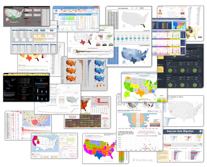
About a month and half ago, we held our annual dashboard contest. This time the theme is to visualize state to state migration in USA. You can find the contest data-set & details here.
We received 49 outstanding entries for this. Most of the entries are truly inspiring. They are loaded with powerful analysis, stunning visualizations, amazing display of Excel skill and design finesse. It took me almost 2 weeks to process the results and present them here.
Click on the image to see the entries.
Continue »There is an Easter egg in this chart!

Do not worry, you are not time traveling or seeing things. Its just that, this year I have decided to publish our Easter Egg a few days early.
And oh, I have 3 reasons for it:
- 2 of my favorite festivals – Easter & Holi (a festival of colors, celebrated in India) are this week. Holi is today (Wednesday) & Easter on Sunday.
- My kids are super excited about Holi as this is the first time they will be playing it. So we have family time from today until Wednesday and I do not feel like writing a blog entry on Friday 🙂
- I like to have 3 reasons for everything.
Hence the Easter Egg is advanced a few days. But it is just as fun (or may be better) as previous Easter eggs.
Continue »Hot or Not – McKinsey’s Innovation Heatmap

Take a look at the innovation heat map published by McKinsey and tell us what you think – Hot or Not?
Continue »A Good Bubble Chart About the Bust

Checkout this very neatly done “where did all the money go?” data visualization on Guardian, and share your opinion.
Continue »


