All articles with '3d' Tag
Some charts try to make you an April fool all the time (or why 3d pie charts are evil)

Recently I saw a big screaming ad that said “the chartbuster rules”. Of course, I know that chartbusters rule. Not just because I was one of them 🙂
So I got curious and read on. And I realized the ‘chartbuster’ is actually a car, not some cool, spreadsheet waving, goatee sporting dude like Jon Peltier. What a bummer!
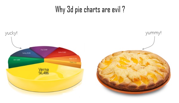
And then to my horror of horrors, I saw the exploding 3d pie chart, with reflection effects & glossy colors. And the sole purpose of the chart is to create an impression that Verna sells better than any car in India.
Today, lets talk about this chart and alternatives for it. Read on.
Continue »Excel Formatting Tips – Gangnam Style [open thread]
![Excel Formatting Tips – Gangnam Style [open thread]](https://img.chandoo.org/f/excel-formatting-gangnam-style.jpg)
Ever seen a glaring, over the top, wow-I-am-sooo-cool type of spreadsheet? Lets call them Gangnam spreadsheets!
Gangnam what?!?
If you have never heard about Gangnam style, do not worry. Just like you I too was living under a rock for about a week ago. Then I watched the awesome Gangnam style song. And now I am hooked. You can see it here.
What has all this got to do with Excel?
Oh I am coming to the point. One of the key ingredients of being awesome in Excel is,
To make our Excel workbooks communicate best by avoiding over the top formatting, unnecessary bells & whistles and focusing on what our users want.
But Excel being a feature rich software, it does have various so called Gangnam styles – superfluous 3d effects, formatting options, charting choices and as such.
Today, lets talk Excel formatting – Gangnam style
Continue »3D Dancing Pendulums

A quick look at Pseudo 3D and 3D Dynamic Pendulums in Excel.
Continue »5 visualizations to inspire you [Nov 21]
![5 visualizations to inspire you [Nov 21]](https://chandoo.org/wp/wp-content/uploads/2008/11/oh-shiiit-how-many-searches.jpg)
The best 3d pie chart ever We all know that 3D pies are not a very good way to express your story. I guess this one is an exception we all are happy to make [via PTS Blog] How to solve problems – Interactive visualization This interactive visualization shows how to solve problems in a […]
Continue »I haven’t noticed this before, but google maps provides 3d building outlines. I think this is pretty cool. You can see them in action here. Earlier on google : Google Park bench in Russia
Continue »

