
Yesterday, we have seen a beautiful example of how showing details (like distribution) on-demand can increase the effectiveness of your reports. Today, we will learn how to do the same in Excel.
Before jumping in to the tutorial,
In this post, I have explained one technique of using charts + VBA to dynamically show details for a selected item. There are 4 other ways to do the same – viz. using cell comments, pivot charts, group / un-group feature and hyperlinks. I have made a 45 minute video training explaining all the 5 techniques in detail. Plus there an Excel workbook with all the techniques demoed. You can get both of these for $17.
Click here to get the video training – Showing on-demand details in Excel
How does the on-demand details chart work – demo:
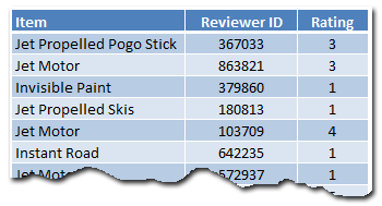
This is a replica of yesterday’s chart from Amazon. When you click on any cell inside the Items + Rating table, the corresponding items review break-up is shown in the chart aside.
Creating this chart in Excel – Step-by-step Instruction
So you are ready to learn how to do this chart? Great, grab a cup of coffee or tea and get started.
1. Understanding the data
This is how I have setup the source data for the chart. It has 3 columns – Item name, Reviewer ID and Rating. Each item has several ratings from several different reviewers. And our goal is to summarize all these ratings.
All this data is in the range Table1. We will use structured references [what are they?] in formulas to keep them readable.
2. Setting up the Item & Rating Table
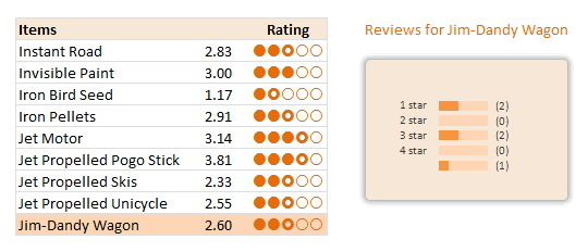
The first step is to show a table with all the products we sell and their corresponding average rating. We will then add the circle indicators at the end to visually show the rating.

Calculating the averages using AVERAGEIF() formula:
The formula is quite simple. Assuming the product names are in C5:C13,
We just write =AVERAGEIF(Table1[Item],C5,Table1[Rating]) for first product’s average. Fill the rest by dragging the formula down.
Displaying Circles:
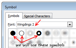 There are no star symbols in the default fonts. But we have circles – a full circle, an empty circle and a donut to indicate half-circle. These symbols are available in Wingdings 2 font. We will use an incell chart to display the circles. Assuming the rating is 2.83, we need to print 2 full circles, one donut and 2 empty circles. [related: inserting symbols in to Excel workbooks]
The formula is quite simple. Since the ratings are in D5:D13, the formula becomes,
=REPT(fullCircleSymbol,INT(D5)) & REPT(donutSymbol,(INT(D5)<>D5)+0) & REPT(emptyCircleSymbol,INT(5-D5))
Naming this grid
Now that we are done with the rating grid, let us name it – rngReviews.
3. Finding out which cell is selected
Now comes the macro part.
Before jumping in to the code, take a sip of that coffee. It is getting cold.
When a user selects any cell inside rngReviews, we need to findout which product it is so that we can load corresponding details.
The macro logic is quite straight forward.
- On Worksheet_SelectionChange, check if the ActiveCell overlaps with rngReviews
- If so,
- findout the relative row number of ActiveCell with respect to topmost row in rngReviews (ie the position of selected cell inside rngReviews)
- Put this value in to a cell on worksheet – say E28
The macro code can be found in the downloaded workbook. Here is an image of macro code.
4. Using the macro output to drive…,
We need to use the value E28 to do 2 things.
- Highlight the corresponding row in the rngReviews using conditional formatting.
- Findout the corresponding product using INDEX formula.
I am leaving both of these to your imagination.
5. Calculating Product – Rating Breakup
In order to show details for the product, we must calculate the corresponding breakup of ratings (ie how many 1 star, 2 star … 5 star reviews the product got).
I am leaving the formulas for this to your imagination. But when you are done, make sure your output looks like this:
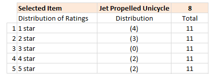
(hint: use COUNTIFS formula).
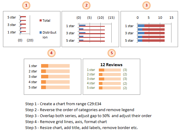
6. Create a Chart to show Rating Break-up
This is the last one before we put everything together. Just follow below 5 steps.
- Select the 3 columns – Rating type, number of reviews, total reviews and create a bar chart (not stacked bar chart). In my workbook, this data is in the range C29:E34 in the sheet “Rating Summary”.
- Reverse the order of categories as Excel shows them upside down. For this select the vertical axis and hit CTRL+1 (or go to axis options from right click menu). Here check the “Show categories in reverse order” option. Also remove the chart legend.
- Set both series of the chart such that they completely overlap each other [image]. Adjust the gap width to 50%. Also, adjust the order of the series from Chart’s source data options [image].
- Remove grid lines, axis line and horizontal axis. Format the chart colors to your pink and translucent green (really!).
- Re-size the chart, add title, add labels, remove border. You need to use dynamic titles.
7. Put everything together
Now is the time to put everything together and test. Move the chart close to the rating table. Test it by clicking on any value inside table.
You can also do some colorful formatting if you prefer.
Finish the coffee and show-off the chart to a colleague or boss. Bask in glory.
Download Example Workbook – On-demand Details in Excel
Click here to download the workbook with this example. Play with it to understand how this chart works.
Note: You must enable macros to use the file.
Note2: If the file does not open on double-click, just open Excel (2007 or above) and drag the file inside to Excel.
Learn this + 4 other techniques using Video Training,
In this post, I have explained one technique of using charts + VBA to dynamically show details for a selected item. There are 4 other ways to do the same – viz. using cell comments, pivot charts, group / un-group feature and hyperlinks. I have made a 45 minute video training explaining all the 5 techniques in detail. Plus there an Excel workbook with all the techniques demoed. You can get both of these for $17.
Click here to get the video training – Showing on-demand details in Excel
How do you like this chart?
Ever since I learned this technique from a good friend, I have been using it in dashboards & complex models to make them more user friendly.
What about you? Did you like this technique? Where are you planning to use it? Please share your views & ideas using comments.
More Resources to One-up your Chart Awesomeness
Want more, here is more:


23 Responses to “Learn Top 10 Excel Features”
What it looks like if excel without formula?? 🙂
It would be not excel it would just be fancy tables in which you could just use power point. (Chandoo) would Access be an alternative?
Awesome piece of work!!!
Great article.
Chandoo - my biggest interest in the article was the awesome word-graphic at the top - where did you go to get it done into a shape?
@Rich.. thank you. I used http://www.tagxedo.com/ to generate this word cloud. I took all the comments in the original post, pasted them in tagxedo website and set up the shape etc.
Awesome Chandoo.. You need always needs coffee to start up with. BTW , how did u created the Heart Shaped picture filled with High Repetitive text in it .. Please put it on your Next blog ...
Chandoo, good article. I’ve added a link to it from Connexion – our collection of the most useful and interesting spreadsheet-related articles from the web. See http://www.i-nth.com/resources/connexion
Hi,
Just one small question. Where the hell have been I in the past for not discovering this website sooner?
I've lost a job interview recently where even though I had the subject knowledge, I was not upto their mark in Excel.
Thank you for all the free tips, guidance and for creating this forum environment.
[PS: I've just been through the site for the 1st time, and have signed up for the newsletter. You can expect pretty stupid questions from me soon]
Hy Chandoo, you always inspire me with to explore something new in excel. This data structure table is only for excel 2007 or compatible to 2010. I recently installed latest excel version 2013 in my System and experience problems regarding operating according to previous one. I'm waiting your article relates to that excel version.
Thanks
Awesome article Mr. Chandoo and that is a awesome heart shaped pic you created. Great tips as well.
[...] Learn Top 10 Excel Features | Chandoo.org – Learn Microsoft Excel Online. [...]
Chandoo is awesome..
Thanks, i got better, And i always get 90.50 in my grade card but now i get 96.50 i improved because of the tutorials you gave, Thank You Very Much Chandoo Guy.
Hi chandoo, i am intersted in seeing the video or step by step done procedure of analysing the comments and presenting in the data percentage steps. I think this one would be first step in finding out how generally happens data calculation. Thank you.
As well i would like to know how to get that black shape art of your face which i see in chandoo. I am interested in making it for me.
Nice to see the features considered by Excel users to be most useful. It might be a good idea to also analyze StackOverflow Excel questions to see what keywords appear most often.
Here are my top 10 Excel Features (for advanced users):
http://www.analystcave.com/excel-10-top-excel-features/
Thanks a ton for this it totally helped with my homework ????
Very good effort
Thank you for this. Lots of learning in the links you've provided for this septuagenarian.
Pls send me new post
Dude, your humor ? ?
Loved your work.
Hello Sir,
I am Sanjeev Khakre and i from Indore City, India , I am your big follower and i have watch your videos and learnt a lots of excel trick or function and many more . thanks so much for all of your excellent support.
Your excel knowledge is real awesome.
Thanks
Sanjeev
Your work is excellent but pls willing to know more details about the features of microsoft excel
Chandoo Would Access be a better alternative than VB?