
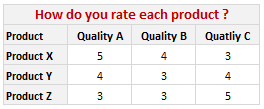
Often when we make a survey to compare various products (or vendors, companies, brands) the results are in the following format:
Now, we can visualize such data in several ways. One of the obvious ways to visualize is to make a stacked bar chart. But it results in poor representation of values as we cannot easily compare ratings of one vendor to another. This is where a panel chart would help. A sample panel chart for above data can be like this:

A panel chart (often called as trellis display or small-multiples) shows data for multiple variables in an easy to digest format. It lets users compare in any way and draw conclusions with ease.
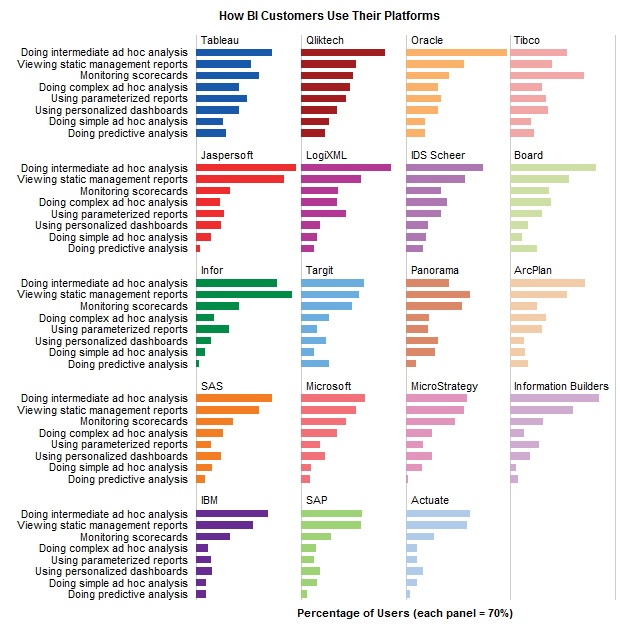
Today, I want to discuss how the principles of panel chart can be applied to visualize a complex set of survey results. For this we will use the recent survey conducted by Gartner on how various customers use BI (Business Intelligence) tools. The folks at Tableau have done good analysis of this data and presented the results in this format:

While the above chart is ok, it doesn’t let you compare vendors very well. We can only compare them on first usage, “viewing static management reports”. For everything else, the base line changes, so it is difficult to draw meaningful conclusions if, for example, you want to know which software is getting used more for “doing complex adhoc analysis”.
Jon Peltier has done beautiful analysis of this chart and presented various alternatives in his post yesterday. One of his recommendations is, of course, making a panel chart like this:
While, Jon’s Panel Chart greatly improves the readability of these survey results, I have 2 problems with it.
- Making such a panel chart in Excel is like baking your own bread. If you are like me, after few hours, you would run to bakery both hungry and frustrated. Panel Charts are not native in Excel. That means, we have to bribe, coax, threaten, protest and bend over backwards to prepare something like this in Excel. Thankfully people have already done that. So we can follow the examples and learn from their lead. [here is a panel chart tutorial from Jon]. However, the point still remains that, creating a panel chart in excel is a pain.
- Once such a panel chart is constructed, it is still pretty rigid. For eg. if you are interested in knowing how IBM as a BI vendor fares, you would like to have the results sorted by IBM’s BI Usages, but doing that in this carefully weaved panel set up means going to square 1 with less dough. So, we are stuck with a panel chart where the values cannot be sorted by any one vendor.
Is there a simpler way to construct panel charts in Excel?
So, I wondered, “is there a better and simpler way to make this chart that would still let me compare values (by BI vendor or BI Usage), let me sort and still save me enough time to drive down to one of the best bakeries in town to get a nice fluffy donut?“.
Of course there is…
The trick is to use Incell Charts. Ahem!
Instead of carefully tweaking chart options, adding dummy series and hiding them in the charts, we can just use incell charts with REPT formula and then align them in the cells. Since Excel naturally has the grid layout, creating panels (or small multiples) is as easy as snapping your fingers. (pls. note, this method of panel chart is only applicable for bar / column charts. If you need panels of line charts or scatter charts, you still need to use the methods suggested by Jon.)
We can also easily add a sorting option and use the lovely LARGE formula to sort the results based on selected vendor.
Here is what I prepared using the above recipe and it took me less than 20 minutes to set this up.

[click here for larger version of this]
How is the above incell panel chart constructed?
I am sure you are eager to know how this chart is constructed. Here is the secret:
- I took the raw data from Jon’s site and then Pivoted it so that we get the survey results in a table (with vendors on top and usages on left).
- I have dedicated a cell to let user select the sort order. Let us call this cell as “K3”
- Based on the vendor selected in K3, I have sorted the entire raw data using LARGE formula (and generous use of MATCH, INDEX, OFFSET formulas as well – examples here and here).
- Then I used the REPT formula to plot the incell bar charts (and the font “play bill” so that the bars look thick and nice).
- I have topped this with conditional formatting so that sorted vendor can be highlighted in different color.
Download the Incell Panel Chart Workbook
Download the Incell Panel chart workbook to play with it. I am sure you will find something useful and fun in that. [mirror download link]
How would you chart survey results?
There are still few problems with this approach though (for eg. adding labels can be a pain), but all in all, this simplifies the charting task and leaves room for adding extra features like sorting, conditional formatting.
Here is a open invitation. We have a long weekend coming up, thanks to Easter. So go ahead and download the original data here. And make your own charts for this survey data. The objective is that we should be able to compare vendors with each other with ease. Save your charts as images and upload them somewhere. Then leave a comment here with that URL so that we all can know how you would chart survey results.
Also, share your opinion on this type of panel charts. What is your experience with them? Do you like / hate panel charts?


11 Responses to “Use Alt+Enter to get multiple lines in a cell [spreadcheats]”
@Chandoo:
One more useful trick.......
In a column you have no. of data in rows and need to copy in the next row from the previous row, no need to go for the previous rows but entering Alt + down arrow, you will get the list of data, (in asending order), entered in the previous rows...
This is another great tip. I use this all the time to make sense of some *very* long formulas. As soon as the formula is debugged I remove the break.
Great tip Chandoo!
I use this feature often and it has even gotten the, "how did you do that" response.
Thanks!
@Ketan: Alt+down arrow is an awesome tip. I never knew it and now I am using it everyday.
@Jorge, Tony: Agree... 🙂
[...] Day 1: Insert Line Breaks in a Cell [...]
how can we merge a two sheet.
excellent idea. Chandoo you are genious
Hi chandoo,
I have used ctrl+enter to break the cell. But I did not get the result.
Please tell me how can i break the cell in multiple lines.
Hi, Ranveer,
Its not Ctrl+enter to break the cell, use Alt+Enter to make it happen.
hi Chandoo....
how we can use Alt+Enter in multiple rows at the same time please reply hurry i have lot of work and have no time and i m stuck in this. 🙁
Alt+J worked once 🙁
So I found another more reliable way:
=SUBSTITUTE(A2,CHAR(13),"")
Where A2 is the cell that contains the line breaks which the code for it is CHAR(13). It will replace it with whatever inside the ""