

My friend Paresh writes excellent commentary on charts on his blog Visual Quest. Last week he gave a home work, asking his readers to recreate the small multiples chart shown below.
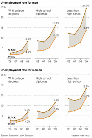
I found this quite interesting. Small multiples, also called as panel charts, are a powerful way to depict multidimensional data and bring out insights. They are easy to read too.
So, today, let us learn how to create such charts using Excel.
Step 1: Arrange your data
Almost any chart or visualization worth its salt must begin with proper arrangement of data. Since I could not get the data for the unemployment chart, I made up a few numbers for a fictional Confectionery Company. The data is shown below.
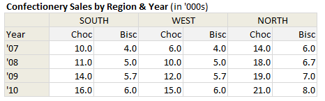
So, we have the data for years 2007 thru 2010, for the regions – South, West & North and for the product lines – Chocolates & Biscuits
Step 2: Select Products for one region & make an area chart
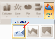
This is simple. Just select data for chocolates & biscuits for one region and make an area chart. You should have something like this:
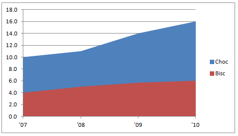
Step 3: Resize the area chart & format it
Now, we need to make this area chart closer to what we want.
- Select the bottom area series and fill it with white color.
- Now resize the chart so that we can fit 3 of them in the area you got.

Step 4: Add same data to the chart
Now, select the same region data, press CTRL+C to copy it. Select the chart and paste it by pressing CTRL+V. See below demo to understand how to do this.

We are doing this because we want to have lines with markers on our chart. But the area chart lines cannot show markers. So we are going to add the same data one more time, but this time format it to be shown as a line.

Step 5: Select the new series and format them as line charts
Select each of the new area series and format as line chart with markers.
You should have something like this at the end.

Step 6: Format the chart
This is where you unleash the creativity. In order to match the look of NYTimes chart, here is what you can do.
- Set the fill color between lines to something dull.
- Format 2 lines in distinct colors.
- Format gridlines & axis lines to something dull.
- Set axis maximum to 25 (as all charts in small-multiples should have same axis settings)
- Set axis major unit to 5.

Step 7: Repeat this for other regions
Now, just copy and paste this chart a couple of times. Just adjust the data source so that we have new charts using this technique.

Note: Learn how you can add descriptive labels to charts.
That is all. You just made a small multiples chart that looks awesome. Congratulations.
Download Small Multiples Example Workbook
Click here to download the example workbook and play with it. You can see the steps for making one of the charts in the workbook as well.
Do you use Small Multiples or Panel Charts?
I really love to use small multiples or panel charts whenever I am analyzing data or presenting results of the same. They offer excellent value per pixel. That said, they take some time to construct. Also, you must tweak axis settings and plot area to get the perfect result. That is why I prefer the in-cell variation of these charts. They are quick to setup and easy to wow (for more on these techniques, see below).
What about you? Do you use Small Multiples or Panel charts? How do you find them? Please share using comments.
Interested to learn more? Read these
As you can guess, small multiples is one of my favorite ways to explore and present data. So we have written quite a few articles explaining this technique. Read these to learn more.


30 Responses
Why color the bottom series white? Make it transparent by changing the fill color to No Fill. Then it doesn’t obscure features like gridlines.
Thanks, Jon. That’s exactly what I was going to suggest!
You can not use the transparent fill approach unless you use stacked area and calculate new values. Currently both series are in effect the bottom series. Setting the fill to match plot area simply masks the bottom of the chocolcate series, which luckly has larger data values for all charts.
I would format the horizontal axis to cross on ticks in order to maximise the plot area usage.
@Jon & Jeff.. good suggestion. As Andy pointed out, we need to use stacked charts and alter the data to get this. Here is how it would look.
You can see the example file here: http://img.chandoo.org/d/small-multiples-example2.xlsx
Andy –
I hadn’t noticed that Chandoo was hiding part of the other series. He wrote “Select the *bottom* area series and fill it with white color”, so I just assumed they were already stacked.
Thank you Chandoo for those nice words.
Thank you Chandoo for those nice words.
Thanks will use this. Also, nice negative halo marketing plan for selling Chocolates by offering alongside Biscuits.
Impressive.. very creative.. thank you for sharing..
Cool visual trick! Thanks!
The copy and paste does not work. I don’t have paste options (right click) but only ‘paste’. And when I use that, I get additional lines in the chart, which are different from the others.
@andreas.wpv
paste special not just paste. then you will see the window.
@chandoo
your highest point on south for ’10 should be 16 but it’s showing 10. likewsie, all other graphs’ 2010 purple line indicating the difference between cho and bisc. Not cho’s data. Please kindly comment.
Im very concious of what I put on my dashboards, and it really pays to make every pixel count. Often small charts like these are use to see the general trend of things, as opposed to a specific value. Bearing this in mind, I would often omit the vertical axis on 2 out of the 3 charts, and have a very small axis on the chart furtherest to the left…..obviously this would only work if all scales are the same..
I recommend structuring the data like as below. Note that there would be a “space” character in the first column for each blank line. This won’t work with a filled area chart, but that fill is extraneous information. This is more flexible than the idea above, because you can actually create a single chart with an arbitrary number of panels.
Choc Bisc
South 07 10 4
08 11 5
09 14 5.7
10 16 6
West 07 6 4
08 10 5
09 12 5.7
10 15 6
North 07 14 6
08 18 6.7
09 19 7
10 21 8
For those that are struggling with the pasting of the data series. You can just drag and drop the range you want, it will give you the paste special dialog as if you had clicked paste special.
Thank you for this description. This technique works also for more then two lines / areas:
http://2.bp.blogspot.com/-tdxbg6aZ9oc/TsUv8Ofh3_I/AAAAAAAAA9Y/e1Kh9kqfYJo/s1600/area+3.JPG
@Mr Nero , that feature was deprecated in xl2007. If done in the later versions the cells will pass thru the chart when dropped and result in them being relocated.
hi,
was trying this on a pivot chart but was not able to do it …reason being illl have to select the data every time i change the settings on my pivot table. I tried placeing one chart over other and making it transparent … no good…
can sone kindly help me with this?
Regards,
Ramakanth
@Fred – that’s what I am saying. I don’t have paste options = I don’t have special paste. Neither right click nor menue.
Dammit,
I tried to change the markers using VBA, but I was getting the old Chart Object does not support this property error.. Anyone else get this to work using code?
Thanks for the visualisation though Chandoo, it looks great.
If you can’t get code to work and want anyone to help debug it, you might get more responses if you actually post the code you’ve tried.
what is it good to have the colour band between the 2 lines?
Ross
I find the shaded portion of the graph is a great way to show a range of values for a subject. if you treat the two lines as the upper and lower values (or best and worst case for example), the shaded region can describe the range available which works well for estimating future trends as is can represent the uncertainty of the calculations without pinpointing specific values.
I found this post useful as I’ve been doing this in excel without knowing what it was called. I’m looking at stacking up various situations against each other with semi transparent shaded areas so the overlap can be observed.
I think treating the areas as wide line graphs is better visually than using error bars.
Really love these charts. I’ve been trying to recreate with my data, but am running into some problems.
Specifically, what happens if the lines cross over each other? i.e. the difference between the top & bottom reverses?
For example, I have two series:
2 4 5
1 3 7
In the 3rd column, the top & bottom series flips.
I’d like to chart the ‘middle shading’ in two colors: green when the top > bottom, and red when bottom > top.
Make sense?
I think it can be accomplished with the transparent stacked charts, but I’m not having much luck. Any suggestions are much appreciated.
@Adam… Interesting question. For something like this, you would end up doing lot of extra steps, as we need to calculate the points where one line crosses another (intersections) using some sort of algebra. Then, the area chart has to be broken to handle all these break points. I think that effort is probably worthless (as data keeps changing).
But I don’t know if there is a better & simpler way of doing this. If you come across something let me know.
Why don’t you start with a line chart of the two data series and then add a stacked area chart with the same values and just make the bottom area transparent. This worked out fine for me…
One can also get the same output by using Pivot multi chart feature. One more advantage with pivot is the chats are created dynamically depending on no of groups in your data.
I know this is an old thread, but does anyone know where to find the Pivot multi chart feature @satish refers to?
Amazing, i love the site, this is my blog favorite about Excel.
Amazing, i love the site, this is my blog favorite about Excel