
In the recent How to visualize survey results using Incell Panel Charts I have presented an easy way to create panel (or trellis / small multiples ) chart using Excel’s Incell Charting capabilities. That post is inspired from beautiful work done by Jon on Stacked Bar Chart Alternatives. Naomi B Robbins, who is an author and writer (visit her site: NBR – Graphics) has written a follow up article on this in which she suggested a dot-plot like this:
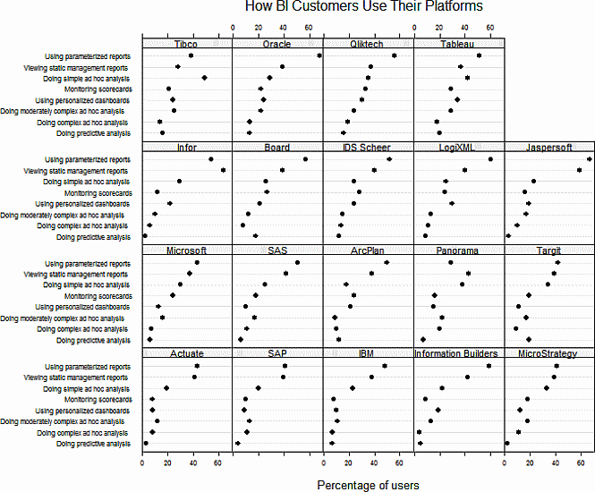
Jeff, who is a sweet fella from down under pointed that Naomi’s dot plots too can be incellified easily with excel. He suggested that I do a follow up post and show how an incell dot plot can be created for same data. I always look for opportunities to make you awesome in excel and Jeff’s request sounded just the right thing to do. So here is the incell dot plot for the same survey data – without further ado…
Incell Dot Plots in a Panel
The chart works exactly same as earlier one. Instead of REPTing | symbols, we used – (hyphens) and then a big black dot in the end (char code x25CF). Since today is a Friday, I am refraining from a lengthy post explaining how this is done. Instead, download the source file and learn yourself. Here is a clue…


19 Responses
thx, chandoo.
question: how do u get the common normalized value (2.5)? any specific formula for it?
reason i’m asking cuz i have similar data: some have extremely high values compared to others
e.g. PRoduct A = values ranges in 1-5k. Product B/C/D = values ranges in 200-500k.
That Chandoo is a magnificient piece of work : simplicity, elegance & a touch of flair.
Bernard…without a comma between the words “That” and “Chandoo” in your post, you’re saying that Chandoo himself is a magnificent piece of work et cetera. Probably the nicest typo that Chandoo’s ever got 🙂
Nice work, Chandoo.
I want to point out a small but important difference between my dot plot and Chandoo’s. In mine, the line connecting the dot to the label goes completely across the panel. Therefore, we are judging the value of the dot by position alone. In Chandoo’s, the line stops at the dot (these are often called lollipop plots.) Therefore, length enters into our judgment. As a result, it is important to always include zero with lollipop charts while a zero baseline is not necessary when the line goes all the way across.
@ naomi
easily remedied by formatting the cell: custum, @*~
You can replace the tilde with whichever character you prever. using different characters for different rows makes it easyer to identify which marker belongs to which label (instead of counting down from the top to see which label corrosponds to that particular data point)
@David: It is mostly trial and error. I used 2 and there were few dots outside the cell width. I tired 3 and there was way too much white space. So 2.5 it is.
@Bernand… thank you 🙂
—-
That Jeff is the most alert and lovely, comment. Thank you 🙂
@Naomi… Thanks for telling us about the lollipop plots. I didnt know there was such a term. Also thanks for the pointer about length and visual judgement.
I have enhanced my chart to show full lines…
I’m not a fan of the lines…kind of defeats the purpose of a dot plot I think.
@ikkeman… very good tip.. I didnt know that.. 🙂
Hi Chandoo.
On my PC, if you format the cell width at 96 pixels, then 100% fills the cell (the dot is “half vanished”, 99% not quite, and every other value is in between. A good alternative to showing the complete line….
@Matt: good idea. However if for some reason the data changes, you need to again adjust the cell width. A better approach could be to use auto-scaling approach suggested by David here: http://chandoo.org/wp/2010/04/01/incell-panel-chart/#comment-99903
Trellis plots are a great visualization method, far underutilized in Excel. My submission for your sales visualization challenge in November was a trellis plot examining salesperson performance across multiple variables:
http://cid-4e546fec4f1c6d0d.skydrive.live.com/self.aspx/.Public/dashboard%20submission.xlsx
I am happy to see the credit given to dot plots, as they are a valuable tool for increasing the data density of reports or tools, e.g. http://pushindatalikeweight.com/2009/11/23/integrating-report-elements-in-excel/
However, while use of character functions to create lightweight in-cell graphics can be handy, it is worth noting that dot plots (or any type of in-cell plot) can be created simply by shrinking down a normal excel graph and making a few formating changes. This approach is allows one to leverage all the different charting capabilities within Excel and relatively easily create detailed and nuanced graphs that would likely be impossible to create using character functions. I provide a tutorial to creating these in-cell charts, including dot plots here:
http://pushindatalikeweight.com/2009/12/05/excel-2010-sparklines-v-small-multiples/
Regards,
PDV
Dear Mr. Chandoo,
Is it possible to operate the dynamic excel dashboard in PowerPoint “slide show? (without open the Excel Program)
Ps. recently i should use other dasboard program to perform the dashboard in PowerPoint
I’m viewing this no an older version of Excel (2003) and the data of the company selected in the dropdown menu seems to be the same for any company, ie. it doesn’t highlight the “true” data before it was highlighted.
Why would this be?
@Remcos: The file should work in Excel 2003 as well. May be you have disabled to automatic formula calculation mode?
I like it! But, how did you make the drop-down list? I’ve created drop down lists before, but I can’t seem to figure out the one in your excel file.
Thanks for sharing this.
Ehhmmm … i can’t download ( first link / adress don’t do nothing, and second , one drive ? diplay an error ). There are some requirements for download ?