
Anyone running a small business knows the oozing bits of joy when you hear a customer saying, “Can you send me an invoice?”
While creating an invoice is an easy task, if you want something that is professional looking, easy to manage and works well, then you are stuck.
That is where Excel really shines. By using an invoice template, you can quickly create and send invoices.
Today I want to share one such template with you all. Why? Because we are awesome like that.
Free Invoice Template – Download
Click here to download the template.
The file contains 2 sheets.
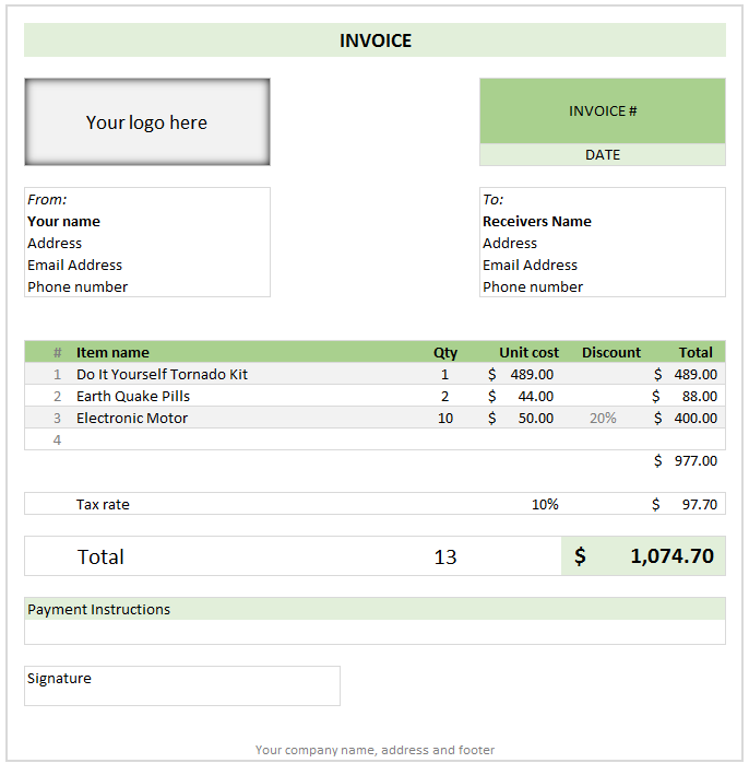
- A ready to use or print invoice template. Just fill in values and bingo!
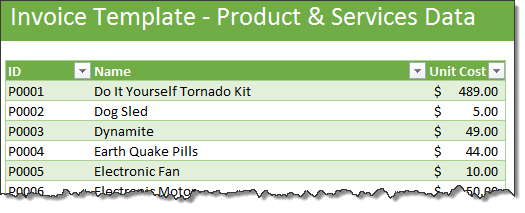
- A table where you can list all your products and services. This way you can select them on the invoice to generate prices quickly, as shown below:
How to use this invoice template?
This template is optimized to print or save as PDF. All you have to do is enter the data and go.
- Go to Products & Services tab and specify your details
- Select items & specify quantities to see prices
- Apply any discount per line item as needed
- Delete extra lines or add lines as needed
- Specify tax % if any
- Provide payment instructions
- Add other details like invoice #, receivers details and your details
- Print this sheet (only invoice will be printed)
OR
Save this worksheet as PDF (only invoice will be saved)
How is this template made?
As a curious reader, you may want to know what Excel techniques are involved in constructing this template. So here we go,
- Tables: to keep the products & services data
- Data validation: to select one of the products from list
- Conditional formatting
- to prevent duplicate product names in the invoice
- to show zebra lines (alternative rows in different color) in the invoice items list
- to show $ amounts only if quantity & product name is specified
- VLOOKUP formula to fetch price of selected item
- IFERROR formula to suppress any errors
- Print areas: to print (or save as PDF) only the invoice portion
Do you use Excel for preparing invoices?
Just like millions of small businesses around the world, we at chandoo.org too use Excel for making invoices, quotations and tracking data.
What about you? Do you use Excel templates to manage invoices, quotations etc.? What is your experience like? Please share your thoughts & techniques in the comments.
More Excel templates for you
Check out these templates to save precious time and kick some serious ass.


19 Responses to “Free Invoice Template using Excel – Download”
Nice post! Invoicing for the small biz or solo entrepreneur is something I see a lot of interest in. Also there are great templates from http://office.microsoft.com/en-us/templates
This is awesome.
I would need a little more. e.g. say I generate a Inv. # 1 with all the details. Once done I can click a button all the relevant details gets stored in some table. Further, when i generate a new invoice those details gets stored in same table but just below the previous invoice.
Is their a way to do this?
I did create a solution you are looking for, however its wrapped in a larger 'Medical Scheduler' and it uses VBA, But you can Save, Update, Lookup, Email, Print & Apply Payments to the Invoice.
You are welcome to download it here:https://www.dropbox.com/s/2yvo0o2tgq9quhe/Medical_Massage_and_Salon_Application-Free.xlsm
The Invoice Items are created from the Appt. Types & Service Items table.
I would love all feedback from this
Thank you for sharing. I will definitely have a look at it.
Daily dose of Excel held a competition in 2005 for this same topic
It obtained 9 solutions which are shown:
http://dailydoseofexcel.com/archives/2005/10/27/invoice-app-the-results/
[…] http://chandoo.org/wp/2014/03/19/free-invoice-template/?utm_source=feedburner&utm_medium=email&a… […]
How can i removed Dollar Sign, As want to use this in india.
Please reply.
Also if possible then can i use Indian Rupee Sign and how?
Hi Chandoo,
Thanks for sharing this invoice template, Let me tell you this template will definitely help me since I got a process to handle where this invoice piece comes. Just a small doubt, can we store all the invoice details in PRODUCT & SERVICES sheet. So that whenever I select an invoice number from invoice sheet I can take print out and I can share it as well. Can we do that?? Since I will be dealing with this on monthly basis.
It would be great if you can help me with this.
Thanks in advance for your help!
Regards,
Gaurang Mhatre
Hi Chandoo,
I was thinking learning excel is quite tuff task but your blog proved me wrong. You made it very interesting. Thank you. Also the template you have provided for Invoice is very helpful to us.
Thanks thanks thanks.. Very helpful. 🙂
Hi i love the speadsheet but would like to ask how do i get it to add the description into the invoice as well
Hi Randy, I tried to download one of your link "https://www.dropbox.com/s/2yvo0o2tgq9quhe/Medical_Massage_and_Salon_Application-Free.xlsm" However, i found the link unavailable. Can you please help me get the new link or can you please send this VBA file on my Email-ID.
Hello Anuj,
Thanks for alerting me to the broken link. This one should work:
https://www.dropbox.com/s/gz89gshex1ad0ex/Medical_Massage_and_Salon_Application-Free.xlsm?dl=0
Please let me know if you have any questions.
Randy
Thank you so much Buddy. will check and revert you soon.
Hi, is there any chance that this can work with the "Products & Service" sheet outside of the Invoice sheet. I create multiple invoice files for the numerous clients. Updating the product sheet for each of them maybe a task. Hence, I want to create a MASTER FILE from which data can be picked up without having to insert new data in each of the invoice files.
Possible? Or am I asking for the moon 😉
Thank you so much for tutorial.
This example can be reviewed for the example of the advanced invoice that made with excel userform :https://youtu.be/Qr-4of-38DI
Good Day
i love this template may i ask if it could be modified to have the following
when you lookup a item code in the next column to the right it brings up the description then the quantity, unit cost, discount and then total otherwise i love the template
Item Code Description Quantity Unit Cost Discount Total
When creating an Invoice template in Excel are you able to utilize the auto row height and wrap feature when the cell is a merged cell? I need to have a number of cells merged together to allow for enough space to type in the description of work performed (lets say cells A-D are merged in each row) however it seems that I am unable to utilize the auto format feature. To work around this I have to manually increase the row height after each entry. Is there a better solution for this? Thank you!