
 Last week, Our of curiosity and fun I asked you “how long have you been using Excel?“.
I was overwhelmed by the response we got to this simple question. More than 437 people responded with their comments, stories and enthusiastic responses. Thank you so much.
It would taken me more time to make the charts and understand the data. But thanks to Hui, who volunteered to tabulate all the survey data in a simple CSV. He also made an interesting dynamic dashboard from this data-set so that you can search and visualize matches. More on this below.
First the data:
We had 437 responses to the poll. While this is no way a good representation of all the 300 million Excel users out there, I would say this is a pretty good sample of Chandoo.org readers.
The key statistics are,
- Median Excel age is 14 years
- Average is 13.2 years
- Minimum is 6 months
- Maximum is 26 years (Rod Reed, Haseen I Alam and Jack Nefus)
Message #1: Excel Teens & Tweens are a majority
When I ran the survey, I thought, a majority of people would be in the Excel age group of 3-10 years. But I was surprised to say the least when I saw the data. More than 45% of the respondents have been using Excel for 11 years or more.
Chart – Excel Age distribution

What this means – possible explanations
- Biased data set (!?!): Since people who started using Excel just a few years ago tend to be not so serious about it, they may not have responded to the survey or neglected it. On the other hand, people who have been using Excel for more than a 10 years tend to be more passionate about it and thus they are active on sites like chandoo.org. So they are prone to responding to surveys or indulging in discussions.
- Excel user base shrinking: With the launch of drag-and-drop analysis tools like Tableau and cheap alternatives like Google docs, Open Office and Zoho, may be Excel user base is shrinking. This could be the reason behind such heavy concentration of 10-19 year user base.
Message #2: Excel 95 and 97 are very popular versions
I wanted to understand how the year on which users started using Excel correlated with Excel releases. So I flipped the chart and plotted Number of people by Year. Then I overlaid Excel releases as noted in Excel history time-line chart. Here is what I got,
Chart – Year people started using Excel by Number of people

What this means – possible explanation
- The big spikes in data coincide with releases of Excel 95 and 97. In fact, you could notice that a large chunk of users (~30%) have started using Excel between 1995 and 1998. We can attribute this to features like VBA (introduced in 1993), Windows 95 launch and spreading of concepts like MIS, Business Intelligence, enterprise databases and business analysis.
Note: this could just be a coincidence.
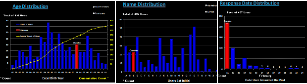
Additional Charts prepared by Hui:
Hui, our guest author and resident Excel Ninja, prepared an impressive dynamic dashboard from this data set. Using this dashboard, you can search for a name or year or age and highlight matches and do some fun analysis (like the distribution of names by first letter of first name) etc.
Few sample charts from Hui’s workbook:
Download Excel workbooks with this analysis:
- Click here to download my workbook with both the charts above and associated formulas etc.
- Click here to download Hui’s dynamic dashboard workbook
- Click here to download just the data (CSV format) so that you can do your own analysis.
Open Challenge to you – Visualize the Excel Age survey Data
Go ahead and download the data here. Make a chart or set of them so that we all can understand the data better.
Excel Techniques used in my charts:
- Generating Frequency distributions for a histogram using FREQUENCY Formula
- Box plot with quartiles overlaid on a regular column chart (more on box plots)
- Text boxes with fill color to create visual segments by age
- Labels on a dummy series (on secondary axis) to show the Excel versions, much like project milestone time-line chart
If you like this post, you will love,
- Visualization of last visible cell in Excel survey
- Visualizing survey results in a panel chart – Excel example
- Want to create similar charts and work with data like a ninja? Join my Excel School online training program


