Excel Charts, Graphs and Templates
Tutorials, Examples and explanations on Excel charting. You can learn how to create almost any chart type in this section. Also learn how to create effective charts, make them interactive and add automation thru VBA
The Olympic Medals by Country Chart – Improved now |
|
|
My Olympic medals by country year visualization in excel is received well by readers. I got few interesting emails on it. Robert from Germany shares an interesting approach at doing this, by doing a heat map of the medal counts on an outline world map. This is very impressive and involves flood filling countries with […] |
Use min-max charts to show the spread of data – Charting Best Practice |
|
|
|
Next time you want to make a chart to tell how your sales (defects, customer calls, page views, number of clicks, walk-ins etc.) are doing over a period of time, consider showing them in a min-max chart. For eg. a min-max sales chart for the last 12 months tells average, minimum and maximum sales per […] |
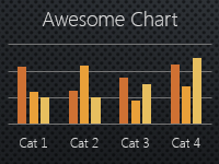
Dashboarding Fun – Display Smileys in your excel dashboards |
|
|
|
Dashboards are daily staple for some of us who need to report status to our bosses, present them in weekly meetings or generally CC half the world with what is up on our end. There are several ways in which you can spice up the dashboard, one of the simple things to do is, to […] |
Doing the NY times Olympic medals by country year visualization in excel |
|

|
When I saw the Olympic medals won by each country by year infographic on nytimes my jaw almost dropped, go ahead see it and come back, I am sure you will love it too. It is one of the coolest visualizations I have seen in the recent past and I see infographics all the time, […] |
Vizooalization: 5 things I have learned about visualization at the zoo |
|

|
On Saturday we went to Columbus zoo, apart from enjoying the lions, penguins, birds, I have also learned 5 simple yet effective lessons in visualization. 1. Design your charts for kids – assume your audience knew bare minimum and curious Above shown is a typical Zoo-mate info dashboard that you can see next to any […] |
Cool infographics around the web – [july 31] |
|
|
|
Time for another round of cool charting / info-graphic ideas around the web. Most Popular Baby Names – all the way from 1880 Nametrends is a cool website totally dedicated to analyzing and showing baby name trends. They have pretty interesting stuff like, how baby names ending with -lie (charlie, willie, ellie etc.) fared from […] |
Excel Links of the week |
|
|
|
Here is a quick round up of excel posts from few of the awe some blogs around the web: At PTS Blog, Jon provides excellent tutorial on adding target lines to your bar charts to show target vs. actual performance. He has several other tweaks for your category axis as well, just read the other […] |
Cool infographics around the web |
|
|
|
Starting this week I will post cool infographics from around the web, 4-5 of them a week to inspire , to give more ideas on presenting information and to provide some eye candy for awesome readers @ Pointy Haired Dilbert. Go ahead, click through these awesome graphics: California Walkability Score Heat Map Lee Byron took […] |
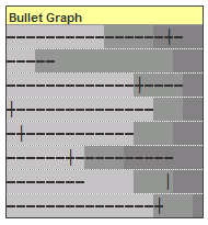
Excel Bullet Graphs |
|
|
Bullet graphs provide an effective way to dashboard target vs. actual performance data, the bread and butter of corporate analytics. Howmuchever effective they are, the sad truth is there is no one easy way to do them in excel. I have prepared a short tutorial that can make you a dashboard ninja without writing extensive […] |
Improve your in-cell charts with colors and negative values |
|

|
In response to Making Incell charts better article, reader Tony mailed me an excel sheet in which he has modified the charts to display colors and negative values. This is pretty cool. Take a look at the chart below: The trick lies in displaying the charts in 2 rows, one for positive values and another […] |
Worst bar chart ever? – World’s Most Expensive Places to Have Sxx |
|
|
|
Environmental Graffiti should get the award for “worst possible bar chart ever” for this unbelievable piece of art… Who said bar charts are only for serious data interpretation, they can be used to have such fun 🙂 Also read Garr Reynold’s comments on this as well. Happy Thursday.. 🙂 |
Incell Bar charts – Revisited |
|

|
I can never get tired of in-cell charts, whenever I get sometime, I try to experiment something on them. Here is an idea to design true incell column charts without using any add-ins or installing fonts. These charts can be fun to have on your project report or annual news letter or memos, they take […] |
Partition Charts – Continuation – [More visualization fun] |
|
|
|
Jon @ Peltiertech has taken a critical look at the partition charts suggested yesterday. You can read his review of the partition charts here. One of the commenters on his site said, Jon, the partition chart is not that bad. It just needs to be defragmented… 🙂 So I de-fragmented my partition chart, this time […] |
Partition Charts in Excel – alternative to pie charts [visualization hack] |
|
![Partition Charts in Excel – alternative to pie charts [visualization hack]](https://chandoo.org/wp/wp-content/uploads/2008/07/partition-charts-in-excel.gif)
|
Next time you had to create a pie chart, consider building a partition chart as these charts can reveal trend information along with how much each pie is contributing. What more? They are as easy to create as eating a chocolate chip cookie dough ice cream 🙂 I made a sample partition chart based on […] |
Google maps 3d building outlines – wow |
|
|
|
I haven’t noticed this before, but google maps provides 3d building outlines. I think this is pretty cool. You can see them in action here. Earlier on google : Google Park bench in Russia |
Hot Thermometer Charts in Excel – here is a cool way to do them |
|

|
Let us learn a simple charting hack to create a thermo-meter chart in excel. This type of charts can be effective in communicating one data point, they can make excellent presentation slide or dashboard widget. What more, they are as simple to do as adding whipped cream to your latte. So lets begin: 1. First […] |
Gantt in 60 seconds – churn out an excel project plan in no time |
|

|
One of the most frequent tasks for any manager is “planning”, be it putting together a hiring schedule or designing a jumbo jet, it all starts with a simple project plan and gantt chart is simple and intuitive representation of the same. But how to make a gantt chart in excel without writing too many […] |
Creating in-cell bar charts / histograms in excel |
|
|
|
Ever since writing the create in-cell pie charts in excel, I have been itching to find a simple enough method to do incell bar graphs. An in-cell bar would probably be more useful and cuter than an in-cell pie as it can instantly provide trending details. What more, these would probably look gorgeous when printed […] |
Create in-cell pie charts in Excel |
|
|
|
Here is a ridiculously easy trick to do nice incell pie charts in excel, what more, they will make you look like a charting wizard. Download free pie chart font from here (direct download link). The font has 21 pie chart codes starting with empty circle (character ‘a’) and ending with full circle (character ‘u’) […] |
Create Cool Tag Clouds in Excel using VBA |
|
|
|
I was toying with the idea of creating a tag cloud in excel – as a form of new visualization, this could be useful when you have medium amounts of data (eg: 50-300 rows) and you want to emphasize on what is important and what is not. I would imagine using a tag-cloud, When you […] |

