Excel Charts, Graphs and Templates
Tutorials, Examples and explanations on Excel charting. You can learn how to create almost any chart type in this section. Also learn how to create effective charts, make them interactive and add automation thru VBA
FIFA Worldcup Excel Spreadsheets [Roundup] |
|
|
|
Looking for FIFA World cup 2018 Tracker? Click here. Today FIFA World-cup 2010 is beginning. For the next 30 days or so, no matter where you go, you are bound to hear about soccer, world cup, teams, points, goals and what not. As a tribute to this beautiful and lovely sport, I want to showcase […] |
Official FIFA World-cup Soccer Balls since 1930 in an Excel Chart [Excel Fun] |
|
![Official FIFA World-cup Soccer Balls since 1930 in an Excel Chart [Excel Fun]](https://chandoo.org/img/vp/official-fifa-worldcup-soccer-balls-from-1930.png)
|
The FIFA World-cup 2010 edition is around the corner. Like millions of people around the world, I too am an ardent fan of football. (although, I have played only one game of soccer in which I waited near opponents goal post as I was too lazy to run around. And when my team mates kicked […] |
Dynamic Dashboard in Excel – Pulling it all together [Part 4 of 4] |
|
![Dynamic Dashboard in Excel – Pulling it all together [Part 4 of 4]](https://chandoo.org/img/ed/excel-dynamic-dashboard-final-th.png)
|
In the last installment of our dynamic dashboard tutorial, we will take all that we have learned in first 3 parts and combine that to create a final dashboard. We are going to use concepts like table of contents, macros and data validation to help us get ahead. You can find the entire macro and downloadable workbook inside the post. Read on… |
Display Alerts in Dashboards to Grab User Attention [Quick Tip] |
|
![Display Alerts in Dashboards to Grab User Attention [Quick Tip]](https://chandoo.org/img/dashboards/dashboard-alerts-example-th.png)
|
Dashboards can be overwhelming with lots of details and context. A simple way to drag user’s attention to important stuff in the dashboard is to use alerts. See this example to understand what alerts mean. How to display alerts in Excel Dashboards? The easiest way to display alerts is to use Excel 2007’s Conditional Formatting […] |
New Features in Excel 2010 Conditional Formatting |
|

|
Conditional formatting is one of favorite features in Excel. CF has helped me save the day at work more than a dozen occasions. I almost became project manager just because I knew how to make a gantt chart in excel using conditional formatting. I have written extensively about it. So, I was naturally curious to explore what is new in Excel 2010’s Conditional Formatting. In this post, I will share some of the coolest improvements in CF. |
Evolution of Privacy Policies on Facebook – a Panel Chart in Excel |
|

|
Out of curiosity I took the data from Matt McKeon’s Privacy on Facebook chart and try to re-do the chart in Excel. I made a panel chart depicting how Facebook’s privacy policies have changed since 2005. You can see a bigger version of chart as well as get the download excel from the post. Read on… |
Introduction to Panel Charts using Excel – Tutorial & Template |
|

|
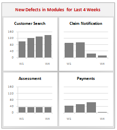
In this article we will learn what a Panel Chart is and how you can construct a panel chart in Excel. A panel chart is a set of similar charts neatly aligned in panels to help us understand some data which has multiple variables in it. Panel charts are also called by names “trellis displays” or “small multiples”. They are an effective way to display multi-variable data. Here is an example panel chart showing the total defects per module over the last 4 weeks. |
Data Tables & Monte Carlo Simulations in Excel – A Comprehensive Guide |
|

|
If anybody asks me what is the best function in excel I am drawn between Sumproduct and Data Tables, Both make handling large amounts of data a breeze, the only thing missing is the Spandex Pants and Red Cape! How often have you thought of or been asked “I’d like to know what our profit would be for a number of values of an input variable” or “Can I have a graph of Profit vs Cost” This post is going to detail the use of the Data Table function within Excel, which can help you answer that question and then so so much more. |
Change Data Labels in Charts to Whatever you want [Quick Tip] |
|
![Change Data Labels in Charts to Whatever you want [Quick Tip]](https://chandoo.org/img/q/custom-data-labels-example-chart.png)
|
We all know that Chart Data Labels help us highlight important data points. When you “add data labels” to a chart series, excel can show either “category” , “series” or “data point values” as data labels. But what if you want to have a data label that is altogether different, like this: Of course you can point data labels to any cell. In this quick tip, we will learn how to do this, read on… |
What are your favorite colors for charts? |
|

|
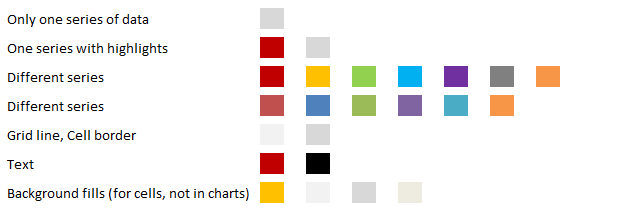
Ok, it is Friday again. That means poll time. I would like to know what color choices you prefer for your charts? These are the colors I use when making charts in Excel 2007 (it has capability to set any color for chart elements). |
Making a Dynamic Dashboard in Excel [Part 3 of 4] |
|
![Making a Dynamic Dashboard in Excel [Part 3 of 4]](https://chandoo.org/img/ed/moving-objects-with-vba.gif)
|
In this post we are going to look at a simple example of the VBA behind the Dynamic Dashboard. Essentially we will learn to write macros for doing this. Read the rest of this post to find code samples and downloadable files to play with. |
How to pick a chart type – Charting 101 |
|

|
Bar chart or Line? Scatter plot or box plot? These are the questions we ask ourselves when we set out to make a chart. Because, “Selecting right chart for our data” is very important to tell our story. In this article, we will learn how to “select the right chart” based on our data and situation. |
Speaking at TechEd 2010 on “How to Select the Right Chart for your Data” |
|

|
I have come to Bangalore to attend the TechEd 2010 conference by Microsoft. Today (April 13th), I will be speaking on “How to select the right chart for your data”. A short talk telling people how to choose the correct chart based on the message they want to convey. [You can see the schedule and […] |
Survey Results in Dot Plot Panel Chart [followup on Incell Panel Chart] |
|
![Survey Results in Dot Plot Panel Chart [followup on Incell Panel Chart]](https://chandoo.org/img/vp/incell-dot-plot-panel.gif)
|
In a follow up to last week’s how to visualize survey data in excel, we will explore how you can create an incell dot plot panel chart. Please follow the links in the article to get more commentary and insights from established persona in the visualization world (including Stephen Few, Naomi, Jon etc.) |
Make your Chart Legends Legendary |
|

|
We all know that legend can be added to a chart to provide useful information, color codes etc. Today we will learn how to make the chart legends smarter so that they provide more meaning and context to the chart, like this: This type of legend can be more useful than a plain legend as this provides more useful information without taking up too much space. |
How to Visualize Survey Results using Incell Panel Charts [case study] |
|
![How to Visualize Survey Results using Incell Panel Charts [case study]](https://chandoo.org/img/cb/survey-results-panel-chart-example.png)
|
A panel chart (often called as trellis display or small-multiples) shows data for multiple variables in an easy to digest format. It lets users compare in any way and draw conclusions with ease. Today, I want to discuss how the principles of panel chart can be applied to visualize a complex set of survey results. For this we will use the recent survey conducted by Gartner on how various customers use BI (Business Intelligence) tools. |
Making a Dynamic Dashboard in Excel [Part 2 of 4] |
|
![Making a Dynamic Dashboard in Excel [Part 2 of 4]](https://chandoo.org/img/ed/excel-dynamic-dashboard-final-th.png)
|
In part 2 of Excel Dynamic Dashboard Tutorial, we will learn how to set up various dynamic charts that are part of the dashboard. We start with a simple dynamic pie chart that shows the sales distributions and then move on to sales trend line charts. These charts use various excel formulas to pull in the information based on user selection. |
Introducing PHD Sparkline Maker – Dead Simple way to Create Excel Sparklines |
|

|
Sparkline or Microchart is a tiny little chart that you can place on dashboards, reports or presentations to provide rich visualization without loosing much space. In excel 2010, MS introduced a beautiful feature for creating sparklines from data in spreadsheets. For earlier versions of Excel (that is 2007 and before) there is no native support […] |
Making a Dynamic Dashboard in Excel [Part 1 of 4] |
|
![Making a Dynamic Dashboard in Excel [Part 1 of 4]](https://chandoo.org/img/ed/excel-dynamic-dashboard-final-th.png)
|
In this and next 3 posts, we will learn how to make a Dynamic Dashboard using Microsoft Excel. At the end of this tutorial, you will learn how easy it is to set up a dynamic dashboard using excel formulas and simple VBA macros. |
31 Excel Tutorials – Learn and Be Awesome in Excel |
|

|
In October 2008, I have started an ambitious series of posts on this blog called – Spreadcheats. These are little tricks, nuggets, tutorials on using Excel that would make anyone a spreadsheet guru. The spreadcheats series has been wildly successful. I am compiling all this useful information and articles in to one big post so that anyone can follow the links and become good in Excel. Read on, [Note: This is not for beginners. If you know what a formula is, you would enjoy this 31 articles] |


