
One of my Excel School students, Rajatha, e-mailed me and asked,
I have to come up with a Birthday and Anniversary calender which would automatically send emails on the particular date, is this possible if yes then how?
My initial response was,
You can do the automated birthday / anniversary reminder using excel. Here is the basic approach:
- Record birthdays and anniversaries in a table
- Now, write a simple macro to scan the list to see which birthdays / anniversaries are on today
- For each of the matches, send an email with a pre-composed message (more on sending emails thru vba here: http://www.rondebruin.nl/sendmail.htm )
To which she came back and said,
I am not familiar with macros… is there any other way?
Well, there is.
You can use Excel to remind you about upcoming birthdays and create pre-composed messages, like above. The basic approach is like this:
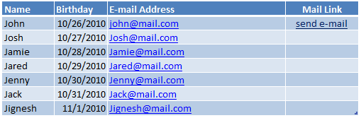
- We list all the birthdays, corresponding names and email addresses in a list.
- Now, using TODAY() and IF() formulas we test if anyone’s birthday is today.
- If that is the case, we use Excel’s HYPERLINK() formula to generate a mailto hyperlink.
- Once you click on that, Excel opens your mail application (outlook or notes or whatever fancy app you are using) and loads the message.
- You just press the send button. Done!
Watch Excel Birthday Reminder – Recipe Video
Download Excel Birthday Reminder Template
Click here to download the excel birthday reminder template & play with it.
Do you use excel to keep track of birthdays etc?
Not me. I have very few close friends and I remember their birthdays. For the rest, I use facebook to get notified when their birthday is around the corner. It is unlikely that I will forget the birthdays of family members.
But, I think Excel has amazing potential to remind you about various important dates. Especially if you want to send birthday wishes to customers (or employees) from a database, Excel is good for that.
What do you think? Please share your experience & tips with us using comments. I am all ears.
Download even more templates:
Visit excel templates page to download several spreadsheet solutions & samples.


53 Responses to “How to make a Birthday Reminder in Excel ? [Video]”
This is a nifty use of the mailto link, I always found them quite handy in situations where I did not have the time or permission to create a proper web form.
If you want to use this sheet year after year, you could test just if the day and month of the birthday match, without comparing the year:
AND(DAY(C9)=DAY(TODAY());MONTH(C9)=MONTH(TODAY()))
instead of C9=TODAY()
And then you can use the real birth year, and even include the age in the birthday greeting: YEAR(TODAY())-YEAR(C9)
Thanks a ton....
I had to do that reminder sheet for a 1000 odd employees of our company, with sheet getting updated when a person leaves.... it saved me a lot of time... 🙂
great post, Chandoo !!
that's great, but let's raise the bar a little bit, if you dare....
this file works great, when opened ......
what about not opening Excel? or rephrased: shat if I don't want the user to "see" the Excel instance when running the macro? I'm thinking about the good ol' scheduled tasks, with a BAT file to run a program to open an Excel instance, not visible, open the reminder file, execute the macro, and then close the file and the instance.
await for your piece of wisdom....
Kind regards,
Martin
@Martin
You need to do two things to make this work
.
1. Make a Windows shortcut with a command line ie: Excel.exe /r "c:\MyFolder\MyFile.xlsx"
http://office.microsoft.com/en-au/excel-help/command-line-switches-for-excel-HA010158030.aspx
.
2. In MyFile.xlsx add an Workbook_Open event
http://office.microsoft.com/en-au/excel-help/running-a-macro-when-excel-starts-HA001034628.aspx
.
Pay special note to the sections on macro security
I created a Birthdays & Anniversaries calendar in Google Apps with one alarm sending an email one week before and another alarm sending me a text message the day before as reminders.
This works well for me, but wanted to say that most of the cell phone companies have an email address that can be used to send a text message. The problem is knowing what carrier you birthday recipient patronizes, but if you want to send yourself a reminder via text message through email Excel could do this as well.
Please share me the code
This is fun and creative. I would have never thought to use mailto in HYPERLINK() like this. Kudos.
From a practical standpoint, it would seem to be the wrong tool for the job. I assume that if you have Excel then you also have Word. To me, it would seem to be easier and faster to do an e-mail merge, using your Excel list as the data source. This would also give you greater control over the content and formatting of the email.
I am guessing that with a little effort, this could be fully automated as well...
Where i work i have one sheet named Distribution (in each excel report) with the list of names that the report gets sent too. On it is a vba macro button that allows anyone updating the report to send it out. Saves on sending multiple distribution lists out every time i want to go away.
Dear Chandoo Sir,
thanks a lot. I cannot express my gratitude with words.
I am learning a lot many things in excel and I am using it in my day to day work with lot of ease.
Your birthday template is simple and neat.... It will help me a lot..... I had a doubt as to how excel will do if i put the complete date of birth, but Gregor Erbach had cleared the same....
Keep continuing the good service... May god bless you....
Can we put an image too
@Gregor... very good formula to make the birthdays year insensitive. 🙂
@Martin: You can use mailmerge and run it from scheduled tasks thru simple vbscript file. Follow Hui's advice and get in to the rabit hole. Its deep, but quite exciting 🙂
@Gregory.. Interesting application... you can probably use google spreadsheet functions to get the carrier info for a given phone number. They have formulas like googlesearch().
@Sixseven.. Thank you so much. I am happy you liked it. I agree that email merge thru word is an easier option. In fact, you should use it as it gives better control over everything (and you can use VBA in word to automate good chunks of this...)
@Jon.. interesting application of VBA...
@Venkataraman... Thank you so much for your kind words. I am delighted that you are enjoying this...
@Rajatha... Thru Excel formulas alone, I doubt it. But if the image is uploaded to a http server and available thru public path, then you can use < IMG tag inside the mail to embed the image. But it may not work as mailto: links are usually text only messages. The next option is to use macros...
Hallo Chandoo!
first of all thank you for such great site for excel. There are so many practical advises and helps.
I have read the artikel about birthday reminder where you can use HYPERLINK() formula to generate a mailto hyperlink and it was very helpful because due my work I need to work on Excel sheet without macros.
I have a 2 questions:
1. I cannot format the email body so I can have line between sentenses, for instance:
Hello,
(line break)
I wish you a very warm birthday!
(line break)
Best regards,
(line break)
Bold
2. If I have too long text in my email then it gives me back #VALUE! message.
So how can I solve this problems.
Thank you in advance.
Bold.
@Bold
There is no need to post here as well as the Forums
This has been answered in the forums already
Hi Hui,
I guess Bold has asked a pertinent question.
I am too facing the same issue.
Can you help. Also as per you this question by Bold has been asked here and the forums, but I have not found the solution for the same.
Again requesting your help.
Thanks in advance.
Pawan
Hi Chandoo,
That was an excellent & interesting way to use hyperlink formulas in excel. I created a similar sheet which worked fine until I used longer email address for which I was getting the #VALUE! message. How do I solve this?
Hi Hui and Chandoo,
Long email message give #VALUE! error. There seems some restriction issue.
Pls can you guys give us solution for the same.
Thanks in advance. Badly need it.
Pawan
thanks a ton Chandoo...
which means i better start learning macros 🙂
Hi Chandoo,
Can we also do some formatting on body contents using formula? I mean apply Red colour, increase font size, etc?
To be clear, Google doesn't have a googlesearch function, it's called GoogleLookup, but it won't return the list of phone carriers and their email-to-SMS-gateways. Yet for future reference Wikipedia has an article that will give you just that.
https://secure.wikimedia.org/wikipedia/en/wiki/List_of_SMS_gateways
In case anybody was wondering.
Hi Chandoo,
Many thanks for the tutorial.
I'm having trouble adapting the template.
I have a list of agreements with expiry dates. I have used mailto to send an email to the responsible person 3 months before the expiry of the Agreement. The email calls up the persons name, the name of the Agreement and I want to include the expiry date of the Agreement.
This is where I am having trouble. I am using the substitute command to replace "$" in a message cell with the expiry date in another cell. It works ok, but when the message generates in Outlook, the date is replaced with a date code not the date itself. Is there anyway I can maintain the date in dd/mm/yy format?
This is the formula: =IF((B10-90)<=TODAY(),HYPERLINK("mailto:"&G58&"?subject="&$G$54&"&body="&SUBSTITUTE(SUBSTITUTE(SUBSTITUTE($G$55,"$",F58),"@",A3),"^",B16),"send e-mail"),"")
Thanks for your help.
PS. I have no macro experience.
D.
@ Dan,
Try this,
=IF((B10-90)
@ Dan,
That didn't seem to pick up all of the formula???, but the main part is to change F58 in your formula to TEXT(F58,"dd/mm/yy")
Hope that helps
Thank you very much for your site and all the effert, to you and all the fine people who contributes. I tried the workbook, first by myself, then dowloaded your file. When clicking "send e-mail", I got a message: "Operation canceled due to restrictions on this equipment. Contact your system administrator".
Anyone has a clue why is this?
Thank you! it works, and thank you Gregor Erbach, that was my issue too, <<>>
But, this one didn't worked, but figure it out.
And then you can use the real birth year, and even include the age in the birthday greeting: YEAR(TODAY())-YEAR(C9)
HI Chandoo,
Thank you! for useful reminder.
Also I like to Thank Gregor Erbach.
I like to know is't possible for send AutoMail based on the Excel date & Email Id.
Prasad.
Wonderful. Thanks. Very close to exactly what I need.
Now what I'd like to see is a box over in column M that says "this week's birthdays" and listing the appropriate names from column B. Possible?
Chandoo, Hui,
sorry for my late reply.
Some years ago, when we used Lotus Notes as the e-mail app, we changed our signature, and thus, we were required to instruct all how to do so.
since it was a HTML signature, all I did was to see the code behind my own signature, and make some changes to include it as a string to be passed to my LN client from the VBA code.
I had the user list with new phone #, job title, cell phone, fax #,, so all I did was to create the macro to check all the items I wanted to process from that list (there was a yes/no field named "send signature?" and voilá ! they received an e-mail with the signature as an attachment,and the instructions on how to set it up.
That file was so good, that it was used all across the region, with excellent results.
Following up my May 30th post - I gather it is not possible?
@Patricia.. you can easily do that. Let me whip up an example and post it during weekend.
Hi Chandoo,
Thanks for the excellent solution. It works perfectly. However, I am facing some issue when I modify the "&body" part of the mail i.e. the cell which contains the body of the mail. I receive a #Value! error. I did some trial and error on this by removing the spaces and the error goes away, however, then the email looks shabby.
Another interesting thing is that when I drag down the formula through the column, only a single cell comes out with an error and the rest are perfect. (In this case I have not modified the content of the mail and let it remain the same as that in your example)
Please enlighten me. Thanks a ton for making life simpler in excel.
hai chandoo,
i am lokesh from bangalore. Right now i am an employee of Xchanging solution ltd (mnc ) i need to improve my excel like you and i am facing lots of problem in my office regarding excel could you please help us.
And i am a fan of yours really you are a genius. actually i am searching the web site for birthday wishes formate. i got your web site link through you tube then i go with your link and get the excel wishes document. its really amazing part of work you did, my heartily wishes you to these kind of excel tricks update in your link and we make use of this in future.
thank you very much chandoo, i want to be become like you please help me.
regards
lokesh.M
email : lokeshsmg2008@gmail.com
I check back to this page occasionally, but have not seen the example. Pardon me if I'm not looking in the right place.
Hi Chandoo, thats cool. I have the same requirement in my organization i just wrote a macro automatically sends greetings to all persons. now my new requirement is when ever any body wants to reply to that mail, i should change "To Address" to email id of person/s having birthday. i am using outlook. can i do this using macros.please help me
Please teach me excel, i want to become an expert like you. let me know what do i need to do to get a class seccion from you at least twice a week
Hi,
I am looking for the link to download an excel CSV spreadsheet template that has birthday reminder settings for outlook. i.e. has the subject, all day event, reminder on, etc so that it reminds me in outlook with a reminder. I would then import this file into outlook.
Thank you.
Ross.
Hi Chandoo,
I am a regular to your website. Thanks for all the amazing work you and your friends and colleagues are doing. I am benefited a lot by that.
I am using your birthday reminder for some specific purpose. It works fine.
However as pointed by @Bold
2. If I have too long text in my email then it gives me back #VALUE! message.
So how can I solve this problems.
Thank you in advance.
Bold.
I guess I am also having issue in the same. It seems there is a restriction in the number of characters for the email message, if I use this approach.
Request your help in resolving this one. Would be really grateful.
Thanks a ton in advance
Hi Chandoo,
I am facing the same issue as bold cannot modify the body as i want to add additional sentences.
Please help me out in fixing thsi
Hi Chandoo,
Is it possible to hyperlink to gmail or yahoo instead of outlook?
@Sethu.. mailto links are opened by in users default mail application always. You can set default mail application thru windows / Mac settings, but this effects all mailto links.
how can i make my gmail account default one to send mails. Currently it is opening via windows live mail.
please suggest.
Thanks And Regards,
Rishit shah.
Hi Chandoo,
I am a regular to your website. Thanks for all the amazing work you and your friends and colleagues are doing. I am benefited a lot by that.
I am using your birthday reminder for some specific purpose. It works fine.
However as pointed by @Bold "If I have too long text in my email then it gives me back #VALUE! message."
I am also having issue in the same. It seems there is a restriction in the number of characters for the email message, if I use this approach.
Request your help in resolving this one. Would be really grateful.
Thanks a ton in advance
Aloha Chandoo!
Much Mahalo (Thank you) for this awesome tutorials.
please i want birthday reminder and advance birthday wishes in excel with proper functions please mail me thesheetalbarua@gmail.com
Hi Chandoo
I have read and downloaded your Birthday template and it is a great tool.
I note in an earlier thread that somebody asked if there was a way to create an automated email.
Youhave made refrence to awebsite http://www.rondebruin.nl/sendmail.htm
I have visted and emailed but cannot seem to get any help.
Is this something you can help with or do you know someone.
Thanks
Hi chandoo,
If i want to add email addressess in CC what should i do with this formula?
=IF(C9=TODAY(),HYPERLINK("mailto:"&D9&"?subject="&$C$4&"&body="&SUBSTITUTE(SUBSTITUTE(SUBSTITUTE($C$5,"$",B9),"@",$C$6),CHAR(10),"%0A"),"send e-mail"),"")
Hi Chandoo
In this excel cancan we add an image
Hi,
When I open the excel template and click on edit workbook the send e-mail link do not work.
Thanks
Hi Chandoo,
I downloaded the birthday e-mail template however when I click on click editing on top of the excel sheet.... the mail link disappears and it does not work.
Please help.
Hi Chandoo..
This is an excellent alternative for people not familiar with macros.
Can I please please request you and other experts to help me with my similar requirements.
I need to send a "welcome greeting" (standard but will add personalized greetings) to all the new joinees whose information is unique and captured in rows. Further if I use your formula then it returns error "#Value". I think the possible reason is that it is a big message with lots of instructions and my assumption is that the formula has a character limitations.
Please assist if this can be tackled with a formula or a macro.
Hi there, i am having trouble setting up the automated birthday reminder emails in Excel.
thanks.
Hi chandoo,
If i want to add another row what should i do with this formula?
=IF(C9=TODAY(),HYPERLINK("mailto:"&D9&"?subject="&$C$4&"&body="&SUBSTITUTE(SUBSTITUTE(SUBSTITUTE($C$5,"$",B9),"@",$C$6),CHAR(10),"%0A"),"send e-mail"),"")
Hi,
I want to ask if there is a possibility of adding a picture as well on the body of the email when we click on "Send Email". If yes, please share the formula or the process of adding the same please.
Can your "Birthday Reminder" be updated using the FILTER function? Also, will the FILTER function catch mulitple birthdays?