Archive for February, 2013
{ 18 Comments }
Use Advances vs. Declines chart to understand change in values
Published on Feb 21, 2013 in Charts and Graphs
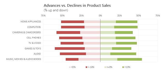
Lets say you are responsible for sales of 100s of products (which belong to handful of categories). You are looking at sales of each product in last month & this month. And you want to understand whether sales are improving or declining by category. How would you do it?
Turns out, this is not a difficult problem. In fact, this question is asked every day & answered using Advances vs. Declines chart.
You may have seen this chart in financial newspapers or websites. Shown above, Advances vs. Declines chart tells us how many items have advanced & how many have declined.
Read on to learn how to create this chart using Excel.
Continue »{ 4 Comments }
Last day for enrollments – Join our Power Pivot course & become awesome analyst
Published on Feb 15, 2013 in Power Pivot, products
 Hi folks,
I have a quick announcement & an awesome Power Pivot technique to share with you. First the announcement.
Only few hours left to join our Power Pivot course…
As you may know, I have opened enrollments for our inaugural batch of Power Pivot course few days ago. The aim of this course is to make you awesome in Excel, Advanced Excel, Dashboards & Power Pivot.
We will be closing the doors of this program at midnight, today (11:59 PM, Pacific time, Friday, 15th of February).
If you want to join us, click here and enroll now.
How many people have joined the class?
At the time of writing this, we have 195 students enrolled in Power Pivot class. We are eager to share Power Pivot knowledge & techniques to as many more of you as possible. So go ahead and join us because you want to be awesome in Excel & Power Pivot.
Continue »
Hi folks,
Today is valentines day. So I thought I should share a few love letters I recently got.
Correction: These letters are not for me, but for our site – Chandoo.org
Addendum: Don’t write me off yet. In my college days I did get all of 17 love letters, mostly because campus postman mistook me (room number 79) for the six foot athletic hunk in room number 29.
While I may not get cat calls & suggestive remarks when I walk on the street, Chandoo.org, the site would totally be kissed and hugged by people of all sexes and ages (well 21 and above).
You see, our site is like Ryan Gosling of Excel websites (or Mila Kunis). Those of slightly older can imagine Chandoo.org as George Clooney or Marissa Tomei of the data analysis world.
How else can I explain the barrage of love letters I get for Chandoo.org?
Continue »{ 19 Comments }
Shading above or below a line in Excel charts [tutorial]
Published on Feb 13, 2013 in Charts and Graphs
![Shading above or below a line in Excel charts [tutorial]](https://img.chandoo.org/c/shaded-line-charts-tell-a-better-story.png)
When comparing 2 sets of data, one question we always ask is,
- How is first set of numbers different from second set?
A classic example of this is, lets say you are comparing productivity figures of your company with industry averages. Merely seeing both your series as lines (or columns etc.) is not going to tell you the full story. But if we can shade our productivity line in red or green when it is under or above industry average… now that would be awesome! Something like above.
Continue »{ 4 Comments }
Distinct Count & Blanks – Power Pivot Real Life Example
Published on Feb 11, 2013 in Power Pivot
When it comes to analyzing business data, managers are always asking, “so how many distinct x each y is doing?”
And that sends us, data analysts & reporting professionals running from pillar to post figuring out the best way to do it.
- We can use variations of SUMPRODUCT, COUNTIFS etc, but the methods are not flexible..
- We can use VBA, but it would become slow as you add more data.
- We can use Pivot tables, but it only gives half of what we want ie each y part, but not distinct count of x.
- We might as well shave our head with a shovel before manually counting values.
And that brings us to 2 distinctly simple solutions:
- Using Power Pivot & Excel 2010
- Using regular pivot tables in Excel 2013
Today, lets talk about these 2 approaches & see why they are so better than anything else for distinct count situations.
Continue »
Today, Formula Forensics examines 3 techniques to determine an interpolated value along a curve.
Continue »{ 4 Comments }
Power Pivot & Advanced Excel course is open, Join us today!
Published on Feb 6, 2013 in Power Pivot, products

Hello readers & supporters of Chandoo.org,
I am very glad to announce that our newest online class – Power Pivot course is now open for your consideration. In this post, you can understand details about this course & how to join us.
Click here if you are ready to join us. Read below to learn more.
What is Power Pivot course?
These days almost any job requires data analysis & presentation of results. While anyone can put a list of values in Excel & sum them up, not everyone can do advanced analysis, create charts, make them interactive, summarize data intelligently, present output in an intuitive dashboard or slice & dice data using Pivot tables & Power Pivot. Having these vital skills can make you invaluable to your organization & expose you to new opportunities. Not to mention the amount of time, money & effort you can save by efficiently using Excel.
That is why I have created 2 powerful courses – Excel School & Power Pivot Class. Think of these as steps in a ladder.
Continue »{ 22 Comments }
Transpose a table quickly using Copy – Paste [Quick tips]
Published on Feb 4, 2013 in Excel Howtos
![Transpose a table quickly using Copy – Paste [Quick tips]](https://img.chandoo.org/q/transpose-a-table-quickly-using-copy-paste.png)
On Friday, we learned how to transpose a table of data using Excel formulas. Today lets learn a quicker & easier way to do this by just using copy, paste, find & replace.
Continue »{ 49 Comments }
Transpose a table of data using Excel Formulas
Published on Feb 1, 2013 in Excel Howtos
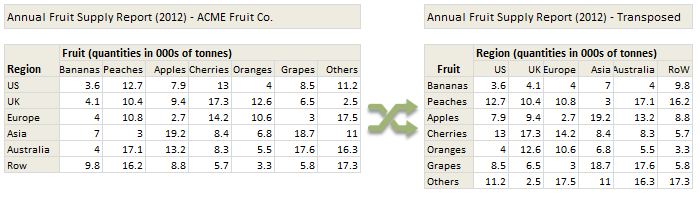
Today lets tackle a familiar data clean-up problem using Excel – Transposing data.
That is, we want to take all rows in our data & make them columns. Something like this:
Learn these 4 techniques to transpose data:
1. Using Paste Special > Transpose
2. Using INDEX formula & Helper cells
3. Using INDEX, ROWS & COLUMNS formulas
4. Using TRANSPOSE Formula

