Archive for September, 2008

There are few charts in excel that are as revolting as a radar chart. The purpose of a radar chart is to compare m options across n parameters so that audience can be convinced that option A is better than say option B. But, I am yet to come across a radar chart that tells […]
Continue »Visualization Challenge – How to show market share changes?

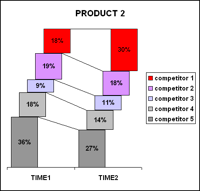
One of our readers Jennifer mailed me with this excel charting problem she is having. I thought why not ask other readers for their advice on this. So here it goes: The Charting Challenge – Visualizing Changes in Market Share Here is an excerpt from her email: The gist of my problem is how to […]
Continue »Calculating Paydays in a calendar year using Excel

In India salary is usually paid on the last working day of a month – the payday. It is slightly different in countries where payrolls are processed every 2 weeks. For eg. in US most companies pay salary on every 2nd Friday / Thursday. We can calculate the paydays / payroll periods in excel with […]
Continue »
My guest post on monitoring web page changes using google docs is posted in Digital Inspiration – one of the most popular technology blogs. Do read it to learn a little bit about using XPATH, RSS Feeds, Google Spreadsheet import() functions. Here is a summary of the technique: First go to the web page which […]
Continue »Power Outage & 99 Excel Tips to keep you Busy
We have a major power outage in Ohio due to a wind storm on Sunday. AEP, Our electric provider says that power would be restored to my area by this Friday midnight, that is almost 6 days without power. I will not be able to blog regularly during this period. So here is a list […]
Continue »American Bald Eagle – Photographic Fridays # 13

Shot at National Aviary, Pittsburgh. Browse archives.
Continue »Infographics of the week [Sep 12]
![Infographics of the week [Sep 12]](https://chandoo.org/wp/wp-content/uploads/2008/09/best-pie-charts-car-logos.jpg)
Donations made to Presidential Candidates – US Elections 2008 What would you get when you take 1.4 million rows of presidential election donations made to Obama’s and McCain’s campaigns? One possibility is the above visualization. The folks at Pitch Interactive created the above visualization. The half pies in the middle represent the overall donations made […]
Continue »
By integrating services like Google Finance, Search in to spreadsheet functions, google docs has paved the way for endless possibilities. Google spreadsheet function GoogleFinance() can be used to build stock portfolio tracker sheet that can fetch historical stock quotes to tell how your money is doing. Click here to see the stock portfolio tracker sheet […]
Continue »![Excel KPI Dashboards – Adding Micro Charts [Part 4 of 6]](https://chandoo.org/wp/wp-content/uploads/2008/09/kpi-dashboard-excel-thumb.jpg)
This is 4th part of Creating Management Dashboards in Microsoft Excel 6 post series by Robert. This 6 Part Tutorial on Management Dashboards Teaches YOU: Creating a Scrollable List View in Dashboard Add Ability to Sort on Any KPI to the Dashboard Highlight KPIs Based on Percentile Add Microcharts to KPI Dashboards Compare 2 KPIs […]
Continue »
Gauges are a familiar metaphor, everyone can understand them, you can see them everywhere – near your stove, ac, car, gaming console, pc – you name it. So, when you are preparing a chart to tell a point, gauge chart like the one above can be effective. (I know charting pros like Jon Peltier wouldn’t […]
Continue »Every week Pointy Haired Dilbert features some of the excel links from around the web here. Get the archives here. Teaching physics using excel My friend Jon @ PTS Blog tries a different approach to teach physics to his daughter. Who says excel is only for corporates? Daily dose of Excel compiles the ultimate list […]
Continue »Splitting text in excel using formulas

Often when you are processing text using excel it is important to split the text in to multiple parts based on a delimiter. For eg. you may want to divide this|needs|to|be|split in to five parts this needs to be split. There is a simple way to do this in excel, using “import text” option. But […]
Continue »
Took this in a bar, rotated the photo in a image editor. Btw, what do you like to drink? For me Vodka if I want to get drunk, otherwise a good chilled beer. Happy weekend?
Continue »![Cool Info-graphics of the Week [Sep 5]](https://chandoo.org/wp/wp-content/uploads/2008/09/anatomy-of-a-great-speech-obama-acceptance-dnc.jpg)
Once every week Pointy Haired Dilbert celebrates the art of chart making by sharing 4-5 of the best info-graphics featured in various web sites. Click here to see the visualizations featured earlier. Anatomy of a Great Speech – Obama’s acceptance speech at DNC Presentation Zen captures Obama’s symphony like acceptance speech in a graph shown […]
Continue »
With each passing day the amount of information contained in a single spreadsheet, slide, document is growing. Thanks to demanding bosses, clients and colleagues, we are now supposed to provide all the relevant information in as much less space as possible. This is where micro charting or light weight data exploration has become a rage. […]
Continue »

