
One of the annoyances of charts is that they all look like boxes (except for pie charts, they just look wrong). Boxes might be ok when you are making 1 or 2 charts. But a whole dashboard of boxes can look little rigid. So how can we make the charts peppy without loosing any effect? Like these charts below:
![Use Shapes and Images make Prettier Charts [Dashboard Tricks]](http://chandoo.org/img/c/pretty-charts-with-shapes.png)
Very simple, we use drawing shapes in MS Excel to draw whatever we want and overlay the chart on top.
See this 3 step tutorial.
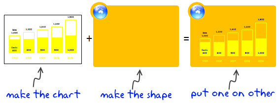
Step 1: Make the chart
This is simple, just make the chart and remove the background color. Also adjust series colors so that they look good when you combine the chart with drawing shape.
Step 2: Make the drawing
Go to Insert > Shapes (in excel 2003, select drawing toolbar and draw a shape) and insert some shapes. Arrange them so that you get desired effect.
Step 3: Put Chart on top of Drawing
This is simple. Just drag the chart on to the shape (s). If needed “send shapes to background”. That is all.
Download Example Charts
Click on these links to download example charts – Excel 2007 | Excel 2003
There are millions of possibilities when using shapes. Try something new for your next dashboard or report.
Note: Shapes can add clutter if you overdo them. Remember, the purpose is to let readers focus on the chart, not on shapes.
Additional material on excel dashboards.


16 Responses
Most important message:
Shapes can add clutter if you overdo them. Remember, the purpose is to let readers focus on the chart, not on shapes.
Otherwise you may as well Send in the Clowns.
In short, you are talking about using chart backgrounds. That is pretty normal with software vendors demonstrating their products but little impractical as it involves addtional time to embed them.
Cheers
Mark
DashboardZone
Though sometime this approach could be useful for concept-heavy shapes such as the Value Chain or Balance Scorecard.
I like it – we can all pretend that everyone just wants the data, and reducing the non-data ink to a minimum is everyone’s goal, but most non-data people like a bit of pizazz.
This is especially true when the dashboard ends up as part of a product that sales people have to take on the road – the challenge is to present great data in a nice format without taking the easy road with gauges and 3D oblique pie charts.
Hey Chandoo,
This is a great way to represent charts. I have found this to be very effective, while creating and illustrating concepts like Du-pont analysis, composition of revenues, P&L, Balance sheet etc.
@Mark: I would not say this is same as background. At a high level, they are but, using shapes to add context to charts is a bit more than simple chart back ground. For eg. as Paramdeep & Bernanr below pointed out, using shapes to make a balanced score-card dashboard is pretty common.
@Alex: Exactly my point. Pure data is good, but some times a bit of variety makes very good impact.
Hi
I am slowly getting convinced that it may not be a very bad idea using some ‘eye candy’ in business charts.
The way I look at it – for my personal analysis – use wire frame charts or minimalist charts.
For presentation of my finding use some eye candy – hey we need to get the idea across.
Chandoo…you’ll find one of the best charts ever at http://www.venganza.org/about/open-letter/
It’s informative, pretty, and fun.
I suggest you read the words above the chart first, rather than just scrolling down to the chart. The wikipedia article at http://en.wikipedia.org/wiki/Flying_Spaghetti_Monster is also a good backgrounder.
This interesting. The underlying technique, layering, is rarely used. However, it has far more applications that placing an image beneath a graph. Laying is a powerful and flexible method for integrating multiple charts, integrating charts with non-chart report elements, formatting and customizing charts, and creating compound charts. I elaborate and provide examples at:
http://pushindatalikeweight.com/2009/12/05/layering-in-excel/
Cool!
Hello it was a pleasure visting your blog.