
This is the last installment of project management using excel series.
Preparing & tracking a project plan using Gantt Charts
Team To Do Lists – Project Tracking Tools
Project Status Reporting – Create a Timeline to display milestones
Time sheets and Resource management
Part 5: Issue Trackers & Risk Management
Project Status Reporting – Dashboard
Bonus Post: Using Burn Down Charts to Understand Project Progress
Communication is a very important aspect of project management. Communicating with stakeholders, sponsors, team members and other interested parties takes up quite a bit of project manager’s time.
In almost all the projects I have been part of, the first and foremost question anyone used to ask us is, “how is the project going?”. There is no one line answer to this. A project status dashboard or project status report can help us express the project status in a crisp yet effective manner.
In today’s installment of project management using excel series, we will learn how to make a project management dashboard using Microsoft excel. [related: Making Dashboards using Excel]
To make the project management dashboard, you must answer the following questions,
- Who is the audience of this dashboard?
- Top management or project sponsors or team members or other departments?
- What are they interested to know?
- Day to day issues or High level stuff or Plans or Budgets?
- What is the frequency for updating the dashboard?
- Weekly, Bi-weekly or Monthly or Once in a blue moon?
The answers to these questions will determine what goes in to the dashboard and how it should be constructed.
For our example, I have assumed the following scenario, but you can easily change the dashboard constituents based on your situation.
- Audience of the report: Project Sponsorship Team
- Interested to know: Project Progress wrt Plan, Blocking issues, Overall timeline and Delivery Progress
- Frequency: irrelevant (could be weekly or bi-weekly)
Step 1: Make an outline sketch of the dashboard
Based on the above answers, we vaguely know what should go in to the dashboard. Based on this, we should make an outline sketch of the dashboard. This will help you structure the dashboard on an excel spreadsheet. For our example, this is the outline I have prepared.

the finalized dashboard will look like this: (click here for a bigger version)
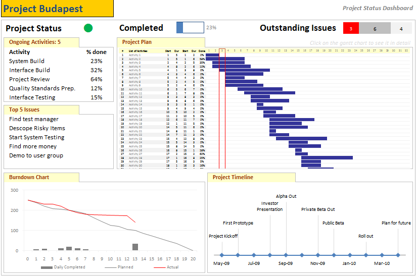
Step 2: Get the data to be placed on dashboard
Making a dashboard in excel is a complex and intricate process. Knowing the outline of the dashboard is only the 10% of work. Getting your data to calculate the dashboard metrics (or KPIs) is the most vital part of any dashboard construction.
In our outline, the sections 1,2 and 3 are purely data and 4,5 and 6 are charts prepared from data.
To facilitate this, first, let us create a worksheet named “data” where we can capture user inputs. These inputs can be further manipulated to make the dashboard.
For our dashboard, we need the following inputs,
- Overall project status and progress
- List of ongoing activities and issues
We will derive other inputs from the following,
- Project Plan Gantt Chart discussed in Part 1 will provide us the project plan
- Project Timeline Chart in Part 2 will give us the timeline chart
- Burn down chart will give us the project deliverable status
- Issue Tracker discussed in Part 5 will give us the metrics related to issues
Step 3: Put everything together and make a dashboard
[PS: I have greatly simplified the process of dashboard construction to keep the article readable. Please note that this step usually takes a few of hours and has lot more detail]
Now that we have all the bits of our data ready, we just need to bring them together to make a dashboard.
We will use the following excel concepts,
- Excel Camera Tool to get a live snapshot of the project gantt chart
- Conditional Formatting to show Red, Green or Amber traffic light to depict the project status
- Thermo-meter chart to show the project progress against 100% total
- We will create a stacked bar chart of outstanding issues by using SUMIFS formula. [counts for issue status=”open” and issue priority=”high”, issue status=”open” and issue priority=”medium”, issue status=”open” and issue priority=”low”]
Let us place the remaining pieces of dashboard from already constructed charts and available data,
- Burn-down chart to show the project deliverable status
- Project Time line to show the project milestones over a period of time
- We will create references to the “issue” and “activity” data and show only the first 5 items.
See the below illustration to understand how each part of the dashboard is constructed.

That is all, our dashboard is ready now.
Download the project management dashboard excel file
Unlike other downloads on Chandoo.org, this file is locked. You can purchase unlocked version along with 23 other project management templates – Click here to buy it.
- To download the locked version of project management dashboard excel file click these links: excel 2003, excel 2007
- To get an unlocked version of the dashboard along with 23 other templates, click here.
Tell us about your Project Management Dashboard / Status Report
Tell me about your project management dashboard, project status report formats and how it is constructed. Do you use excel or some other tool (like powerpoint, word) to prepare the report? How the report / dashboard generated? Is the process automated or manual? What have you learned from using / making such status reports?
Resources for Project Managers
Check out my Project Management using Excel page for more resources and helpful information on project management.
Also check out below posts to make your project management files awesome.
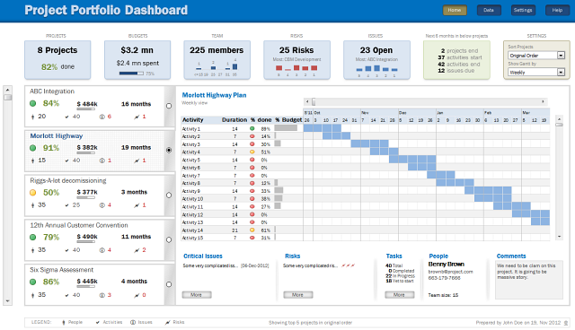
- Project Portfolio Management Dashboard
- Gantt Box chart – depict uncertainty in your projects
- Excel Risk Map template
What next?
This is the last installment of project management using excel series. I am looking for ideas to extend this series in useful manner. Please use comments to tell me what other activities of project management can be made easy using Microsoft Excel. I will try to write follow up posts if the topics are interesting.
Thanks a lot for reading the series and suggesting valuable inputs to make it better. I have learned a lot about project management and excel writing this series. I hope you have picked up few concepts too.
Tell me your feedback using comments.


49 Responses
Excellent!
I was looking forward to this and you’ve done it again…Shame I can’t claim it was all my own work 😉
ps hope you’re getting enough sleep
Excelent !!! Tks to share your knowledge with us.
Izabel
Sao Paulo – Brazil
Nice job!.
I’m also keen on PM Excel Dashboards. Please, take a look at
http://screencast.com/t/TyaxH5r4mDf
That’s one example of my Project control Spreadsheets.
Cheers
Hi Miguel,
Do you share your PM Excel Dashboards? It looks awesome.
Regards,
Germán
Hi M. Miguel,
Can you share your Excel Dashboards? Awesome work BTW.
Regards,
Michel Levesque
Can you share the PM excel template?
Quite a nice and helpful article. I am sure excel is one of the most used application across many many big companies. And your info on project status update using excel would surely be usefull. Keep up the good work on this blog site. Also to share there are some open source flash-based graphing and charting solution which caould also be used on any project..
http://askwiki.blogspot.com/2009/07/how-to-create-quality-charts-using.html
@Alex, Izabel .. thank you 🙂
@Miguel: Thank you. Your dashboard looks very good. It is inclined towards the budget and finances of the project. I have kept those aspects out of this series. May be I will revisit the financial aspect of projects at a later point.
@Rishil: Thank you. Yes, you can create flash based charts (or even simple image based charts) and embed them in a project dashboard that can be published to the team using intranet (like sharepoint). This is how large companies usually do it. Thanks for sharing the Askwiki article.
Great looking dashboard!! Do you have a version for the Mac versions of Office available?
Thanks
Chandoo,
this is great piece of collating info.I liked it and shall try using it in office.
Thanks for the all hard work behind this.
Chandoo,
Kudos. This is really as simple as it gets for laymen. We did this sort of stuff in Consulting – but this can now become really simple for people. Will have my team look at this! Great work.
thanks,
Mrigank
Just downloaded the project management template bundle…great!
Have you done anywork on a Project Portfolio Dashboard template?
@Bw… Thanks for getting a copy of the templates. 🙂 I have worked on few assignments where we built such templates. But these are similar to other regular dashboard templates. I will share some of these ideas in a later post someday. Meanwhile if you have any ideas on how to structure project portfolio dashboard, let me know using comments or email.
Thanks fro the great ideas! To get a sense of the layout and design of a Dashboard more geared toward Cost and Schedule anaysis, check out the example Dashboard at http://www.ProjectDashboards.com which was built entirely in excel.
hey,
i just need a simple Chart where by i can show some of the projects by % wise. no dates required.
1st column Project name and 2nd column will be status (filled with %). can you pls help me out.
Thanks.
@DS… if you have excel 2007, you can use data bars in conditional formatting for this purpose.
Hi Chandoo – this series is an excellent resource and tutorial, thank you for sharing.
When I sat down to consider what my dashboard should look like, one of the most important features for me is to be able to maintain version control and to show simply on what version is on display.
Apart from the naming convention of the file name, is there a good way to do this within a dashboard? I’d be interested to hear your thoughts!
@Larph: Welcome 🙂
> You can do version control thru Macros (but always remember that your audience can disable macros)
> Another option is to use a static time stamp / version number in the title page of dashboard that you update manually whenever you make changes to the file
> In excel 2010, you can keep track of file versions from File menu. This can be used to select a previous version of dashboard.
> Best option is to use a version control system like SVN or upload files to Sharepoint or something like that. This will take care of versioning for you (although it is a bit technical and dashboard audience may have difficulty figuring the versions out).
> The easiest option is to use filenames and the CELL() formula to get the version number (or date) from the filename so you can show it on the dashboard.
Hi Chandoo… I’m following you from Brazil…
I would like to thank you for the tips about excel, mainly with dashboards … It helped me a lot …
Take care…
Di
On the dashboard when I print, the text is blanked out in the middle of the Issues list – suggestions on how to fix?
Hi Chandoo, do you have an equivalent Project Management Dashboard / Project Status Report for MS Office 2010?
As a Microsoft trainer I’m interested in your choice of Excel for project management. I’m assuming that you’ve tried Microsoft Project and have decided not to use it? We get folks on our MS Project courses who’ve tried to use Excel for PM purposes and none of them have made such an impressive project plan, but I wonder is it worth all the effort?
This looks very interesting. How may I be a part of this
Does this template work in Google Spreadsheets?
Many thanks for sharing your expertise with us. Keep up the good work 🙂
Heya i’m for the first time here. I came across this board and I to find It really helpful & it helped me out a lot. I am hoping to offer one thing again and aid others like you helped me.
Hi Chandoo,
Your PM dashboards impressed me so much that I’ve downloaded the Portfolio and Project Management package. All of the documents look very professional.
I was going through the Portfolio dashboard and I had a question.
When I enter in additional holidays they are highlighted in the gantt chart. Is it possible so that the name of the holiday shows up in the highlighted area of the gantt chart.
Thanks
Adam
can you confirm that the downloads will work on a mac – excel for mac v14.3.6
thanks
Made a slight variation on the schedule sheet,
1. Add a date column for start
2. In week column cell use =weeknum() and link to date cell
3. Hide week column
When you enter in a date for each task the week number is populated accordingly
simple but more effective, you can also dynamically link the date cell to your MSP project file for even more automation!!
I purchased a copy of the project management dashboard excel file. I misplaced the password to unlock the file and make modification. Can you please resend the password.
Thank much in advance…
Hi there! I just would like to give you a big thumbs up for your great info
you’ve got right here on this post. I’ll be returning to your website
for more soon.
I bought ur project management template just want to know how to hide the budget section from portfolio?
Hi, Thanks – very good job you’ve prepared!
You’ve inspired me as well 🙂
Best regards
Hello!
I am using a gantt chart template which i got from your website. All is good just when I add all my acitivities in data spreadsheet and then go back to gantt chart to view them, I only see first 9 and then I need to keep scrolling for the next ones. is it possible to see most of the activities if not all in the single frame.
thanks for answering!
This is my first time pay a visit at here and i am actually happy to read all at alone place.
I am interested in your dashboard; downloaded the locked version, unable to use it…do you have a user guide that is available that I can see and use on the locked version?
Please send me daily newsletter
Hi,
I downloaded the PM dashboard and the gantt chart only has dates till the year 2016. How do I change this to include 2017 FY as well.
When I enter a activity for this year , it fails to show up on the chart.
Hi
Would.like to purchase the project management .kits
Pls share the payment link in INR
Also share your contact number to speak with you
Regards
Hari
9384825926