
If I need some charting inspiration, I always visit New York Times. Their interactive visualizations are some of the best you can find anywhere. Clear, beautifully crafted and powerful. Long time readers of Chandoo.org knew that I like to learn from visualizations in NY Times & redo them using Excel.
Today let me present you one such chart.
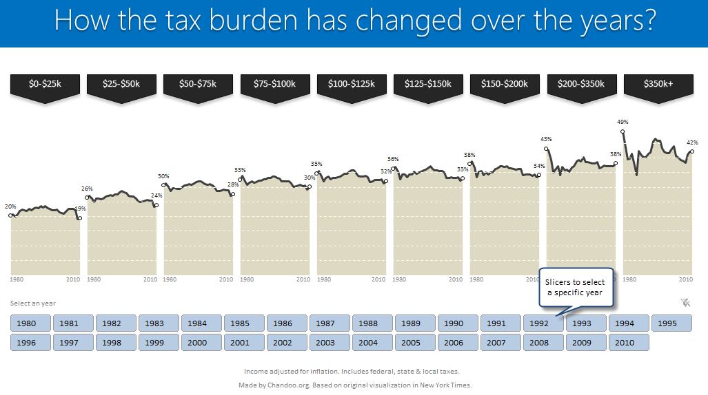
How the tax burden has changed over the years – Visual story by NY Times
First take a look at this story on New York times website. Go ahead and check it out, I will wait for you.
Back already. Good.
Now that you have seen a well presented story with the support of panel charts, let us learn how to re-create such charts using Excel.
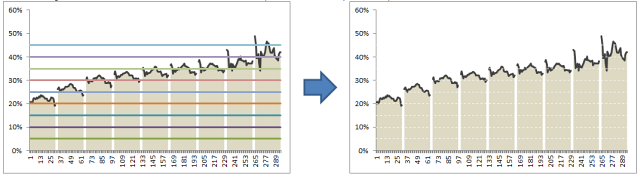
Look at the tax burden Excel chart
Take a look at the excel implementation of this chart below. Read on to learn how to create this.
[click here to see larger version]
Recipe for creating this chart using Excel
We need below ingredients to make this chart using Excel
- Raw data
- One area chart and few lines on top
- Simple formulas
- One Slicer (to select an year)
- One large cup of coffee or whatever else that you gulp
So if you are ready, lets start cooking.
Step 0: Arrange data
This is a prerequisite for any charting exercise. Although we can work with data in any shape, for quick results, arrange your data in this format:

In the example file you will find data for overall tax burden for all 9 tax brackets in the years 1980-2010.
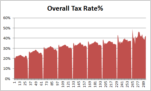
Step 1: Create an area chart from all the data
Simple, select tax bracket & tax percentage rows and create an area chart. This is how it should look.

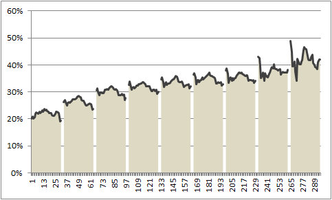
Step 2: Insert 2 columns after every tax bracket in your source data
Very simple, just add 2 blank columns after every tax bracket to your source data. This will change your chart to,
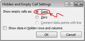
Step 3: Adjust data settings so that blank cells are treated as gaps
Right click on the chart, go to Select Data > Hidden & Empty cells
Specify that all blank cells should be treated as gaps. See below.
Now, your chart should look like this:

Step 4: Add a line to the chart & format it
Although our chart looks almost like NY Times chart, we still need to show a line on top. For this,
- Go to your data, reselect all the tax burden %s and copy them.
- Come back to the chart, select it and paste. (more on this)
- Excel will add this new data as another series to chart
- Right on this new series, choose Change series chart type
- Select Line chart
- Format the chart so that it looks like below.
Step 5: Remove grid lines & fake them using additional series
Excel chart’s grid lines always show up behind the data. For our chart, we want them on top. So let just delete grid lines and fake them using additional lines on the chart.
For this,
- In your data, add 9 extra rows at bottom (why 9? because we want to show one grid line for every 5% and the maximum we have is around 45%)
- Fill first row with 0.05, second with 0.1, third with 0.15… ninth with 0.45
- Copy all these and paste them in the chart. You should have nine lines across the chart.
- Now, format each line so that it looks like a dull white line with dashes.
- When you are done, the final output should look like this:
Step 6: Remove horizontal axis (x-axis) labels & fake them too
Again, horizontal axis labels produced by Excel are useless for us. So we will create our own.
- First delete the existing axis.
- Then add a text box to the chart and place it where axis should be.
- Type the values 1980 few spaces 2010.
- Adjust the font size to 7pt.
- Now play with the text box until you are satisfied for one tax bracket.
- Then copy paste it 8 more times and adjust their positions.
Although we could automate this step, it felt un-necessary as the years are not going to change.
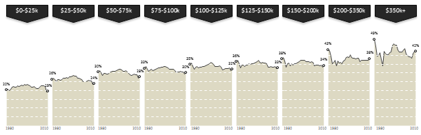
Our chart is almost ready
At this stage, our chart looks like below.
It is almost ready, but we need few more additions.
- We need to add labels to first & last point in each tax bracket.
- We need a mechanism so that user can select a particular year.
- When any year is selected, we need to show that year’s tax burden %.
Adding labels for first and last points
This is done by adding one more series of values. This new series (lets call it label-first-last) will have values for only 1980 & 2010. Everything else will be NA().
The formula I used to generate this series is,
=IF(OR(year=1980,year=2010),taxburden,NA())
Once this series is added, we just format it so that only markers are shown (no line) and then add data labels. Format the labels to show in 0% format. Adjust their size and position.
Also add arrow shaped boxes on top to label each tax bracket.
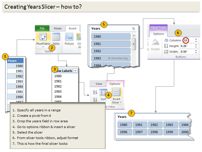
Enabling year selection thru Slicers
[This works only for Excel 2010 or above]
In a blank sheet type the years 1980 thru 2010. Select them and create a pivot.
Once the pivot is ready, insert a slicer for the years field.
For detailed steps on slicer creation see this illustration.
Figuring out which year is selected
Once the slicer is ready, we need to figure out if user made a selection thru slicer. To do this,
- Use a simple formula to check how many values are shown in the pivot table (ex: COUNTA(pivot!A:A) )
- If only one value is shown, then extract it by referring to first row item in pivot (=pivot!A4)
Adding labels for selected year
Once we know which year is selected, we can easily create one more series that has NA() for all values except selected year. The rest you know.
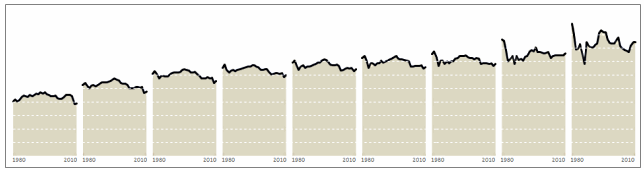
Final outcome – Tax burden over the years chart using Excel
Download this example & Play with it
Click here to download the tax burden chart. Play with it to learn more. Examine the formulas in “Data” sheet & scroll down on “Chart” sheet for step by step instructions.
Do you like this chart?
I really loved how NY Times has been able to tell a very good story by using multiple panel charts. These are great way to examine multidimensional data and understand what is going on.
What about you? Do you like this chart? Please share your thoughts and ideas using comments.
More such charting inspiration
If you are looking for some fresh charting inspiration & ideas, you are at the right place. Check out these examples to get started:
- Introduction to Panel Charts & How to make them in Excel
- Usain Bolt vs. Rest of runners – Interactive visualization in Excel
- Impact of Grammy award on sales – Grammy bump interactive chart
- Visualizing world education rankings – excel chart
- Facebook Privacy policies as a panel chart
- More charts & visualizations
Do you want to create powerful & insightful charts like these?
If you want to learn how to create these types of charts, consider enrolling in our Excel School program. Be warned, you will become unusually awesome in Excel by going thru our course 🙂


38 Responses
Immediately after seeing this, I thought “Why don’t use the Mouse rollover technique?” as told in Option Explicit Blog http://optionexplicitvba.blogspot.com/2012/09/the-excel-rollover-mini-faq.html
Probably, a closer approach to the original chart.
Great Post! Thanks so much as always, Chandoo!!
Hi Martin… Thanks for the comments. Of course, the hyperlink technique is what came to my mind when I wanted re-create this. But I preferred slicer version as it would be easier to implement (no macros).
I am, of course, a proponent of the rollover method but definitely understand why people don’t prefer it. Rollovers take time to implement and explaining how they work on a finished product usually requires more detail than your normal Excel tutorial. (Ok, put another way: explaining how rollovers work can be a bitch! God knows how behind I am on explaining in detail half the stuff I’ve put up in that faq!) In any event, slicers are the future of Excel–and there appears to be a movement in spreadsheet dashboard development away from macros (or, at least minimizing their use) in favor of what can be done with spreadsheet controls like pivot tables, powerpivot, form controls, etc. This post is a much welcome addition to the cool things you can do in Excel with no code.
I got excited, but immediately got stuck after I realized I don’t have data for the specific tax rate for each year. How do I know the overall tax rate for the specific year so I can move on to the next step?
Thanks.
Same question here!
Jordan,
I agree with your comment. Excel, if any, made much of non-IT users capable of IT-related tasks, when it came to data analysis.
Nevertheless, I prefer to think on the final product, rather than the process. End users, most of the time, don’t even matter on how you produce a chart or a dashboard: they just use it. Same thing here: it doesn’t matter how many time you spent on designing, testing and setting things up with the worksheet; they just want to show off.
And in the case some user wanted to know about the magic behind the scenes, you can always share the link to here!!!
Rgds,
Martin
Thanks, this is another great interactive chart example. I was able to reproduce it until I got to the last step of formatting the lines for the year that was selected. This would be “the rest you know” step! I’m thinking that I need to swap the data from rows to columns but I can’t figure that part out. Any insight would be appreciated.
Thanks,
Sally
I am glad to know that you are able to re-produce it. You can see in the example file how the selected year series works. In a nut shell here is what I did:
Hope that helps you.
Very insightful
It is a very good article. Unfortunately, i am unable to get the same layout in Step 1 itself. I followed the instructions but is able to get the “line trending effect at the top of the area chart. All i have is a “staircase” looking chart i.e. even lines for each bracket. Any thoughts? I’ve used the data as attached in your file.
Thanks
@chew… You are welcome. I think excel is also adding the bracket codes to the chart. Just select the step case series and delete it. Then follow next steps.
Hi Chandoo,
I was able to reproduce the chart on my home PC using Excel 2010 and I think I would be able to redo the chart in Excel 2007 using the VBA rollover technique.
But what would be your recommendation for a redesign of the slicer / rollover technique if you have to use Excel 2007 and are not allowed to send around spreadsheets using macros…
I came up with a redesign using an in-cell dropdown menu via DATA VALIDATION -> ALLOW:LIST -> IN-CELL DROPDOWN.
Unfortunately, in-cell dropdown menus look pretty ugly and they don’t provide a nice overview of all possible selections as they only show the current selected item.
Any better ideas?
BTW: Great Post! Thanks so much as always!
Matt,
Unfortunately, rollovers require some VBA – so you can’t use them without using macros. However, if you want to recreate this version without drop downs are slicers, consider using a form control scroll bar:
http://chandoo.org/wp/2011/03/30/form-controls/
With a scroll bar, you can create a psuedo-sliding effect similar to the mouseover effect in the NYT’s interactive chart. If you were to go down that route, you would have to account for a “no filter” scenario when no years are selected, which you could do with formulas perhaps.
Beautiful Presentation chandoo.
Hi,
does anyone can help me to make hotel sample report..
Thanks
1. How do you get the drop lines to show when a marker is selected?
2. How do I get the filter to appear on the slicer to clear the selection?
3. Is there a way to increase the height the data labels shows because they get obscured when some years are selected e.g 1983.
4. Is there a way to go back and select a specific series for formatting later on? As there are so many series, trying to click on the entire series is difficult e.g with the markers. Therefore it normally lets me edit the single datapoint rather than the series.
Many thanks.
Thanks for the comments Ian.. Try this.
1. The drop lines are 100% negative error bar on the “selected year” series.
2. It comes by default when you create a slicer. Right click on slicer settings and you can turn it off / on.
3. You cannot set the height / width for default data labels. But you can apply a white background to them so that the label is readable always.
4. Yes, you can select the chart and then go to Layout Ribbon. From here on top left, you can select any particular chart item (series, axis, labels etc.) to format them.
Fixed, many thanks :).
1. Now when I select the filter, my markers go to 0%. Did I miss a step to make it show the start and end?
2. Is there a way to recreate the line in the following graph, rather than drawing it in with shapes?
http://www.facebook.com/photo.php?fbid=507444329276901&set=a.474781192543215.108122.470168386337829&type=1&permPage=1
How do you format the marker lines to get only the first and last circles to appear? I tried to recreate and it put s alot of marker circles when I added them. I get 1 circle for each year and can’t get it to display only the marker for the first and last year.
Thanks,
–Robert
Hi Ian ,
Think this can help ?
http://peltiertech.com/WordPress/line-chart-without-risers/
Narayan
Much appreciated Narayan
Good one, but i can not open the example file, please let me know the reason.
This is my first visit to this site, I am so amazed with the quality of the tutorials. Thank you very much to Chandoo and all staff for creating such wonderful articles, I am so happy to have the chance to learn a lot of things, this graphic tutorial is fantastic, excellent!! Now I need to gain experience in charting for my job and this site will help me a lot with no doubt. I really appreciate your great job, congratulations!!!
Congratulations, Great Tutorial,
After doing this successfully you can’t say you know nothing about chart in Excel.
Two thing about your job.
1 – I can’t insert Gridlines in one step ?
2 – As it’s the case on the NYT website, it’s possible to add dynamic label for selected year using photo tool and another table. i did this maybe i can upload this somewhere.
Thank’s again
Here’s the example :
Regards
Hello,
Is there a way i can adjust the width of the gap?
@Rohan
The Gaps are based on the Gaps in the rearranged data on the Data sheet in Row 11
You can insert cells and make the gaps bigger
how to create blinking text in excel
Can i have link for you tube tutorial for this chart pls
@GTA
I don’t believe there is a video tutorial for this dashboard
Simply follow the instructions above.
Love this Chandoo, but a simple question if I may..
How did you lock the chart adn group all the contents together?
Hi Chandoo,
I understand all your steps, but I got lost from “Adding labels for first and last points” stage.
I don’t quite understand how the slicer interacts with the chart, especially your year tab. I don’t see the connection between column E and the slicer. How does clicking on different years in the slicer change column E?
This chart doesn’t cease to amaze me, it’s incredible! Is it possible to add vertical lines automatically to separate the different charts by amounts?
I don’t understand the connection between Tax chart and the Slicers. How to add Slicers to Tax chart.
Thanks?
@Zezhi
The slicers are connected to the source table feeding the chart and as such you can think of them as Remote Filters