Changing stubborn opinions with visualizations [case study]
We, analysts take pride in the fact that we tell stories. But what if you have a boss, client or colleague who wouldn’t buy the story?
This is a problem we face often. Let’s say your boss has stubborn opinion about something, like more advertising leads to more sales. You know the data doesn’t support this theory. But how do you change your boss’ mind?
Here is an interesting way, showcased in NY Times recently.
How to create a Then vs. Now interactive chart in Excel?
You have been there before.
Trying to compare last year numbers with this year, or last quarter with this quarter.
Today, let us learn how to create an interactive to chart to understand then vs. now.
Demo of Then vs. Now interactive chart
First, take a look the completed chart below. This is what you will be creating.
Excel Links for you – Busy busy edition
As the launch date for our 2nd batch of Power Pivot class nears, my plate looks fuller than ever. Fine tuning the course details, preparing our online classroom for new batch of students and coordinating with Rob for video recording etc.
But I wanted to take a few mins today and share with you some really useful Excel tricks, ideas and examples from web. I found these really useful and inspiring. I am sure you will learn from these links as much as I learned.
How the tax burden has changed over the years – Excellent chart by NYTimes & Redoing it in Excel
If I need some charting inspiration, I always visit New York Times. Their interactive visualizations are some of the best you can find anywhere. Clear, beautifully crafted and powerful. Long time readers of Chandoo.org knew that I like to learn from visualizations in NY Times & redo them using Excel.
Today let me present you one such chart. This is based on an interactive visualization prepared by NY Times explaining how the tax burden has changed over years for various income groups.
Take a look at tax burden chart – Excel implementation
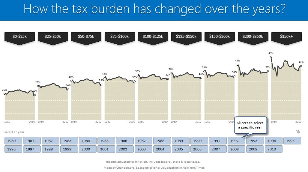
Read on to learn how to create this chart using Excel.
Excel Links – What are your plans for 2010 Edition
So we are in 2010, dawn of a new decade. In fact everyday is a start of new decade, as my friend Jon reflects on twitter. So what are your plans for this year and decade? As for me, I haven’t really jotted down any new year resolutions. So I am using this post as […]
We cant Cure Cancer, But we can Cure this Medicare Chart [Chart Busters]
In this installment of Chartbusters, we take a look at a poorly constructed choropleth of medicare reimbursements in US and suggest cure for it. The post is from our Guest Buster – Jeff.
Visualizing Search Terms on Travel Sites – Excel Dashboard
Microsoft excel bubble chart based Visualization to understand how various travel sites compete search terms