All articles with 'visualizations' Tag
Gantt Box Chart Tutorial & Template – Download and Try today

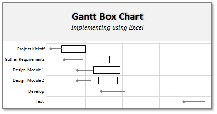
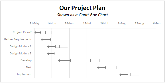
On Firday, we proposed a new chart for showing project plans. I chose an ugly name for it and called it Gantt Box Chart. Essentially, a gantt box chart is what you get when a gantt chart and box plot go to a bar, get drunk and decide to make out. It shows the project […]
Continue »A Gantt Chart Alternative – Gantt Box Chart

Traditional project plans use Gantt Charts to depict the plan. While gantt charts work great and provide instant picture of overall plan, they fail to communicate the uncertainty in the plan. In most real world projects, the plans always change. Most of the management energy is spent on controlling and communicating about this plan uncertainty. This is where a project plan like gantt box chart can help. This chart (as shown above) clearly shows the variance in end dates of project tasks thus giving a clear picture of uncertainty in the plan. Read more to find out how this chart can be used in project management.
Continue »Best Sales Dashboards, as Voted by You [Visualization Challenge #2 – Winners]
![Best Sales Dashboards, as Voted by You [Visualization Challenge #2 – Winners]](https://img.chandoo.org/v/s/sales-data-dashboard-alex-kerin-1-excel.png)
Finally, our second visualization challenge comes to an end. We got a winner. Background about Zoho Reports Visualization Challenge: (skip this section if you know what I am going to say) Back in November, 2009, I have asked the readers to come up with best possible ways to visualize a set of fictitious sales data. […]
Continue »Sales Dashboards – Visualizing Sales Data – 32 Dashboard Examples & Implementations

Sales reports and dashboards are very common in any company. There are several ways in which you can visualize sales data to understand the trends and sales performance. So in November, I have asked you to visualize sales data using sample data. The visualization challenge #2, sponsored by Zoho Reports generated a huge buzz around the community and fetched 32 incredible entries. The response was so overwhelming that it took me almost 24 hours to write this post. Thanks everyone for participating and making this a huge learning experience for everyone. Personally I have learned several useful dashboard and charting tricks. I will be sharing some of these lessons with all of you in the coming weeks.
Continue »Best Charts to Compare Actual Values with Targets – What is your take?

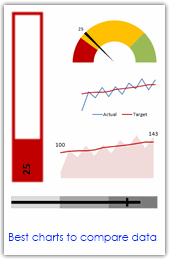
Comparing values is one of the main reasons we make charts. Yesterday we have a post on using thermometer charts to quickly compare actual values with targets. Today we follow up the post with 10 charting ideas you can use to compare actual values with targets. Check out how bullet charts, thermometer charts, traffic lights, gauges, column charts, area charts can help you compare targets with actual performances. A review of best charting options when you need to compare.
Read the rest of the post to see the options and participate in poll.
Continue »Use Shapes and Images to make Prettier Charts [Dashboard Tricks]
![Use Shapes and Images to make Prettier Charts [Dashboard Tricks]](https://chandoo.org/img/c/use-shapes-to-make-better-dashboard-charts.png)
One of the annoyances of charts is that they all look like boxes (except for pie charts, they just look wrong). Boxes might be ok when you are making 1 or 2 charts. But a whole dashboard of boxes can look little rigid. So how can we make the charts peppy without loosing any effect? Like these charts below:
Very simple, we use drawing shapes in MS Excel to draw whatever we want and overlay the chart on top.
Continue »Group Smaller Slices in Pie Charts to Improve Readability

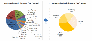
Jon Peltier can stand on his roof and shout in to a megaphone “Use Bar Charts, Not Pies”, but the fact remains that most of us use pie charts sometime or other. In fact I will go ahead and say that pie charts are actually the most widely used charts in business contexts.
Today I want to teach you a simple pie chart hack that can improve readability of the chart while retaining most of the critical information intact.
Continue »Waterfall Charts using Excel

Learn how to create waterfall charts in Excel in this tutorial. Our guest author, Aaron, explains how to create cool looking waterfall charts with connectors. Waterfall charts are great, especially for visually showing the contribution of parts to a whole.
Continue »Are you excited about this twitter chart?

In this ironically titled “Let’s not get too excited” chart, David shows us how the twitter community is divided. Can you guess what is wrong with this chart?
Continue »Charting Lessons from Optical Illusions

The other day while doing aimless roaming on the dotcom alley, I have seen some cool optical illusions. There are so many valuable lessons optical illusions can teach us – chart makers. Don’t believe me? Look at the bubble chart illusion on the left and tell me which orange circle is bigger? What is your answer? Right or left. Well, my friend, the answer is both are of same size. Read the rest of this post to find some cool optical illusions and what they can teach us – chart makers.
Continue »14 Basic Skills for Chart Makers (Big question: How many do you have?)
Blame John Walkenbach if you don’t like this post. There, I said it. He started the 14 basic skills for men. And then added 14 basic skills for women. Not stopping there, he went ahead and added 14 basic skills for dogs. Debra at Contextures blog added her 14 cents by writing 14 basic skills for excel users.
I got jittery and quickly searched 14 basic skills for people writing 14 basic skills posts on google. Alas! nothing found. But being the inveterate non-give-upper I went ahead and prepared my list.
<drum roll> here is the,
14 basic skills for people making charts (or graphs or plots or ok, you get the point)
![Project Management: Show Milestones in a Timeline [Part 3 of 6]](https://chandoo.org/img/pm/project-timeline-chart-excel-th.png)
Learn how to create a timeline chart in excel to display the progress of your project. Timelines are a good way to communicate about the project status to new team members and stake holders. Also, download the excel timeline chart template and make your own timeline charts.
Continue »Excel Links – Bacon bits are good edition
In this edition of Excel Links, we feature a new excel blog on the blog, named bacon bits. We also share links about interesting articles like generating tinyurls using vba, making maps using xy charts, designing filters for your dashboards and more.
Continue »![Gantt Charts – Project Management Using Excel [Part 1 of 6]](https://chandoo.org/img/pm/gantt-chart-project-plan-thumb.png)
This is a 6 part tutorial on project management using microsoft excel. These posts represent few of the things related to project management using excel that I have learned over the years. The first installment deals with Preparing & tracking a project plan using Gantt Charts in MS Excel.
The other parts I am planning are, Day to day operations – using to do lists, Preparing a project time line, Time sheets and Resource management, Tracking issues and risks, Project Status Reporting – Dashboard.
Read the first part of the article to learn how to make excel gantt charts / project plans.
Continue »Bring out your bad charts, the ChartBusters are here…
Imagine having two annoying little bloggers looking over your shoulder and trying to mess up with the chart you are making…
I am still waiting, go ahead, imagine…
Now come back, that is exactly what “ChartBusters” is all about. Read more…
Continue »

