All articles with 'Charts and Graphs' Tag
Intraday Candlestick Charting [Stock Charts]
![Intraday Candlestick Charting [Stock Charts]](https://chandoo.org/img/n/intraday-candlestick-chart-thumb.png)
Gene asks me in an email, “I’m trying to graph candlestick charts in Excel for 10 minute candles. Excel seems to allow daily only with its stock templates. Can you point me to any resources for creating intraday candle charts?”. Of course, you can create intraday candlestick charts just the way you would create normal candlesticks, just change the axis options once you are done. Read the post to find more.
Continue »A Good Chart is a Story [Charting Principles]
![A Good Chart is a Story [Charting Principles]](https://chandoo.org/wp/wp-content/uploads/2009/05/obesity-vs-eating-time.png)
A good chart tells a story. Here is a fantastic example of what a good chart is. The chart itself is very simple and easy. But it brilliantly juxtaposes two interesting pieces of data : Obesity rates in countries and Time spent eating per day, to tell a story.
Continue »Analyzing Search Keywords using Excel : Array Formulas in Real Life
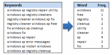
Jarad asks me in an email “how word frequency can be generated from a range of cells using excel formulas?” This got me thinking and lead to this post, where we learn how to calculate word frequency using array formulas and use it to analyze a bunch of search keywords.
Continue »The winner for our first visualization contest is decided. Curious? Read on…
Continue »How Many Bubbles are Too Many Bubbles?
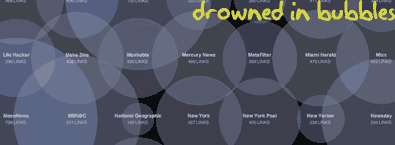
In How Many Links are Too Many Links, O’Reilly radar shows us this unfortunate bubble chart. Read the rest to see why the chart is unfortunate.
Continue »Market Segmentation Charts using Conditional Formatting
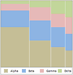
Trust Peltier to come up with solutions for even the most impossible looking charts. Today he shares a marimekko chart tutorial. I couldn’t sit still after seeing his post. So here comes market segmentation charts or marimekko charts using,
Make a Dynamic Chart using Data Filters
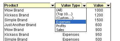
As part of our spreadcheats series, we will learn how you can use data filters to create dynamic charts in Microsoft excel
Continue »Professional Resume or Data Visualization Fail? [poll]
![Professional Resume or Data Visualization Fail? [poll]](https://chandoo.org/img/c/data-visualization-resume.png)
Michael Anderson, a web designer has posted this delicious looking visual resume. While the resume looks stunning at a glance, a closer inspection reveals that you cant really make any valuable conclusions about Michael’s past experience and qualifications. Of course if the purpose of this resume is to show that he is a fabulous designer, then the resume definitely achieved that.
What is your opinion on this type of resume data visualizations ?
[Weekend Poll] How do you Sex up your Charts?
![[Weekend Poll] How do you Sex up your Charts?](https://chandoo.org/img/a/your-fav-chart-format.png)
This weekend, let us talk … umm… charts. I want to know if you absolutely make sure your charts look good every time you sent them out to someone. I do this most of the time.
How do you sex up your charts?
Continue »[Reader Poll] Stacked, Seperated or Mirrored ?
![[Reader Poll] Stacked, Seperated or Mirrored ?](https://chandoo.org/img/a/bar-charts-ways-to-stack.gif)
Stacked bar charts are a popular way to depict 2 more series of related data, like sales of 2 products.But there are several ways to stack the bars in a bar chart. Here is a list of 6 ways to stack them
Continue »
9 charting tricks you can use to make your pie charts likable
Continue »Sales Funnel Charts in Excel – Tutorial
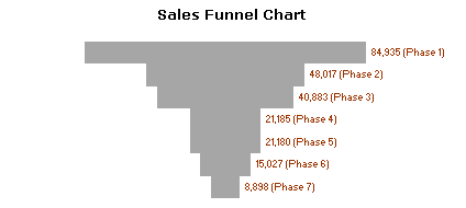
Sales funnel is a very common business chart. Here is a simple bar chart based trick you can use to generate a good funnel chart to be included in that project report.
Continue »Excel Basics – What are Combination Charts and How to Make One?
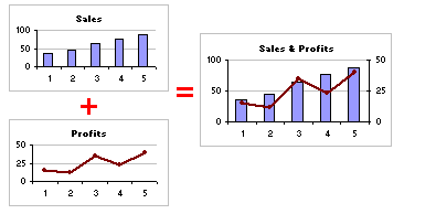
A combination chart is when you combine two different charts to make one. A popular example for combination chart is a line & bar graph combination.
Continue »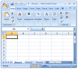
After a really long wait finally I have used … Excel 2007 (drum roll) and contrary to what many people think, I have found Excel 2007 to be a very well designed piece of software. Of course there are various issues with it and I am sure folks at MS are working on them so that next versions of MS Office are much more pleasant and simpler to use.
I wanted to share 10 wow factors in Excel 2007 that may convince you to try it.
Continue »Creating Excel Art from Images [spreadsheet fun]
![Creating Excel Art from Images [spreadsheet fun]](https://chandoo.org/wp/wp-content/uploads/2008/12/cell-art-image-thumb.png)
Amit at Digital Inspiration features a lengthy way of creating beautiful excel cell art from an image. I guess we all can use a method that is little simpler and smarter.
Continue »

