All articles with 'visualization principles' Tag
Correlation vs. Causation [Charting Chatter]
![Correlation vs. Causation [Charting Chatter]](https://chandoo.org/wp/wp-content/uploads/2016/08/correlation-causation-confusion.png)
Here is a trap that is easy to fall in to. Confusing correlation as causation. As analysts, it is our job to see the data as it is rather than imply causation that doesn’t exist.
Let’s sample a chart, recently featured in Economist’s graphic detail under the title Measuring well-being.
Continue »Fish Eye Effect for highlighting selection – Is it effective? [Advanced Charting]
![Fish Eye Effect for highlighting selection – Is it effective? [Advanced Charting]](https://chandoo.org/wp/wp-content/uploads/2016/05/fish-eye-effect-thumb.png)
A few days back, WSJ ran a visualization titled “What’s your pay gap?” It depicts median pay gap between female & male workers in 422 different professions in USA. The chart uses fish eye effect to highlight the selected profession. See below demo to understand the effect.
Continue »Tell all versions of truth [Dashboard Best Practice]
Here is a simple but effective rule for your next dashboard. Tell all versions of truth. All versions? But there is only one version no? Of course, there is only one version of truth (or data), but you can present that in different ways, thus creating different perspectives, offering different insights. By using an interactive element (slicers […]
Continue »“How Trump happened” in Excel [visualizations]
![“How Trump happened” in Excel [visualizations]](https://chandoo.org/wp/wp-content/uploads/2016/03/how-trump-happened-excel-replica.png)
During last week, an alert reader of our blog, Jørgen emailed me a link to “How Trump happened“. It is an interactive visualization by Wall Street Journal. Jørgen asked me if we could replicate the visualization in Excel. My response: “Making a new chart in Excel? Hell yeah!”
Read on for awesome visualizations and full explanation.
Continue »Don’t make your charts heavier than they should be – The weight of the world chart [case study]
![Don’t make your charts heavier than they should be – The weight of the world chart [case study]](https://chandoo.org/wp/wp-content/uploads/2016/01/weight-of-the-world-chart.png)
Here is an interesting chart from Economist, ironically titled The weight of the world. Can you tell what is wrong with it?
Continue »CP041: 6 charts you’ll see in hell – v2.0

Podcast: Play in new window | Download
Subscribe: Apple Podcasts | Spotify | RSS
In the 41st session of Chandoo.org podcast, Let’s take a trip to data hell and meet 6 ugly, clumsy, confusing charts. I am revisiting a classic Chandoo.org article – 6 Charts you will see in hell.
What is in this session?
In this podcast,
- Quick announcement about Awesome August
- 6 charts you should avoid
- 3D charts
- Pie / donut charts with too many slices
- Too much data
- Over formatting
- Complex charts
- Charts that don’t tell a story
- Conclusions
Shading an area chart with different colors for up & down movements [case study]
![Shading an area chart with different colors for up & down movements [case study]](https://chandoo.org/wp/wp-content/uploads/2015/07/indian-stock-market-chart.png)
We all know that area charts are great for understanding how a list of values have changed over time. Today, let’s learn how to create an area chart that shows different colors for upward & downward movements.
The inspiration for this came from a recent chart published in Wall Street Journal about Chinese stock markets.
We will try to create a similar chart using Excel. We are going to create the above chart in Excel.
Looks interesting? Read on…
Continue »Changing stubborn opinions with visualizations [case study]
![Changing stubborn opinions with visualizations [case study]](https://chandoo.org/wp/wp-content/uploads/2015/05/family-income-vs-college-enrollment-nytimes.png)
We, analysts take pride in the fact that we tell stories. But what if you have a boss, client or colleague who wouldn’t buy the story?
This is a problem we face often. Let’s say your boss has stubborn opinion about something, like more advertising leads to more sales. You know the data doesn’t support this theory. But how do you change your boss’ mind?
Here is an interesting way, showcased in NY Times recently.
Continue »CP032: Rules for making legendary column charts

Podcast: Play in new window | Download
Subscribe: Apple Podcasts | Spotify | RSS
In the 32nd session of Chandoo.org podcast, let’s make legendary column charts.
What is in this session?
Column charts are everywhere. As analysts, we are expected to create flawless, strikingly beautiful & insightful column charts all the time. Do you know the simple rules that can help you create legendary column charts?
That is our topic for this podcast session.
In this podcast, you will learn
- Few personal announcements
- Rule 0: Start at zero
- Rule 1: Sort the chart
- Rule 2: Slap a title on it
- Rule 3: Axis + grid-lines vs. Lables
- Rule 4: Moderate formatting
- Conclusions
Revenue vs. Commission growth – Getting the message across [BYOD]
Situation: Our commissions are growing way faster than revenues
Let’s say you are looking revenues & sales commissions of your company for last few years. The data looks like this:

And you want to highlight the fact that commissions are growing faster than revenues.
So you plot YoY growth rates for revenues & commissions.
Problem: The chart of YoY growth rates is not convincing
Take a look at the chart. It doesn’t convey the message that we want. At best it says “revenue growth is less than commission growth”

How to convey the message “Commission growth is a problem for us”?
Continue »CP013: Is this a FIFA worldcup of late goals, lets ask Excel [How to analyze data to answer questions like these…]
![CP013: Is this a FIFA worldcup of late goals, lets ask Excel [How to analyze data to answer questions like these…]](https://img.chandoo.org/podcast/session-013.png)
Podcast: Play in new window | Download
Subscribe: Apple Podcasts | Spotify | RSS
In the 13th session of Chandoo.org podcast, lets turn our attention to on-going FIFA worldcup and ask an important question.
What is in this session?
A week ago, we discussed “Has it been a late goal FIFA worldcup?” and used various charts & analysis techniques to answer the question. In podcast, lets tackle the same problem, understand various approaches to answer questions like these & shares some lessons for all the analysts.
Show Top 10 Values in Dashboards using Pivot Tables

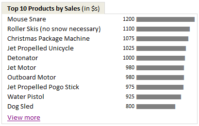
A good dashboard must show important information at a glance and provide option to drill down for details.
Showing Top 10 (or bottom 10) lists in a dashboard is a good way to achieve this (see aside). Today we will learn an interesting technique to do this in Excel.
Continue »Show Months & Years in Charts without Cluttering

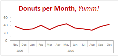
We make charts with date axis all the time. So, today we will learn how to set up axis settings in Excel so that Months & Years are shown neatly structured without cluttering your chart. See the example next to understand.
Continue »First some personal matters. Today I am celebrating my 28th birthday. The last one year has been very good for us. We have been very busy parenting 2 hilarious and naughty twins, I moved back to India, quit my job and started a company. My business became a mild success crossing $100k revenues in 12 […]
Continue »Display Alerts in Dashboards to Grab User Attention [Quick Tip]
![Display Alerts in Dashboards to Grab User Attention [Quick Tip]](https://chandoo.org/img/dashboards/dashboard-alerts-example-th.png)
Dashboards can be overwhelming with lots of details and context. A simple way to drag user’s attention to important stuff in the dashboard is to use alerts. See this example to understand what alerts mean. How to display alerts in Excel Dashboards? The easiest way to display alerts is to use Excel 2007’s Conditional Formatting […]
Continue »

