All articles with 'statistics' Tag
How to get a random sample of data with Power Query

Today’s Power Monday trick is about Power Query. This is based on my experience of working with large volumes of data.
Today I have been building a hotel dashboard (more on this later). As part of the dashboard, I wanted to show a random sample of user reviews. Reviews database had quite a few rows, so I wanted to extract a randomized sample of 100 reviews and show them in the report. When you refresh the report (Data > Refresh), then a new set of reviews will be fetched and shown.
Let’s learn how to generate a random sample with Power Query in this article.
Continue »
Hello folks, how are you?
I have an announcement for you.
It is almost holiday time. Every year, Chandoo.org celebrates holidays with a 3 day sale on our most popular product – Excel School training program. The sale for this year will be,
10th December to 12th December (Wednesday to Friday)
What is on sale?
You will be able to save $30, $50 or $100 on our most popular courses
- Excel School + Dashboards program ($30 discount)
- Excel School + VBA + Dashboards ($50 discount)
- Excel School + VBA + Power Pivot + Dashboards ($100 discount)
More details & links for Sale page will be available on 10th of December. Stay tuned.
Excel Links
It has been a while since we had a round of Excel links. Here are some cool tips & links for you.
Continue »CP010: Averages are Mean – 8 Techniques for making your analysis above average

Podcast: Play in new window | Download
Subscribe: Apple Podcasts | Spotify | RSS
This is a continuation of Session 9 – Averages are mean
In the earlier episode, we talked about AVERAGE and why it should be avoided. In this session, learn about 8 power analysis techniques that will lift your work above averages.
In this podcast, you will learn,
- Re-cap – Why avoid averages
- 8 Techniques for better analysis
- #1: Start with AVERAGE
- #2: Moving Averages
- #3: Weighted Averages
- #4: Visualize the data
- …
- Conclusions
CP009: Averages are Mean – Know these things before you make any more AVERAGE()s

Podcast: Play in new window | Download
Subscribe: Apple Podcasts | Spotify | RSS
In the 9th session of Chandoo.org podcast, lets raise above AVERAGEs.
AVERAGEs are a very popular and universal way to summarize data. But do you know they are mean? Mean as in, AVERAGEs do not reveal much about your data or business. In episode 9 of Chandoo.org podcast, we tackle this problem and present solutions.
In this podcast, you will learn,
- What is AVERAGE?
- Pitfalls of averages
- 5 statistic concepts you must understand
- Standard Deviation
- Median
- Quartiles
- Outliers
- Distribution of data
- What next?
What areas of Excel scare you most? [survey]
![What areas of Excel scare you most? [survey]](https://img.chandoo.org/polls/what-areas-of-excel-scare-you-most.png)
Yesterday was Halloween. To our readers who are not familiar with it, ‘Halloween is a colorful festival with lots of costumes, scary stories, theme parties and trick-or-treating, celebrated on 31st October, every year.” I have never celebrated Halloween as it is an unknown tradition in India where I live. But that is no excuse. Especially when the celebration calls for colorful clothes, scary themed houses and shrieking kids.
Of course, we are not going to have a traditional Halloween. Because,
- At our house, we use pumpkins to make sambar, not lights
- The only ones with costumes in our house are my kids.
- If I send my kids for trick or treat, they will get neither.
So that brings us to the only part of Halloween that I can celebrate. Telling scary stories.
So lets talk about the stuff that scares us. But bear in mind that I am not interested in that time when you & your cousin went camping and stumbled in to an abandoned log cabin to discover the …Save it for real Halloween.
We want to talk stuff that scares you in Excel of course.
Continue »Visualizing Roger Federer’s 7th Wimbledon Win in Excel

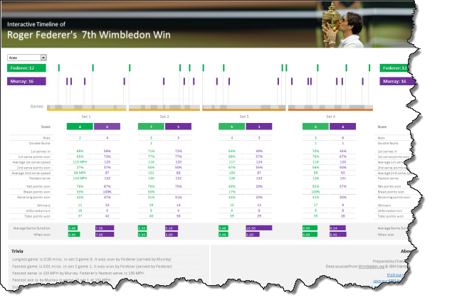
Did I tell you I love tennis? Some of my personal heroes & motivators are tennis players. And as you can guess, I admire Roger Federer. Watching him play inspires me to achieve more. So last night when he lifted Wimbledon trophy for 7th time, I wanted to celebrate the victory too, in my style. So I made an interactive timeline chart in Excel depicting his victory.
Continue »Statistical Distributions in Excel [spreadcheats]
![Statistical Distributions in Excel [spreadcheats]](https://chandoo.org/img/n/frequency-excel-formula.png)
Excel has very powerful formulas and add-ins for performing almost any kind of statistical analysis. Today we will learn how you can make a statistical distribution of test scores using excel. There is a downloadable workbook too, for you to take a look at the formulas and play with them.
Continue »Sports Statistics Dashboard in Excel – Few More Alternatives

First of all, thanks everyone for making the should you always start barcharts at zero? discussion lively. Almost everyone felt that we should start bar charts at zero. After spending sometime with my initial test cricket statistics dashboard, I have created few alternatives. You can see them below. But somehow I feel that I haven’t […]
Continue »How can you ensure that your blog post, term report or business case is readable without spending a lot of time getting beta reviews from others? Thanks to google docs, you can do that with one click. Just upload your word document / txt file to google docs. Once inside, goto menu > tools > […]
Continue »

