All articles with 'Microsoft Excel Formulas' Tag
![Between Formula in Excel [Quick Tips]](https://chandoo.org/img/f/between-formula-in-excel.png)
Checking if a value falls between 2 other values is fairly common when you are working with data. In today’s quick tip, we are going to learn how to check for such between conditions in excel. You will be learning how to check if a value, date or text falls between 2 other values, dates or texts (when arranged in dictionary order) as shown in the picture aside.
Continue »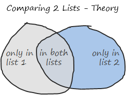
Comparison of lists of data is something that we do all the time. Today, lets learn a few tricks that you can apply immediately to compare 2 lists using Excel. This post discusses how to compare two lists with formula based rules. If you just want to quickly highlight common values, click here. If you […]
Continue »{ 27 Comments }
Convert Text to Sentence Case using Excel Formulas [Quick Tips]
Published on Jun 7, 2010 in Excel Howtos
![Convert Text to Sentence Case using Excel Formulas [Quick Tips]](https://chandoo.org/img/f/sentence-case-in-excel-formulas.png)
It is almost 3:30 am now, I stayed awake for last 23 hours so that Excel School 2 can be ready for rolling. But that is no excuse for not having a post here. So here it goes. Excel has formulas for converting a bunch of text to UPPER, lower and Proper Cases. But not […]
Continue »{ 103 Comments }
Average of Top 5 Values [and some homework]
Published on Jun 4, 2010 in Featured, Learn Excel
![Average of Top 5 Values [and some homework]](https://chandoo.org/img/f/average-of-top5-values-excel-formula.png)
The other day, while doing consulting for one of my customers, I had a strange problem. My customer has data for several KPIs and she wants to display average of top 5 values in the dashboard. Now, if she wants average of all values, we can use AVERAGE() formula if she wants top 5 values […]
Continue »{ 25 Comments }
Display Alerts in Dashboards to Grab User Attention [Quick Tip]
Published on May 25, 2010 in Charts and Graphs
![Display Alerts in Dashboards to Grab User Attention [Quick Tip]](https://chandoo.org/img/dashboards/dashboard-alerts-example-th.png)
Dashboards can be overwhelming with lots of details and context. A simple way to drag user’s attention to important stuff in the dashboard is to use alerts. See this example to understand what alerts mean. How to display alerts in Excel Dashboards? The easiest way to display alerts is to use Excel 2007’s Conditional Formatting […]
Continue »{ 19 Comments }
Exclude Hidden Rows from Totals [How to?]
Published on May 11, 2010 in Excel Howtos, Learn Excel
![Exclude Hidden Rows from Totals [How to?]](https://chandoo.org/img/f/find-a-row-is-hidden-or-not-subtotal-formula.png)
Denice, an Excel School student emailed me an interesting problem. I have a bunch of data from which I want to find the sum of values that meet a criteria. But I also want to exclude any rows that are hidden. Well, we know how to find sum of values that meet a criteria – […]
Continue »{ 206 Comments }
Data Tables & Monte Carlo Simulations in Excel – A Comprehensive Guide
Published on May 6, 2010 in All Time Hits, Analytics, Charts and Graphs, Excel Howtos, Featured, Huis, Learn Excel, Posts by Hui, simulation

If anybody asks me what is the best function in excel I am drawn between Sumproduct and Data Tables, Both make handling large amounts of data a breeze, the only thing missing is the Spandex Pants and Red Cape!
How often have you thought of or been asked “I’d like to know what our profit would be for a number of values of an input variable” or “Can I have a graph of Profit vs Cost”
This post is going to detail the use of the Data Table function within Excel, which can help you answer that question and then so so much more.
Continue »{ 65 Comments }
Change Data Labels in Charts to Whatever you want [Quick Tip]
Published on May 5, 2010 in Charts and Graphs
![Change Data Labels in Charts to Whatever you want [Quick Tip]](https://chandoo.org/img/q/custom-data-labels-example-chart.png)
We all know that Chart Data Labels help us highlight important data points. When you “add data labels” to a chart series, excel can show either “category” , “series” or “data point values” as data labels.
But what if you want to have a data label that is altogether different, like this:
Of course you can point data labels to any cell. In this quick tip, we will learn how to do this, read on…
Continue »{ 8 Comments }
How to Get “Either-Or” Condition in Data Validation?
Published on May 4, 2010 in Learn Excel
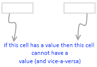
In a recent consulting assignment I had a tricky data validation problem. The customer wanted to have an either-or condition in the data validation, like this: My initial reaction to this requirement was “hmm… that is not possible“. But before shooting the email back to client, I got curious and checked if excel data validation […]
Continue »{ 5 Comments }
Quarterly totals when you have multi-year data [SUMPRODUCT again]
Published on Apr 30, 2010 in Excel Howtos, Learn Excel
![Quarterly totals when you have multi-year data [SUMPRODUCT again]](https://img.chandoo.org/f/quarterly-totals-multi-year-data.png)
In yesterdays post – Find Quarterly Totals from Monthly Data, we have learned how to use SUMPRODUCT formula to find totals by Quarter from a set of monthly values. The approach is fine, but has one glaring draw back. It only works when you have data for one year. In that post, Martin said, … […]
Continue »{ 34 Comments }
Find Quarterly Totals from Monthly Data [SUMPRODUCT Formula]
Published on Apr 29, 2010 in Excel Howtos, Learn Excel
![Find Quarterly Totals from Monthly Data [SUMPRODUCT Formula]](https://img.chandoo.org/f/quarterly-totals-from-monthly-data.png)
Here is a problem we face very frequently. You have a list of values by months. And you want to find out the totals by Quarter. How do you go about it? There are 2 options: You can make a pivot report from the data and then group dates in that to find totals by […]
Continue »![SUMIF works in 2D too [quick tip]](https://chandoo.org/img/i/2d-sumif-excel-formula-example.png)
We all know that SUMIF formula can be used to find the sum of values meeting a criteria. Like this, But I was pleasantly surprised to realize that SUMIF works equally well for 2D ranges too, like this: During a recent consulting work with a client I had a requirement to sum up values that […]
Continue »{ 19 Comments }
Survey Results in Dot Plot Panel Chart [followup on Incell Panel Chart]
Published on Apr 9, 2010 in Charts and Graphs
![Survey Results in Dot Plot Panel Chart [followup on Incell Panel Chart]](https://chandoo.org/img/vp/incell-dot-plot-panel.gif)
In a follow up to last week’s how to visualize survey data in excel, we will explore how you can create an incell dot plot panel chart. Please follow the links in the article to get more commentary and insights from established persona in the visualization world (including Stephen Few, Naomi, Jon etc.)
Continue »
We all know that legend can be added to a chart to provide useful information, color codes etc.
Today we will learn how to make the chart legends smarter so that they provide more meaning and context to the chart, like this:
This type of legend can be more useful than a plain legend as this provides more useful information without taking up too much space.
Continue »{ 13 Comments }
Use CTRL+Click to speed up your formula entry [Quick Tips]
Published on Apr 7, 2010 in Learn Excel
![Use CTRL+Click to speed up your formula entry [Quick Tips]](https://chandoo.org/img/q/faster-formulas-with-ctrl-click.gif)
Sometimes we think there is very little we can improve in something and then we come across an idea that would change our perceptions. I have been writing excel formulas for such a long time that it was easier to remember when I first shaved than when I first wrote a formula. (may be, because […]
Continue »
