All articles with 'Learn Excel' Tag

– Cue, alluring music.
Just like Jack and the crew of Oceanic Airlines flight 815, Excel has a number of LOST functions.
This post will look at some of Excel’s Undocumented, Unloved and Rarely used Functions
Introduction to Programming – Demo Lesson from our VBA Class
We have a challenge in our VBA class. Many of the students who join our VBA program have no formal programming background. They may have written a few simple programs long time ago, but most of them lack basic understanding of programming. Teaching VBA can be difficult if we do not address this problem.
So, we have added a lesson on “Introduction to Programming”. In this lesson, our aim is to introduce programming to non-programers.
Since many of you are considering to join our VBA classes, it is appropriate that we give this introduction to programming lesson as a demo lesson. Please watch it below.
Continue »
Ok, You’ve just finished the mother of all Spreadsheets. Not only does it solve your companies budget, it tracks production, reports variances, makes a mean cup of coffee and some say, “it May Even Solve World Peace ?”.
But the boss walks in and asks “I have a list of items which I need to distribute evenly into colored buckets”
I had never thought of that option, Maybe I can constrain my model and let it work it out for me ?
Solver I need your help !
VBA Classes are Open now. Please join today!

Dear Readers & Friends,
I am very happy to announce that our first batch of VBA Classes is open for your consideration. Please read this short post to understand the benefits of this program and how you can join. Click here to join our class, if you are ready.
What is this VBA Class?
VBA Class is a structured and comprehensive online training program for learning Microsoft Excel VBA (Macros). It is full of real world examples & useful theory.
The aim of VBA Classes is to make a beginner an expert in VBA.
What are the benefits of this class?
Oh so many! Learning VBA one ups your Excel mojo. You will suddenly start saying “Yes” several work opportunities & challenges. Your boss might fall in love with you. You realize the potential to automate large chunks of your work and save time & money.
Continue »5 things you should know about VBA Classes + a Demo Lesson
Today, I want to quickly share a few things about the upcoming VBA Classes.
I have been running online training programs since Jan, 2010. I have trained more than 900 students till date. Still, whenever I am launching a new program, I could feel that familiar sense of eagerness, tension and tremendous enthusiasm building up. I feel eager because I want to meet you, teach you and learn from you. I feel tensed because I want to do it right. I feel enthusiastic because these training programs give me a lot of new ideas and open-up new possibilities.
Continue »80% Discount on PUP & PowerPivot Contest – Hurry up!

Since I am busy with background work on VBA Classes launching next week, today I want to give you two quick updates.
1. John Walkenbach is offering 80% discount on his Power Utility Pack Excel add-in, only today (3rd May) between 11AM-1PM EST.
2. You can win an XBOX 360 + Kinect by participating in PowerPivot Nerdtastic Quiz on their facebook page.
Read more to get the details about these two.
Continue »Online VBA Classes by Chandoo.org – Details & Dates
Few days ago, I have asked you, Do you want to learn Excel VBA online? and many of you said YES. So we are starting the program, on next Monday – 9th of May.
VBA Classes is a 12 week online training program that will explain various Excel VBA concepts to you in an easy to understand format. Just like Excel School, we will keep this fun, exciting, interactive and useful. We will learn from each other as much as we learn from this course. To help you understand how this course works, we made a small video. You can watch it and get other details about the program in this post.
Continue »Place Key Information in Golden Triangle on your Reports, Dashboards etc. [Quick Tips]
![Place Key Information in Golden Triangle on your Reports, Dashboards etc. [Quick Tips]](https://img.chandoo.org/dashboards/golden-traingle-excel-workbooks.jpg)
Today, we will take a detour to world-wide web and learn how we can improve our dashboards, reports, presentations or workbooks by using one of the ideas, called as Golden Triangle.
Continue »
Last week, we have learned what Pivot Table Report Filters are & how to use them.
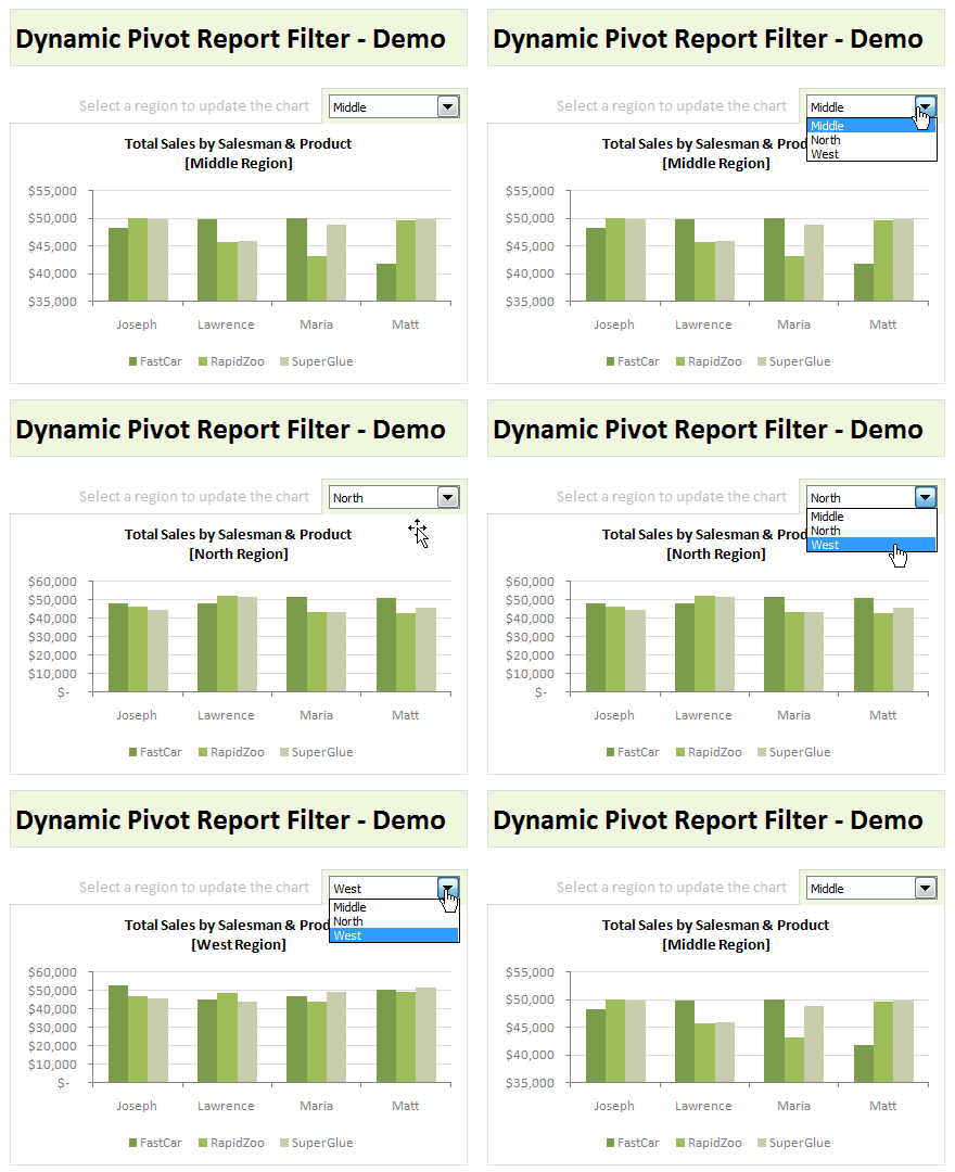
Today, I am going to show, how you can use simple macro code to change the report filter value dynamically.
We will learn how to create the chart shown here.
Continue »What are Pivot Table Report Filters and How to use them?

Today we will learn about Pivot Table Report Filters.
We all know that Pivot Tables help us analyze and report massive amount of data in little time. Excel has several useful pivot table features to help us make all sorts of reports and charts.
Report Filters are one such thing.
Continue »Are You Ready for Online VBA Classes? I need your help!

Many of you have emailed and asked me, “Chandoo, can you help us learn VBA too? Just like you do with Excel.”
Well, as flattering as those requests were, the fact is, I was lousy at VBA. Well, I used to be very good at Visual Basic, back in the college days. But my programming skills have rusted over the years as I did very little coding. I guess, I have become a business-guy. So it took me time to re-learn VBA. And now, I am happy to announce that We are ready to start our very first batch of VBA Class.
But, before we start, I need some help from you. I want to know what is it that you want to learn, so that we can design the course curriculum & methodology around your needs.
So please take a few minutes and complete this survey:
Continue »
I know I am late to the party, but better late than…, uh! forget it.
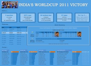
As the keen readers of our blog knew, I like cricket and I show my enthusiasm by making an excel dashboard (or info-graphic) whenever Indian team reaches a major milestone. So naturally, I was super excited when we won the ICC World cup 2011. Last time Indian won the event was in 1983 and my idea of a dashboard at that time was a bottle of milk and jingo-bell, my favorite shake-to-make-annoying-noise toy. I think our latest world-cup victory deserves something more than that. So here we go.
Continue »
How to make a 5 Star Chart (Similar to Amazon)
Last week Chandoo presented Give more details by showing average and distribution
At the top of the post was a small screen capture from Amazon.com showing a 5 Star chart showing that Twilight had a 3.5 Star Rating (way over-rated if you ask me).
I received an email shortly afterwards from Rajiv, “How can I make one of those charts ? ” with the Stars Circled
It’s actually very simple and this post will show you how.
Continue »Auditing Spreadsheets? – Disable Direct Editing Mode to save time [quick tip]
![Auditing Spreadsheets? – Disable Direct Editing Mode to save time [quick tip]](https://chandoo.org/img/q/find-dependent-cells-by-disabling-direct-editing-model-excel-tip.gif)
For most of us, the prospect of inheriting a large, undisclosed sum of money is bleak. But we have high probability of inheriting a complex Excel workbook with 19 worksheets and 2300 rows of data and 195 formulas. The kind where entire rainbow colors are used to color code accounts receivable statuses. Then what do we do? We spend a whole afternoon (and then the rest of the month) breaking our head trying to figure out why the total revenues are only $ 41.2 million when profits are $ 99.23 million.
So how do we deal with our inheritance?
Here is a quick tip to help you get started. Disable “Direct editing mode“.
Continue »![Show Details On-demand in Excel [Tutorial + Training Program]](https://img.chandoo.org/c/on-demand-analysis-and-details-in-excel-demo.gif)
Yesterday, we have seen a beautiful example of how showing details (like distribution) on-demand can increase the effectiveness of your reports. Today, we will learn how to do the same in Excel.
Continue »

