All articles with 'Learn Excel' Tag
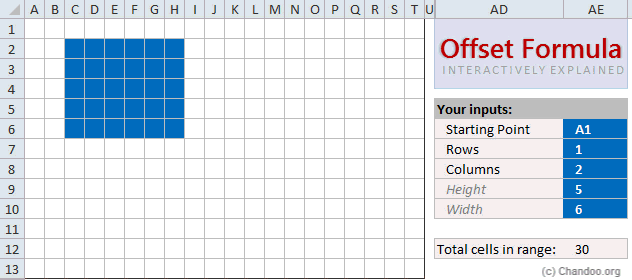
Today, lets learn OFFSET formula.
OFFSET formula gives us reference to a range, from a given starting point with given height and width in cells.
OFFSET formula syntax
OFFSET formula looks like this:
=OFFSET(starting point, rows to move, columns to move, height, width)
Starting point: This is a cell or range from which you want to offset
Rows & columns to move: How many rows & columns you want to move the starting point. Both of these can be positive, negative or zero. More on this below.
Height & width: This is the size of range you want to return. For ex. 4,3 would give you a range with 4 cells tall & 3 cells wide.
Read on…,
Continue »{ 78 Comments }
How many values are common in 2 lists? [homework]
Published on Sep 14, 2012 in Excel Challenges, Excel Howtos
![How many values are common in 2 lists? [homework]](https://img.chandoo.org/hw/formula-size-of-common-values-in-2-lists.png)
Here is a formula challenge for you. Lets say we have 2 lists of values in A1:A10 & B1:B10 Now, how do you find the number of common values in both lists? We just want the count, not list of common values it self. Go ahead and figure out the formula and post your answers […]
Continue »
Can we make a calendar using Pivot Tables?!? Of course we can. Today let us learn a simple technique to create calendar style reports using Pivot tables. Thanks to Rob for inspiration Before making any progress, let me thank Rob from PowerPivotPro for the inspiration. Recently he wrote an article explaining how to use PowerPivot […]
Continue »Lets have some fun this Friday.
Post your favorite Spreadsheet jokes using comments. Have a big smile.
I will start:
1. A pivot table walks in to a bar and orders a beer. It says, “Put me in the same tab, will ya?”
2. A slicer and pivot chart walk in to a bar. The bartender says, “look at those bast*rds, walking around with out a pivot!”.
3. Once Excel, Access and Windows were bragging to each other. Excel says, “I once crashed so hard, it took 5 minutes to recover”. Access says, “Oh thats nothing. I once crashed and took down an entire data base. It took them 30 minutes to recover”. Windows doesn’t say anything. Excel pokes him in the arm asks “what about you?”, Windows jolts & replies, “Sorry, what did you say, I just crashed again.”
![Show Decimal Points if needed [Quick Tip]](https://img.chandoo.org/q/general-formatting-in-excel.png)
Sometimes you want to turnoff decimal points if the value after point is 0. Mireya, Chandoo.org member had one such situation. She writes:
I am a complete beginner in excel, how can I keep the zeros when I am working with decimals and remove them when are not required.
This is where we can use General formatting. Read on to learn how General formatting works and what to do in extreme cases.
Continue »After a long time, I am writing one more Excel links post. First let me share a quick personal update.
I am invited to Lome, Togo to spend a day at Ecobank – CFO conference in 3rd week of September. I will be conducting a one day masterclass on Advanced Excel & Dashboard Reporting. I am excited about this trip as I have never been to any African country. I will post some pics and tell you how it went once I am done with the conference.
Moving on to Excel Links for today,
Continue »{ 13 Comments }
Best Practice Modeling – Make these 5 changes today
Published on Aug 29, 2012 in Financial Modeling

Our guest author, Myles Arnott discusses what Best Practice Modeling is and offers 5 practical, easy to implement tips to get you started.
Best Practice Tip #1: Apply a modeling life cycle
Best Practice Tip #2: Give structure to your spreadsheets
Best Practice Tip #3: Make cells consistent based on their behavior
Best Practice Tip #4: Use similar formulas
Best Practice Tip #5: Build error checks in to your models
Read on…
Continue »{ 28 Comments }
Excel Salary Survey Dashboard Contest Winners
Published on Aug 27, 2012 in Cool Infographics & Data Visualizations, Excel Challenges
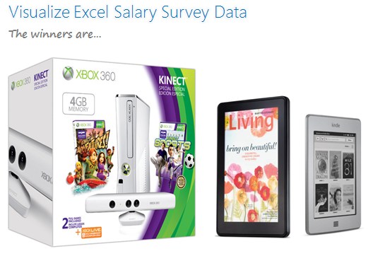
Finally the wait is over. Eager to know who won our Excel Salary Survey Dashboard contest? Read on.
Continue »{ 30 Comments }
Growing a Money Mustache using Excel [for fun]
Published on Aug 22, 2012 in Charts and Graphs, Learn Excel
![Growing a Money Mustache using Excel [for fun]](https://img.chandoo.org/trackers/growing-mustache-demo.gif)
Mustache and Excel?!? Sounds as unlikely as 3D pie charts & Peltier. But I have a story to tell. So grab a cup of coffee and follow me.
Today, lets talk about how to construct a dynamic chart that can show us how much progress we have made against a financial goal (in this case, accumulating a big chunk of money). I call this growing mustache chart, inspired from the wonderful Mr. Money Mustache.
Continue »{ 165 Comments }
Homework: Can you extract dates from text?
Published on Aug 17, 2012 in Excel Challenges, Excel Howtos
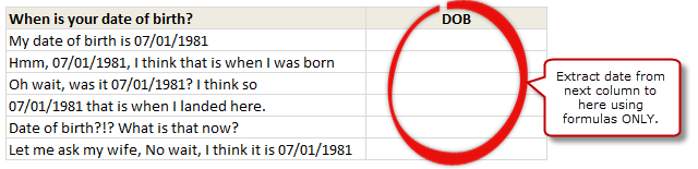
So who is up for a challenge? Can you use only formulas and extract dates buried inside text?
- Download this file.
- In column C, write a formula such that you can extract the date in column B
- If you succeed, post your solution here as a comment.
- If you fail, drink some coffee, start afresh.
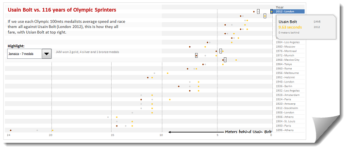
During London 2012 Olympics, Usain Bolt reached the 100mts finish line faster than anyone in just 9.63 seconds. Most of us would be still reading this paragraph before Mr. Bolt finished the race.
To put this in perspective, NY Times created a highly entertaining interactive visualization. Go ahead and check it out. I am sure you will love it.
So I wanted to create something similar in Excel. And here is what I came up with.
Continue »{ 79 Comments }
How fast can you finish this Excel Hurdles Challenge [Spreadsheet Olympics]
Published on Aug 10, 2012 in Excel Challenges, VBA Macros
![How fast can you finish this Excel Hurdles Challenge [Spreadsheet Olympics]](https://img.chandoo.org/contests/excel-hurdles-challenge.png)
Watching the Olympic athletes run & jump all I could think of is,
- What should I eat to jump & sprint like that?
- How come I never heard about steeple chase?
- Should we really have 3 bullet points in all lists?
But I digress. Coming back, when watching one of those hurdles events, I got an idea as sharp as Chinese table tennis team.
Why not create a hurdles game in Excel to measure how good you are with keyboard?
So ladies & gentleman, let me present you our very own Olympics hurdle run.
Continue »{ 30 Comments }
Excel Salary Survey Dashboards – Choose the winner [poll]
Published on Aug 3, 2012 in Cool Infographics & Data Visualizations
![Excel Salary Survey Dashboards – Choose the winner [poll]](https://img.chandoo.org/contests/ssc/excel-salary-dashboards-pick-the-winner-poll.png)
Recently, we published 66 dashboards visualizing Excel salaries around the world. Each of the contestants have put in great effort and hand-crafted these beauties. Now its time we picked a winner.
How does the voting work?
The voting has 2 components
- Readers (that is you) pick a winner and runner-up using online voting.
- Judges (2 of them) will also pick winners. Judges vote carries 20% weight.
![Making your dashboards interactive [Dashboard Essentials]](https://img.chandoo.org/vp/grammy-bump-chart-replication-in-excel-demo.gif)
Everyone likes to be in control. Even my 2 year old daughter jumps with joy when she lays her hands on TV remote. She pushes the buttons and assumes it is working. It is another story that we rarely watch TV at home.
By adding an element of control, we can make our dashboard reports fun. Interactive elements like form controls, slicers etc. invite users to play with your dashboard, get involved and understand data by asking questions. That is why I recommend making dashboards interactive.
Today lets understand how you can make dashboards interactive.
Continue »{ 22 Comments }
How to make Box plots in Excel [Dashboard Essentials]
Published on Jul 31, 2012 in Charts and Graphs
![How to make Box plots in Excel [Dashboard Essentials]](https://img.chandoo.org/dashboards/bp/box-plot-in-excel-how-to.png)
Whenever we deal with large amounts of data, one of the goals for analysis is, How is this data distributed?
This is where a Box plot can help. According to Wikipedia, a box plot is a convenient way of graphically depicting groups of numerical data through their five-number summaries: the smallest observation (sample minimum), lower quartile (Q1), median (Q2), upper quartile (Q3), and largest observation (sample maximum)
Today, let us learn how to create a box plot using MS Excel. You can also download the example workbook to play with static & interactive versions of box plots.
Continue »
