All articles with 'Learn Excel' Tag
{ 39 Comments }
How to remove all cells containing John (or anything else) [Quick tip]
Published on Mar 15, 2013 in Excel Howtos
![How to remove all cells containing John (or anything else) [Quick tip]](https://img.chandoo.org/q/delete-all-cells-with-a-specific-value.png)
Here is an interesting question someone asked me recently,
If I have to delete all rows with “John” in it. Do you know how to do it?
Well, it looks like they really hate John. But it is none of my business.
So lets go ahead and understand a dead-simple way to get rid of all cells with John or whoever else you fancy.
Continue »{ 19 Comments }
Shading above or below a line in Excel charts [tutorial]
Published on Feb 13, 2013 in Charts and Graphs
![Shading above or below a line in Excel charts [tutorial]](https://img.chandoo.org/c/shaded-line-charts-tell-a-better-story.png)
When comparing 2 sets of data, one question we always ask is,
- How is first set of numbers different from second set?
A classic example of this is, lets say you are comparing productivity figures of your company with industry averages. Merely seeing both your series as lines (or columns etc.) is not going to tell you the full story. But if we can shade our productivity line in red or green when it is under or above industry average… now that would be awesome! Something like above.
Continue »{ 49 Comments }
Transpose a table of data using Excel Formulas
Published on Feb 1, 2013 in Excel Howtos
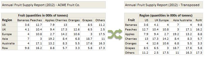
Today lets tackle a familiar data clean-up problem using Excel – Transposing data.
That is, we want to take all rows in our data & make them columns. Something like this:
Learn these 4 techniques to transpose data:
1. Using Paste Special > Transpose
2. Using INDEX formula & Helper cells
3. Using INDEX, ROWS & COLUMNS formulas
4. Using TRANSPOSE Formula
{ 4 Comments }
Details about our Power Pivot Course [and a video for those of you not interested]
Published on Jan 30, 2013 in Excel Howtos, Power Pivot
![Details about our Power Pivot Course [and a video for those of you not interested]](https://img.chandoo.org/power-pivot/power-pivot-course-details.png)
Hello folks,
If this article was a person, they would be schizophrenic. You see, it has 2 purposes:
- Give you all the details about my upcoming Power Pivot course
- Give you a solution to last week’s vacation days problem
Details about Power Pivot Course
Power Pivot, an Excel add-in makes it easy to connect, analyze & visualize massive amounts of data. This course aims to teach you how to use Power Pivot to analyze data, create advanced reports & prepare dashboards all from familiar interface of Excel. This is ideal for data analysts, reporting & MIS professionals, business analysts, managers & dashboard makers.
{ 23 Comments }
Introduction to DAX Formulas & Measures for Power Pivot
Published on Jan 28, 2013 in Power Pivot
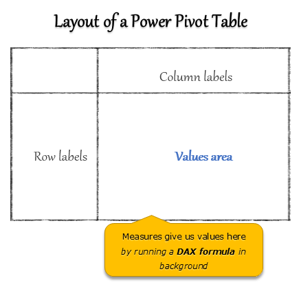
A measure is a formula for the values area of Power Pivot table.
A measure can be implicit or explicit.
Implicit measures are created automatically when you drag and drop a field in to Power Pivot values area. For example, in last week’s introduction, we created an implicit measure for SUM of Sales by dragging and dropping the sales amount field in to values area of our power pivot table.
Explicit measures are created by you using New measure button in Power Pivot tab (or Calculated Field button in Excel 2013 Power Pivot tab). You can also create a measure in the Power Pivot window.
Learn what measures are, how to create them using DAX (Data Analysis Expression) formulas in this video tutorial.
Continue »{ 67 Comments }
Can you calculate vacation days in a period? [Homework]
Published on Jan 25, 2013 in Excel Challenges
![Can you calculate vacation days in a period? [Homework]](https://img.chandoo.org/hw/calculate-vacation-days-excel-formula-homework.png)
Its Friday, that means time for another Excel challenge for you.
Calculate vacation days in a period:
Your mission, if you choose to accept it,
Step 1: Download the hom work problem file.
Step 2: Calculate number of vacations taken in a period. Specifically,
1) How many vacations are taken between start & end dates, assuming complete vacation should be inside the start & end date period?
2) How many vacations are taken such that at least one day of vacation is between start & end dates?
3) How many people took vacations? (if same person took multiple vacations, then count it as 1)
{ 61 Comments }
What is Power Pivot – an Introduction [video]
Published on Jan 21, 2013 in Learn Excel, Power Pivot
![What is Power Pivot – an Introduction [video]](https://img.chandoo.org/power-pivot/introduction-to-power-pivot-excel.png)
Today, lets talk about Power Pivot & understand it.
What is Power Pivot?
Power Pivot is an Excel add-in to connect, analyze & visualize massive amounts of data..
Lets take a closer look at the definition.
Connect: You can use multiple tables of data & set up relationships between them using Power Pivot. For example, you can connect customer details to sales transactions so that you can summarize sales by customer location or gender easily.
Analyze: You can create simple pivot table style reports or create something exceedingly complex by defining your own calculated fields for values area of the pivot. There is a whole set of formulas defined for exactly this purpose, called as DAX formulas.
Visualize: Instantly filter your reports using slicers, time lines (Excel 2013 or above only), conditional formats, pivot charts etc. You can even define KPIs and see the performance in bands.
Massive Amounts of Data: Although your typical Excel worksheet contains a million rows, if you tried to load even half of those with any data, Excel would quickly become slow & lazy. Power Pivot can take a million rows for breakfast and would be hungry for more. It can processes millions of rows of data very quickly and easily, all from the comfort of a standard desktop or laptop.
Continue »
Few weeks ago, someone asked me “What are the top 10 formulas?” That got me thinking.
While each of us have our own list of favorite, most frequently used formulas, there is no standard list of top 10 formulas for everyone. So, today let me attempt that.
If you want to become a data or business analyst then you must develop good understanding of Excel formulas & become fluent in them.
A good analyst should be familiar with below 10 formulas to begin with.
Continue »{ 27 Comments }
Insert Multiple Columns at once [Quick tip]
Published on Jan 15, 2013 in Excel Howtos
![Insert Multiple Columns at once [Quick tip]](https://img.chandoo.org/q/insert-multiple-columns-excel-tip.gif)
Here is a quick tip to start your week. Ever wanted to insert a few columns in between like this? Here is how to do it. Hold down control key. Select one column at a time Right click and choose Insert Done! Bonus tip: You can use this to insert rows too! More Quick tips.
Continue »{ 3 Comments }
Introducing ‘Finance for Non-finance people’ training program
Published on Jan 10, 2013 in Financial Modeling, products

Dear readers & supporters of Chandoo.org,
I am very glad to announce that our brand new online course – “Finance for non-finance people” is now available for your consideration. Please take a few minutes to read this short message to understand what this program is & how it benefits you. If you are ready to join, please click here.
What is Finance for Non-finance people course?
This course aims to teach financial fundamentals & introduce you to the world financial analysis in a no-nonsense way.
We start by introducing financial analysis and the basic jargon. Then we talk about 3 important components of any company’s finances – Balance Sheet, Income Statement & Cash flow Statement.
Then we discuss about various analytical techniques like ratio analysis, valuation mechanisms, break-even analysis.
Finally we explain advanced accounting concepts like long-lived assets, depreciation, explore trend analysis and unit economics.
In a nut-shell, this course takes someone with no finance background and makes them proficient in world of finance.
Continue »{ 15 Comments }
3 upcoming courses to Make you awesome [Announcements]
Published on Jan 9, 2013 in Learn Excel, products
![3 upcoming courses to Make you awesome [Announcements]](https://img.chandoo.org/es/upcoming-courses-first-q-2013-chandoo.org.png)
A quick announcement for all of you aiming to become awesome in Excel in 2013.
I am very happy to share our course timeline for first 3 months of 2013.
Upcoming Courses:
Here is a summary of courses I am planning to launch in next 3 months. I will be posting more details about these courses soon.
1. Finance for Non-finance people
Learn about financial basics, financial analysis thru Excel in our finance for non-finance people course. Designed by my partners at Pristine education, this course helps you gain insights to finance world quickly.
This course will be launched Thursday, January 10th – 2013
2. Power Pivot School
Jump in to power pivot, analyze data & extract insights like a pro by going thru this program. Aimed at Excel analysts & reporting professionals, this course helps you unleash power of PowerPivot to do awesome things.
This course will be launched on Wednesday, February 6th – 2013
…
Continue »{ 63 Comments }
To-do List with Priorities using Excel
Published on Jan 7, 2013 in Excel Howtos, Templates
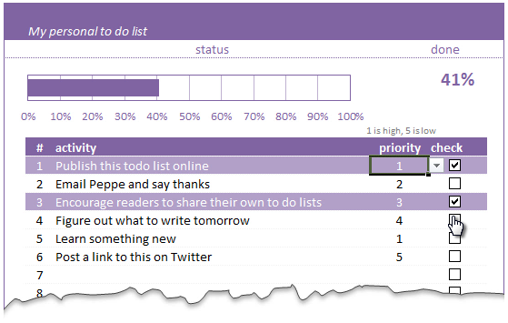
A while ago, we published a new year resolution template. This was a hit with our reader with thousands of you downloading it. During last week, Peppe, one of our readers from Italy, took this template and made it even more awesome.
The original template had tasks and completion check mark. As you finish each task, you can see the progress bar moving.
Peppe added priorities to this. With his new version, progress is measured based on how much priority we assigned that particular task. Pretty neat eh?!?
Continue »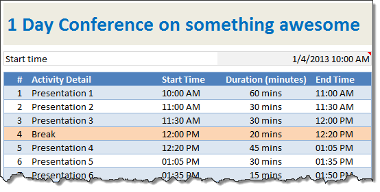
When planning a meeting, an event or activity, we deal with many individual steps (each taking certain amount of time). Today let us understand how to create an agenda template in Excel using simple formulas.
Continue »2012 has been the most awesome year since we started Chandoo.org.
The credit for this goes to our community of Excel users – that is you.
For practically every day of 2012, you have inspired me (and all of us at Chandoo.org) to learn something new, share and make you awesome. I know I say this many times, but I can never feel enough – Thank you for your support to Chandoo.org.
Apart from you, there are many other amazing people & companies that played a role in our success. In this post, let me highlight them & express my sincere gratitude.
Continue »![2013 Calendar – Excel Template [Downloads]](https://img.chandoo.org/c/2013-calendar-template-FREE-download.png)
Here is a New year gift to all our readers – free 2013 Excel Calendar Template.
This calender has,
- One page full calendar with notes, in 4 different color schemes
- Daily event planner & tracker
- 1 Mini calendar
- Monthly calendar (prints to 12 pages)
- Works for any year, just change year in Full tab.

