All articles with 'downloads' Tag
Financial Ratios – Cappuccino or Latte?

A Quick Question for you!
Don the hat of a financial wiz today. What I have for you are the financials of two companies: Cappuccino and Latte – Two dot com companies (Sometimes they also make revenues ;-))
Which is better – Cappuccino or Latte? ( Hint: It’s a trick question! 😉 )
It may seem obvious that Latte is performing better (Higher the revenue, the better the performance!). Sometimes a single source of data does not speak the full story!
Continue »![Project Portfolio Dashboard in Excel [Part 2 of 2]](https://img.chandoo.org/pm/project-portfolio-dashboard-small.png)
In this 2 part tutorial, we will learn how to design a project portfolio dashboard. Part 1 discussed user needs & design. Part 2 will show you Excel implementation.
Click here to get your copy.
Final Implementation – Project Portfolio Dashboard
First lets take a look at the finalized dashboard implementation. Continue reading to learn more & download this dashboard.
Continue »Happy Diwali [Animated Chart inside]
![Happy Diwali [Animated Chart inside]](https://img.chandoo.org/c/animated-diwali-chart-in-excel.png)
My heartiest Diwali wishes to all our readers.
The spirit of Diwali is to encourage people to spread joy, celebrate good things and throw away darkness (evil). These ideas are universal. So let me wish you a very happy Diwali.
Diwali, festival of lights, is celebrated in the month of October / November. It is one of my favorite festivals since childhood. A time when all family members get together, celebrate all the good in their life, laugh and light a few fire crackers (fire works).
This year, our kids (Nishanth & Nakshatra) too are excited about the festival. They are eager to light diyas (small lamps), watch the fire works and enjoy. Naturally I do not feel like opening Excel.
But then…,
Sometime during my morning coffee, I thought “hey, why not create a small Diwali greeting using Excel?”
So here we go.
Continue »Show monthly values & % changes in one pivot table
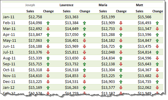
Pivot tables are great help when analyzing lots of data. One of the common questions managers & analysts ask (when looking at monthly sales data for example) is,
How is the monthly performance of our teams (or regions, products etc.)?
A pivot report can answer this question in a snap. Today lets learn how to do that.
Continue »Journey of Hurricane Sandy – Animated Excel Chart
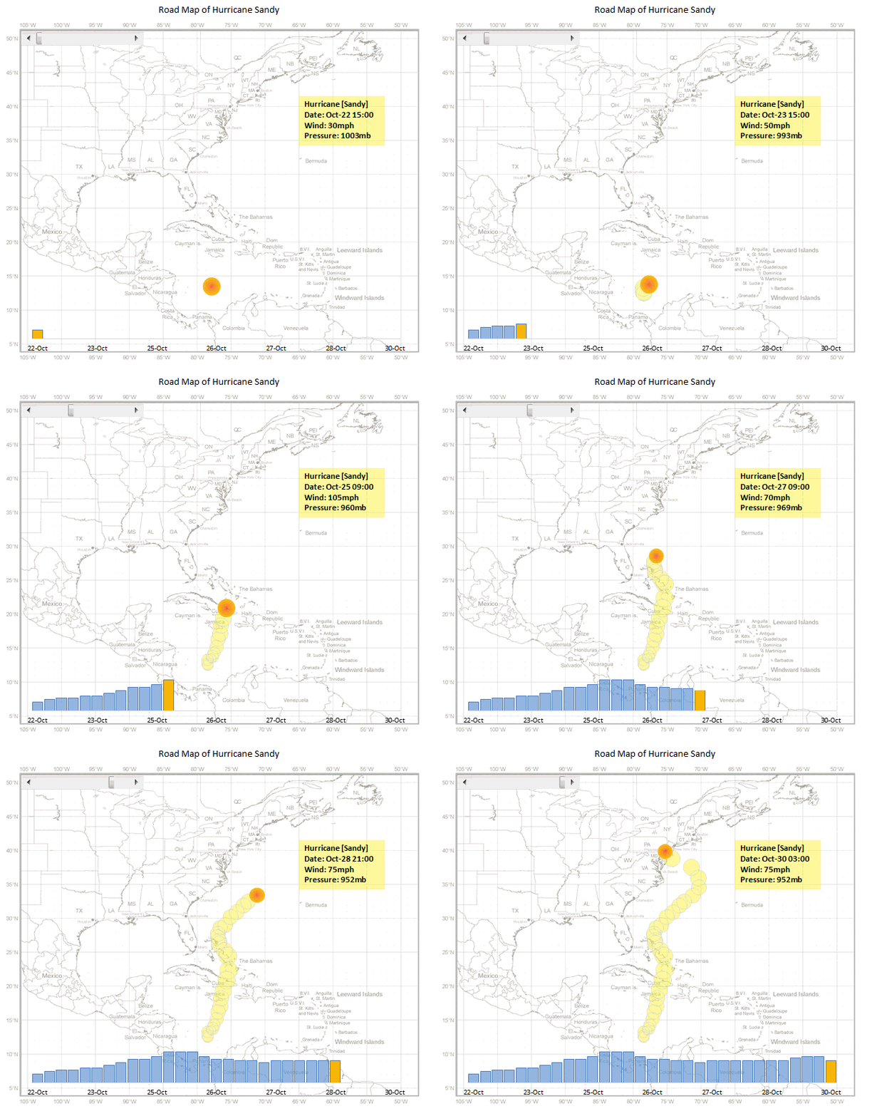
Hurricane Sandy has taken front seat in all major news channels, papers, websites even in far off places like India. I hope & pray that our readers in US East coast are safe.
Today, lets understand the journey of Hurricane Sandy in this animated chart, prepared by Chris from Excel365.
Continue »Extract file name from full path using formulas
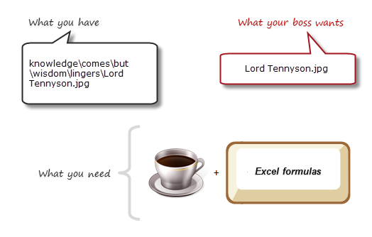
Today lets tackle a very familiar problem. You have a bunch of very long, complicated file names & paths. Your boss wants a list of files extracted from these paths, like below:
Of course nothing is impossible. You just need correct ingredients. I cannot help you with a strong cup of coffee, so go and get it. I will wait…
Back already? well, lets start the formula magic then.
Continue »
Your the production manager and have a need to schedule uneven resource across uneven requirements, how can you do that?
Well today we’ll look at Resource Allocation and Scheduling using Excel to do the hard work
Use Indexed charts when understanding change [Charting Techniques]
![Use Indexed charts when understanding change [Charting Techniques]](https://img.chandoo.org/c/example-indexed-chart-in-excel.png)
Today, lets talk about indexing, a technique used to compare changes in values over time.
What is indexing?
Lets say you want to compare prices of Gold & Coffee over last few years. Gold price in 2011 (oct) is $1,655 per ounce. And now (sept 2012) it is $1,744. Like wise, Silver price in 2011 is $32.06 and in 2012 it is $33.61. How do we compare such diverse numbers?
Enter indexing.
First we need to calculate price of Gold and Silver in 2012 assuming their starting price is 100. This can be done with simple arithmetic.
Now, we can easily compare the prices. Looking at the indexed prices, we can conclude that both Gold & Silver prices have gone up by similar percentage (~5%).
Continue »Formula Forensics No. 030 – Extracting a Sorted, Unique List, Grouped by Frequency of Occurrence

Today at Formula Forensics, Guest author Sajan shows us how to extract a sorted, unique list of items, displaying the most frequently occurring items first, while restricting the output based on some additional criteria.
Continue »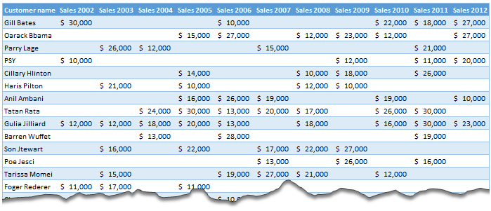
Moosa, one of our readers emailed this interesting question:
I have huge list of customers (around 1500).
Table includes following information
Customer # , Customer Name, Sales 2002, sales 2003, … sales 2012My requirements are
1. list of customer who did not have sales during all these years
2. List of customer who have not business from 2003
3. List of customer who have not business from 2004
Today, lets learn how to identify all the non-performing customers.
Continue »18.2 Tips on Rounding numbers using Excel Formulas
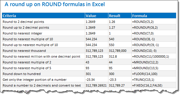
Lets talk round numbers today.I have 18.2 tips for you on round numbers.
We can use a variety of formulas to round numbers in Excel depending on the situation. We have ROUND, ROUNDUP, ROUNDDOWN, MROUND, INT, TRUNC, CEILING, FLOOR, FIXED, EVEN, ODD and few more. To know how to use all these formulas and how to round numbers based on any criteria, just read on.
Continue »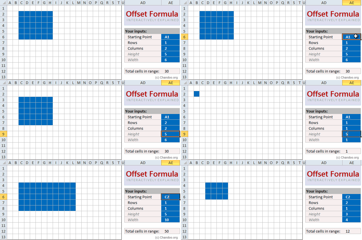
Today, lets learn OFFSET formula.
OFFSET formula gives us reference to a range, from a given starting point with given height and width in cells.
OFFSET formula syntax
OFFSET formula looks like this:
=OFFSET(starting point, rows to move, columns to move, height, width)
Starting point: This is a cell or range from which you want to offset
Rows & columns to move: How many rows & columns you want to move the starting point. Both of these can be positive, negative or zero. More on this below.
Height & width: This is the size of range you want to return. For ex. 4,3 would give you a range with 4 cells tall & 3 cells wide.
Read on…,
Continue »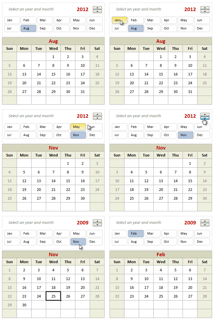
Can we make a calendar using Pivot Tables?!? Of course we can. Today let us learn a simple technique to create calendar style reports using Pivot tables. Thanks to Rob for inspiration Before making any progress, let me thank Rob from PowerPivotPro for the inspiration. Recently he wrote an article explaining how to use PowerPivot […]
Continue »Growing a Money Mustache using Excel [for fun]
Mustache and Excel?!? Sounds as unlikely as 3D pie charts & Peltier. But I have a story to tell. So grab a cup of coffee and follow me.
Today, lets talk about how to construct a dynamic chart that can show us how much progress we have made against a financial goal (in this case, accumulating a big chunk of money). I call this growing mustache chart, inspired from the wonderful Mr. Money Mustache.
Continue »Homework: Can you extract dates from text?

So who is up for a challenge? Can you use only formulas and extract dates buried inside text?
- Download this file.
- In column C, write a formula such that you can extract the date in column B
- If you succeed, post your solution here as a comment.
- If you fail, drink some coffee, start afresh.


