
A while ago (well more than 3 years ago), I wrote about an array formula based technique to check if a list of values have any duplicates in them.
Today, lets learn a simpler formula to check if a list has duplicate numbers.
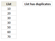
Assuming you have some numbers in a range B4:B10 as shown below,
You can use COUNTIF & MODE formulas to check if the list has any duplicates, like this:
=IF(COUNTIF($B$4:$B$10,MODE($B$4:$B$10))>1, "List has duplicates", "No duplicates")
How does it work?
MODE formula gives us the most frequently occurring number in a list. Then, we use COUNTIF to see how many times this number occurs in a list.
In a list with no duplicates mode value occurs only 1 time. If a list has duplicate numbers, then count of mode would be more than 1. That is what the IF formula checks for and then prints appropriate message.
See this example:
[Embedded Excel, if you can not see it, click here]
Play with below embedded Excel file to understand the technique. You can modify numbers or formula.
Or Download this Example
Click here to download the example workbook and play with it.
How do you check if a list has duplicates?
For text values, I use the array formula technique described here. For numeric values, I prefer MODE + COUNTIF combination because it is easy to write & explain.
What about you? How do you check if a list has duplicates? Which formulas do you use? Please share your techniques using comments.
More on Duplicates & Unique values
If we analyze the time an analyst spends on various things, we would realize,
- 30% of time cleaning data (removing duplicates etc.)
- 30% of time actual analysis
- 30% of time drinking coffee
- 10% of time actual presentation
On a more serious note, if you want to learn various techniques to deal with duplicate values, read on:
- Extracting unique values from a list in Excel using formulas
- Extracting unique values from a list using Pivot tables
- Count the number of values in a list (excluding duplicates)
- Quickly compare 2 lists and check for duplicates
- Removing duplicate values quickly
- Avoiding duplicate data entry using Data Validation


29 Responses
Do you even require the COUNTIF function? It seems that MODE will return #N/A if no number appears more than once, so you could use:
=IF(ISERROR(MODE($B$4:$B$10)),”No duplicates”,”List has duplicates”)
You are right. I did not realize it. Thanks for sharing this.
its working i have done in my data
thanks
I used to use the COUNTIF function, but in Excel2007 & 2010 the conditional formatting, highlight duplicates, is REALLY easy to get to and easy to use, so that’s all I use for it. You can even just use it on the fly as a quick check for duplicates & then cancel without applying.
Hi Lydna,
I completely agree with you. In excel 2007 and 2010 we have Conditional Formatting which highlights the duplicate values in seconds. As you said you can check and then leave without applying or delete the duplicates as needed.
This method doesn’t work with non-Numeric data. I can’t really think of a time that I’m looking at a list to weed out duplicate #s, usually duplicate text.
See this for a method that works for text as well:
http://chandoo.org/wp/2009/03/25/using-array-formulas-example1/
=REPT(“no “,ISNA(MODE($B$4:$B$10))) & “duplicates”
Well, that is what genius is. Thanks for posting it 🙂
Didn’t quite work for me – had to miodify it to
=REPT(“no “,ISNA(MODE($B$4:$B$10))*1) & “duplicates”
Array Enter
=OR(COUNTIF(B4:B10,B4:10)-1)
Returns a True if there are Duplicates, False otherwise
Works for both numbers and text
Non Array
=SUMPRODUCT(COUNTIF(B4:B10,B4:10)-1) return 0 if no duplicates, number if there are dups
I have a much simpler method-
Assuming data in column A-
–sort column A
–Add in Column B the following formula—=if(a2=a1, “duplicate”, “not duplicate”)
–Copy down
same here i always use this
thankssss
We can use conditional formattting to check if there are duplicates.
Select the seriers of numbers
Under
Conditional formatting –> Highlight cell rules –> Duplicate values.
If there are any duplicate values then the numbers will be highlighted.
If you want a conditional formatting based technique, see this:
http://chandoo.org/wp/2010/07/01/compare-lists-excel-tip/
It seems kind of boring compared to using formulas, but I find pivot tables a convenient way of determining if there are duplicates in a file; and it works for both text and numbers.
To automatically remove, rather than just identify duplicates, make the data into a table (2007 onwards insert table). You can then use the remove duplicates function.
Another method I have used in the past is to create a pivot table based on the data and then pull though the column to analyse (in the row labels area) and then pull through the same column into the values area (as a count). If you then sort descending any duplicates will come to the top of the pivot table.
*Assuming data with possible dups is in Col A.
=countif(A:A,a1) fill down
Counts of the number of occurrences, and then you can filter/sort Largest to Smallest to remove them. Works with text and numbers.
or modify the formula to
=IF(COUNTIF(B:B,B4)>1,”Duplicates Found”,”No Duplicate”)
I just use the following in a new column =countif (A:A,A1)>1 then copy down, all the trues are duplicates, false number only occurs 1 time, also works with text.
its too dificult to do with huge data we can take any risk but if we just want to know that there is some duplicate or not then we must use =IF(ISERROR(MODE($B$4:$B$10)),”No duplicates”,”List has duplicates”)
I prefer to go line by line and check…:)
Actually, I use the conditional formatting function to find duplicates or in some cases, unique values.
I run a report each week where I need to figure out which records have been added since the report was last run and I use conditional formatting to identify unique values.
Thanks for the tips! They’re always interesting to look at.
While I like this tip and was excited to learn another practical use for MODE, I agree with most of the comments in that more analysis is usually required in such circumstances.
I extensively use 2 formulas(!) when I create interactive pivot tables. These tables are either to empower the client to ascertain what they need immediately or they become prototypes for a for defined, and more complex, model.
My first formula identifies the original occurrence of any given argument:
eg: if(sumproduct(($A$2:$A2=A2)*($B$2:$B2=B2))>1,0,1)
The formula is copied for each record in the data-set.
The second formula simply identifies the total occurrences of a given criteria
eg: countif($c$2:$c$10,$c$2:$c$10) – Also copied to every record within data-set
A practical application of these formula could be as follows:
Having followed Chandoo.org, I realise these formula are not spectacular. Indeed, they come with issues and restrictions. However, inspired by Chandoo.org, and now by the ability to present using MS Web Apps, I wanted to share this with my peers for further review as I feel the formulas, and webb app example, demonstrate so much more than my attempt to explain. And, as I have said, I actually use these formula extensively in the real world and so wanted to share my opinion.
How we find the common & unique value from sheet 1&2 in sheet 3
i am working with sudoku using excel….and im getting trouble of how to determine the duplicate numbers and the certain number that occur more than once…could someone hep me with this please:))thanks in advance!
Mode does not work with TEXT duplicates.
CountIf does not work with arrays.
This method works with both, in VBA or on a worksheet. It returns the number of values that appear in both lists.
VBA:
Dupes = WorksheetFunction.Count(Application.Match(sList1, sList2, 0))
Worksheet (must be entered as array formula):
=COUNT(MATCH(A1:A3,B1:B3,0))
If you want a simple TRUE/FALSE result, wrap it in a simple IF > 0 function:
=IF(COUNT(MATCH($A$1:$A$3,$B$1:$B$3,0))>0, TRUE, FALSE)
Count works because Count automatically ignores errors and blanks 🙂
(PS, anyone know any other functions that automatically ignore errors and blanks?)
in VBA, certain worksheet functions only work with the Application. prefix, instead of WorksheetFunction. prefix.
Trying to take this formula to the next level, by returning an array of the duplicate items.
These two methods fail:
INDEX apparently cannot return an array (tho i’ve read it can). Anyone know a non-VBA way to return an array from INDEX, or another function that can achieve the same thing?
=INDEX($B$1:$B$5,MATCH($A$1:$A$5,$B$1:$B$5,0))
Here, OFFSET does return an array of the duplicate items, which is great. But also returns a bunch of errors (for the non-duplicated items). Anyone know a simple non-VBA function to remove errors from a worksheet array?
=OFFSET($B$1,MATCH($A$1:$A$5,$B$1:$B$5,0)-1,0)
I can think of a way to do it with a nested IF…ISERROR formula, but hoping for a simpler method.