All articles with 'downloads' Tag
{ 6 Comments }
Make 1,200 dinosaurs in no time with Excel [formulas]
Published on Jan 29, 2016 in Learn Excel
![Make 1,200 dinosaurs in no time with Excel [formulas]](https://chandoo.org/wp/wp-content/uploads/2016/01/Velociraptor-rs.png)
It seems spreadsheets & dinosaurs on a collision course. How else can you explain Jon’s XKCD Velociraptor problem solved with Excel and now this. Debby, alert reader of our blog sent me this email yesterday.
Continue »I need an algebraic formula to solve this in Excel
I have 5 heads, 5 bodies, 4 arm sets, 4 leg sets and 3 tails. I need to see if I can create 1000 dinosaurs from these, and if that’s too many AND I need the 5 digit groupings to prove it and create them.
basically Xa*Xb*Xc*Xd*Xe=1000 – I’m not supposed to go over 1200. […] And then I want the 5 digit combinations if possible – right now they are trying to do the combinations by hand – would be awesome if we could do it in Excel.
![Transpose this address data [VBA homework]](https://chandoo.org/wp/wp-content/uploads/2016/01/transpose-address-data-problem.png)
Here is an interesting problem to keep you busy.
Transpose the address data in column A into the format indicated in C:G using either VBA, formulas or Power Query. Once done, post your answers in comments section.
Continue »{ 16 Comments }
2016 Calendar, daily planner Excel templates [free downloads]
Published on Jan 4, 2016 in Learn Excel
Here is a New year gift to all our readers – free 2016 Excel Calendar & daily planner Template.

This calendar has,
- One page full calendar with notes, in 4 different color schemes
- Daily event planner & tracker
- 1 Mini calendar
- Monthly calendar (prints to 12 pages)
- Works for any year, just change year in Full tab.
{ 5 Comments }
Generate a snow flake pattern Excel [holiday fun]
Published on Dec 23, 2015 in Charts and Graphs
![Generate a snow flake pattern Excel [holiday fun]](https://chandoo.org/wp/wp-content/uploads/2015/12/snow-flake-pattern-in-excel.png)
Yesterday I saw a tweet from @JanWillemTulp with random snow flake generator.
That got me thinking…? Why can’t we make a snow flake pattern in Excel?
This is what I came up with.
Read on to know more about this snow flake and download the example workbook.
Continue »![Color changing line chart [tutorial]](https://chandoo.org/wp/wp-content/uploads/2015/12/color-changing-line-chart.png)
Let’s learn how to create a color changing line chart using Excel. This is what we will create.
Looks interesting? Read on.
Continue »
Here is an interesting twist on the good old VLOOKUP. How to find the pricing applicable for given quantity of a product?
Something like above.
Looks interesting? Then read on…
Continue »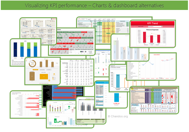
Hello all, prepare to be amazed! Here are 43 creative, fun & informative ways to visualize KPI data.
About a month ago, I asked you to visualize KPI data. We received 65 entries for this contest. After carefully reviewing the entries, our panel of judges have discarded 22 of them due to poor charting choices, errors or just plain data dumps. We are left with 43 amazing entries, each creatively analyzed the data and presented results in a powerful way.
How to read this post?
This is a fairly large post. If you are reading this in email or news-reader, it may not look properly. Click here to read it on chandoo.org.
- Each entry is shown in a box with the contestant’s name on top. Entries are shown in alphabetical order of contestant’s name.
- You can see a snapshot of the entry and more thumbnails below.
- The thumb-nails are click-able, so that you can enlarge and see the details.
- You can download the contest entry workbook, see & play with the files.
- You can read my comments at the bottom.
- At the bottom of this post, you can find a list of key charting & dashboard design techniques. Go thru them to learn how to create similar reports at work.
Thank you
Thank you very much for all the participants in this contest. I have thoroughly enjoyed exploring your work & learned a lot from them. I am sure you had fun creating these too.
So go ahead and enjoy the entries.
Continue »
Podcast: Play in new window | Download
Subscribe: Apple Podcasts | Spotify | RSS
In the 48th session of Chandoo.org podcast, let’s make some animated charts!!!
What is in this session?
In this podcast,
- Announcements
- Why animate your charts?
- Non-VBA methods to animate charts
- Excel 2013’s built-in animation effects
- Iterative formula approach
- VBA based animation
- Cartoon film analogy
- Understanding the VBA part
- Example animated chart – Sales of a new product
- Resources and downloads for you
{ 6 Comments }
Happy Diwali for all our readers – Animated Flower Pot Cracker in Excel for you…
Published on Nov 11, 2015 in Charts and Graphs, VBA Macros

Today is Diwali, the festival of lights. I wish you and your family a happy, bright and prosperous festive time. May your house shower with lots of light, laughter and love.
Diwali is one of my favorite festivals. It is a time when all family members get together, eat delicious food, laugh to hearts content and light up diyas (small oil lamps) to celebrate the victory of good over evil. This year, my kids (who are 6 yrs btw) are very excited about the festival. They are looking forward to lighting up diyas and crackers (fire works).
To celebrate the holiday, I made something for you.
An animated flower pot firework in Excel.
Continue »{ 26 Comments }
Employee training tracker & calendar – tutorial & download
Published on Nov 4, 2015 in Charts and Graphs, Learn Excel

Imagine you are the head of training department at ACME Inc. You arrange training programs round the year to empower your team. It is hard work, coordinating between employees, trainers, department heads, venues and coffee machines. What if there is something to help you keep track of all this? I am not talking about getting you a shiny new iPad, you silly. I am talking about a tracker & calendar built in Excel that ties everything together (well, almost everything, you still have to fill the coffee machine.)
We are going to build a training program tracker & calendar using Excel.
Continue »{ 32 Comments }
Save a range as text file using VBA [tutorial]
Published on Oct 28, 2015 in VBA Macros
![Save a range as text file using VBA [tutorial]](https://chandoo.org/wp/wp-content/uploads/2015/10/save-range-as-text-vba-data.png)
Last night I asked members of our Chandoo.org facebook page to share an Excel problem you are struggling with. Francis asked,
How to save a file as .txt in vba without quotes? When I save as .txt, the file has got quotes inside of it. I used the code Print, but it didnt work because the file loses its delimitation.
Does anyone know how to solve this?
Let’s understand how to save a range as text and overcome the double quote problem.
Continue »{ 3 Comments }
Weighted Sorting in Excel [video]
Published on Oct 1, 2015 in Excel Howtos, Learn Excel
![Weighted Sorting in Excel [video]](https://chandoo.org/wp/wp-content/uploads/2015/10/weighted-sort-in-excel.png)
Imagine you are looking customer data like below and want to sort them by performance. If you sort the data by any one column, you will not get full picture of performance. To understand which customers rank low on performance, you need to defined a weighed sort, the kind of sort where you assign weights to each attribute (customer age, recent purchases and rate of returns) and come up with single score to sort them all.
Sounds interesting? Watch below video to understand how to do weighted sorting in Excel.
Continue »{ 9 Comments }
Unpivot data quickly with Power Query [tutorial]
Published on Sep 29, 2015 in Pivot Tables & Charts, Power Query
![Unpivot data quickly with Power Query [tutorial]](https://chandoo.org/wp/wp-content/uploads/2015/09/unpivot-data-using-power-query.png)
Power Query (Get & Transform data in Excel 2016) is a must have tool, if you wrangle with data every day. Here is a quick introduction, in case you are new.
Let’s learn how to use Power Query to unpivot data.
Essentially, we are trying to go from left to right in the above picture.
Doing something like this thru either formulas or VBA can be very complex. But Power Query can get you unpivoted data in just a few clicks. Sounds interesting? Read on.
Continue »{ 1 Comment }
CP045: Introduction to Monte Carlo Simulations in Excel
Published on Sep 24, 2015 in Chandoo.org Podcast Sessions

Podcast: Play in new window | Download
Subscribe: Apple Podcasts | Spotify | RSS
In the 45th session of Chandoo.org podcast, let’s get in to Monte Carlo simulations.
What is in this session?
In this podcast,
- Quick personal updates – 200km BRM and book delay
- History of Monte Carlo simulations
- Monte Carlo simulations – an example
- How to do simulations in Excel
- Formulas
- VBA
- Data Tables
- Using data tables to run simulations – case study – estimating Pi value
- Things to keep in mind when setting up your simulation models
- Resources on Monte Carlo simulations in Excel
- Conclusions
{ 4 Comments }
How countries spend their money – chart alternatives
Published on Sep 22, 2015 in Charts and Graphs
Econimist’s daily chart is a one of my daily data porn stops. They take interesting data sets and visualize in compelling ways. While the daily chart page is insightful, sometimes they make poor charting choices. For example, this recent chart visualizing how countries spend their money uses a variation of notorious bubble chart. Click on the chart to enlarge.

What is wrong with this chart?
Bubble charts force us to measure and compare areas of circles. Unless you have a measuring tape somehow embedded in your eyes and you are a walking human scientific calculator, you would find this task impossible.
So when you look at the chart and want to find out what percentage Japanese spend on restaurants or how much Americans pay for housing, your guesses will have large error margins.
Not only bubble charts are difficult to read, they are very hard to align. So when you have a bunch of bubbles, no matter how hard you try, your chart looks clumsy (see how the Russian food bubble eats in to Mexico’s bubble, as if it is too hungry 😉 )
Let’s check out a few alternatives to this chart. Read on…
Continue »
