All articles with 'date axis' Tag
Show Months & Years in Charts without Cluttering

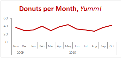
We make charts with date axis all the time. So, today we will learn how to set up axis settings in Excel so that Months & Years are shown neatly structured without cluttering your chart. See the example next to understand.
Continue »August 2010 – Best Month Ever (and 2 charting tips inside)

Time to stop everything we do and celebrate, for, our little community at chandoo.org had the most fantastic, awesome month ever.
That is right. August 2010 has been the best month since I started chandoo.org. We have broken a majority of previous records in terms of conversations, connections, content and revenues.
In August, we had 17 posts, with 604 comments. We had 178,000 visitors reading 453,000 pages. Our RSS subscriber base grew to 11,917 (it was 5738 an year ago). August has been the best month in-terms of revenues too. We sold highest number of project management templates & excel formula e-books since launch. We had a stellar launch for wedding planner with 22 customers.
Read rest of this post to find statistics about chandoo.org and get 2 charting tips.
Continue »Gantt Box Chart Tutorial & Template – Download and Try today

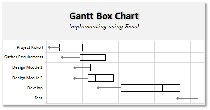
On Firday, we proposed a new chart for showing project plans. I chose an ugly name for it and called it Gantt Box Chart. Essentially, a gantt box chart is what you get when a gantt chart and box plot go to a bar, get drunk and decide to make out. It shows the project […]
Continue »Flu Trends Chart in Excel [Yes, we can edition]
![Flu Trends Chart in Excel [Yes, we can edition]](https://chandoo.org/img/p/flu-trends-chart-final-th.png)
Last week I have reviewed Google’s flu trends chart and told you that is it is very well made. Out of curiosity I made a similar chart in Excel. In this post, I am going to share the experience and results with you. Interested? Read on…
Continue »![Fix this chart [excel homework #1]](https://chandoo.org/img/cb/axis-mixup-chart-fix.gif)
This column chart shows daily, weekly or monthly data depending on the user’s choice. In daily the columns are displayed properly, but in weekly & monthly mode the columns are a fraction of the width they should be – why, and how can this be avoided? Bonus points if you can describe how to use an INDIRECT formula on the x-axis labels which is another problem. Go fix it.
Continue »

