All articles with 'data visualization' Tag
When & how to use the 30+ chart types in Power BI?

Power BI has a LOT of chart types. So, when & how to use these charts in data analysis situations? In this article, let me share my top tips for picking and using the right chart type for your needs.
Continue »
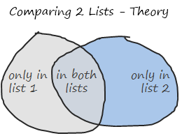
Comparison of lists of data is something that we do all the time. Today, lets learn a few tricks that you can apply immediately to compare 2 lists using Excel. This post discusses how to compare two lists with formula based rules. If you just want to quickly highlight common values, click here. If you […]
Continue »Bonavista Chart Tamer Kicks ass.

Over the last few days I have been using Bonavista Chart Tamer tool and I found it pretty neat. Read my review of this wonderful tool.
Continue »What is Your Opinion on Pie Charts?

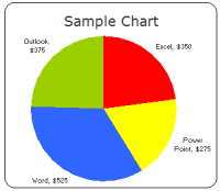
Pie charts are one of the most used charts in the world. And for obvious reasons: they are simple to create and easy to understand. When it comes to pie chart, I have no clear opinion. Part of me says use them, the other says avoid them.
What is your opinion on Pie charts ?
Continue »A Good Bubble Chart About the Bust

Checkout this very neatly done “where did all the money go?” data visualization on Guardian, and share your opinion.
Continue »Professional Resume or Data Visualization Fail? [poll]
![Professional Resume or Data Visualization Fail? [poll]](https://chandoo.org/img/c/data-visualization-resume.png)
Michael Anderson, a web designer has posted this delicious looking visual resume. While the resume looks stunning at a glance, a closer inspection reveals that you cant really make any valuable conclusions about Michael’s past experience and qualifications. Of course if the purpose of this resume is to show that he is a fabulous designer, then the resume definitely achieved that.
What is your opinion on this type of resume data visualizations ?


