All articles with 'Cool Infographics & Data Visualizations' Tag
Analyzing 20,000 Comments

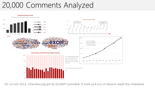
On 14th July, evening 4:51 PM (GMT), Chandoo.org received its 20,000th comment. 20,000!
The lucky commenter was Ishav Arora, who chimed, “Like super computers…Excel is a super calculator!!!!” in our recent poll.
It took us 8 years & 15 days since the very first comment to get here. And it took just 1 year 7 months & 23 days to add the last 10,000 comments (we had our 10,000th comment on 21st November, 2010).
Out of curiosity, I wanted to understand more about these 20,000 comments. So I downloaded our comment database, dumped it in Excel and start analyzing.
Continue »August 2010 – Best Month Ever (and 2 charting tips inside)

Time to stop everything we do and celebrate, for, our little community at chandoo.org had the most fantastic, awesome month ever.
That is right. August 2010 has been the best month since I started chandoo.org. We have broken a majority of previous records in terms of conversations, connections, content and revenues.
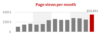
In August, we had 17 posts, with 604 comments. We had 178,000 visitors reading 453,000 pages. Our RSS subscriber base grew to 11,917 (it was 5738 an year ago). August has been the best month in-terms of revenues too. We sold highest number of project management templates & excel formula e-books since launch. We had a stellar launch for wedding planner with 22 customers.
Read rest of this post to find statistics about chandoo.org and get 2 charting tips.
Continue »Immigrants in Denmark – An Excel Infographic

Faheem (@FaheemH) from Denmark sent me this beautiful infographic depicting various facts about Immigrants in Denmark. Immigrants in Denmark – Excel Infographic: [view high res] How is this Info-graphic made? Faheem used a variety of tricks to create this infographic. Some of the key ideas are, Using text boxes and drawing shapes Using bar charts […]
Continue »Sachin Tendulkar ODI Stats – an Excel Info-graphic Poster

Sachin Tendulkar is undoubtedly the best cricketers to play One Day International Cricket. He is a source of inspiration and joy for me and many others. So, naturally I was jumping with joy when I heard that he scored the highest ever runs in a single match on 24th of Feb. He scored 200 runs […]
Continue »Best Month Ever (and a charting tip inside)

Let us take a minute and bask in some glory, for, our little community at PHD had the most fantastic month ever. That is right, January 2010 is so far the best month since I started blogging. We have broken all sorts of previous records on content, conversations, connections, traffic and revenue. In January, we […]
Continue »Flu Trends in a City chart from Google is Awesome!

There is nothing awesome about flu. In fact, it is anti-awesome if you have flu. I have been fortunate enough not to get it ever (it is another story that I have cold almost 364 days of an year).
Don’t worry if you are afraid of it, Folks at Google are not letting you down. They are using google search terms to predict flu trends and present the information in a beautiful chart.
Today I want to tell you why this particular chart on flu trends made by Google is awesome…
Continue »Dashboard Best Practice – Google Analytics Intelligence Report

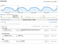
Yesterday while checking my website analytics reports on Google analytics site, I have noticed a new beta feature called “Intelligence”. Out of curiosity I clicked on it. It took me to a an intelligence alert dashboard. Ok, lets just back up for a minute and understand what “intelligence dashboard” is before moving on. In the […]
Continue »Visualization Lessons from Eiffel Tower [Chartbusters in Paris]
![Visualization Lessons from Eiffel Tower [Chartbusters in Paris]](https://chandoo.org/img/cb/eiffel-tower-visualization-lessons.png)
Ever since I was a child, I was fascinated by Paris (and Eiffel Tower). Recently, I had opportunity to visit Paris, albeit for just a few hours (I had a 12 hour lay-over in Paris between flights). I went to see the Eiffel Tower and it looked just as beautiful and majestic as it did in my imaginations.
During my visit to Eiffel tower, I took the stairs to 2nd floor and along the way they have a handful of visualizations explaining the tower. I found them quite interesting and well made. Here, I have listed down 4 simple, yet very effective visualization lessons for all of us.
Continue »Nightmarish Pie Charts [because it is weekend]
![Nightmarish Pie Charts [because it is weekend]](https://chandoo.org/img/cb/pie-chart-on-piecharts.png)
Nothing like a weekend making fun of something worthless. So we will pick on some of the plump, overloaded and visually disgusting pie charts featured on various extremely popular websites. As a bonus, you get to see my hand-drawn pie chart on the usage of pie charts.
Continue »Are you excited about this twitter chart?

In this ironically titled “Let’s not get too excited” chart, David shows us how the twitter community is divided. Can you guess what is wrong with this chart?
Continue »14 Basic Skills for Chart Makers (Big question: How many do you have?)
Blame John Walkenbach if you don’t like this post. There, I said it. He started the 14 basic skills for men. And then added 14 basic skills for women. Not stopping there, he went ahead and added 14 basic skills for dogs. Debra at Contextures blog added her 14 cents by writing 14 basic skills for excel users.
I got jittery and quickly searched 14 basic skills for people writing 14 basic skills posts on google. Alas! nothing found. But being the inveterate non-give-upper I went ahead and prepared my list.
<drum roll> here is the,
14 basic skills for people making charts (or graphs or plots or ok, you get the point)


