All articles with 'charts' Tag
Dynamic Dashboard in Excel – Pulling it all together [Part 4 of 4]
![Dynamic Dashboard in Excel – Pulling it all together [Part 4 of 4]](https://chandoo.org/img/ed/excel-dynamic-dashboard-final-th.png)
In the last installment of our dynamic dashboard tutorial, we will take all that we have learned in first 3 parts and combine that to create a final dashboard. We are going to use concepts like table of contents, macros and data validation to help us get ahead. You can find the entire macro and downloadable workbook inside the post. Read on…
Continue »Making a Dynamic Dashboard in Excel [Part 3 of 4]
![Making a Dynamic Dashboard in Excel [Part 3 of 4]](https://chandoo.org/img/ed/moving-objects-with-vba.gif)
In this post we are going to look at a simple example of the VBA behind the Dynamic Dashboard. Essentially we will learn to write macros for doing this. Read the rest of this post to find code samples and downloadable files to play with.
Continue »![Making a Dynamic Dashboard in Excel [Part 1 of 4]](https://chandoo.org/img/ed/excel-dynamic-dashboard-final-th.png)
In this and next 3 posts, we will learn how to make a Dynamic Dashboard using Microsoft Excel.
At the end of this tutorial, you will learn how easy it is to set up a dynamic dashboard using excel formulas and simple VBA macros.
Continue »Best Month Ever (and a charting tip inside)

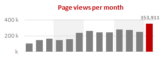
Let us take a minute and bask in some glory, for, our little community at PHD had the most fantastic month ever. That is right, January 2010 is so far the best month since I started blogging. We have broken all sorts of previous records on content, conversations, connections, traffic and revenue. In January, we […]
Continue »Use “Playbill” font to make your incell charts realistic [quick-tips]
![Use “Playbill” font to make your incell charts realistic [quick-tips]](https://img.chandoo.org/c/use-playbill-font-incell-charts.png)
Most of you already know that using the REPT formula along with pipe (“|”) symbol, we can make simple in-cell charts in excel. For eg. =REPT(“|”,10) looks like a bar chart of width 10. Despite the simplicity, most people don’t use in-cell charts because these charts don’t look anything like their counterparts. But you can […]
Continue »Product Recommendation – Excel Dashboard Training Kit

If you want to make better charts and create lasting impressions, chances are you have heard about Jorge Camoes. He writes at excelcharts.com (previously charts.jorgecamoes.com). I have been reading Jorge’s blog for over 2 years now and have linked to his excellent articles on PHD several times. Jorge also has an Excel Dashboard Training Kit, which teaches us how to make a dynamic and comprehensive excel dashboard. The dashboard training kit is a culmination most of his lessons implemented in a practical way using Excel.
In this article, I review the product and tell you why you should get a copy of it.
Continue »Best Charts to Compare Actual Values with Targets – What is your take?

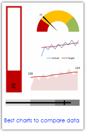
Comparing values is one of the main reasons we make charts. Yesterday we have a post on using thermometer charts to quickly compare actual values with targets. Today we follow up the post with 10 charting ideas you can use to compare actual values with targets. Check out how bullet charts, thermometer charts, traffic lights, gauges, column charts, area charts can help you compare targets with actual performances. A review of best charting options when you need to compare.
Read the rest of the post to see the options and participate in poll.
Continue »2 Great Pieces of Advice for Chart Makers, Dashboard Designers and Story Tellers Everywhere
The worldwide web is a wonderful place. I am constantly amazed by the simple yet very effective stuff we can learn by just reading. Today I want to share with you two very great pieces of advice: Seth Godin’s 4 Simple Principles for making effective graphs: Seth Godin is probably one of the most remarkable, […]
Continue »![Gantt Charts – Project Management Using Excel [Part 1 of 6]](https://chandoo.org/img/pm/gantt-chart-project-plan-thumb.png)
This is a 6 part tutorial on project management using microsoft excel. These posts represent few of the things related to project management using excel that I have learned over the years. The first installment deals with Preparing & tracking a project plan using Gantt Charts in MS Excel.
The other parts I am planning are, Day to day operations – using to do lists, Preparing a project time line, Time sheets and Resource management, Tracking issues and risks, Project Status Reporting – Dashboard.
Read the first part of the article to learn how to make excel gantt charts / project plans.
Continue »Tweetboard Implementations – Download and make your twitter style dashboard today

Check out two fabulous implementations of tweetboards in excel. Download the workbooks and play with them yourself. Thanks Fernando and Lee for sharing these workbooks with us.
Continue »Web Analytics Dashboard by Percent Mobile is Fun [Dashboard Reviews]
![Web Analytics Dashboard by Percent Mobile is Fun [Dashboard Reviews]](https://i287.photobucket.com/albums/ll133/pointy-haired-dilbert/web-analytics-dashboard-th.png)
Take a look at the web analytics dashboard from percent mobile. It is well executed and provides good quality information at a glance.
Continue »Ads that are also Infographics – 10 Dazzling Examples

Advertisements and info-graphics can excite us a lot by their sheer ability to tell a story convincingly. What happens when you combine both? The results are dazzling… don’t believe me? Checkout these examples: Heineken Beer – How to get a girl in the bar – Flow chart Evening College from 5 – 10 PM – […]
Continue »Here is a quick round up of excel posts from few of the awe some blogs around the web: At PTS Blog, Jon provides excellent tutorial on adding target lines to your bar charts to show target vs. actual performance. He has several other tweaks for your category axis as well, just read the other […]
Continue »Excel Bullet Graphs

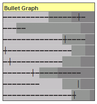
Bullet graphs provide an effective way to dashboard target vs. actual performance data, the bread and butter of corporate analytics. Howmuchever effective they are, the sad truth is there is no one easy way to do them in excel. I have prepared a short tutorial that can make you a dashboard ninja without writing extensive […]
Continue »Environmental Graffiti should get the award for “worst possible bar chart ever” for this unbelievable piece of art… Who said bar charts are only for serious data interpretation, they can be used to have such fun 🙂 Also read Garr Reynold’s comments on this as well. Happy Thursday.. 🙂
Continue »

