All articles with 'charting' Tag
Excel Tips Submitted by You [Part 1]
The first installment of “your week @ PHD” features 4 excel tips shared by our readers: (1) A macro to unhide all sheets (2) a KPI Dashboard with VBA and Charts (3) Using Excel’s Find to Save time at work (4) An Array Formula to Solve a Tricky Problem.
Continue »
That is right. Next week is your week on this blog. I will post content that is shared by you. So go ahead and share your tips and tricks with us. Read more to find out how you can share your tips with the community.
Continue »Tweetboards – Alternative to traditional management dashboards
Here is a fun, simple and different alternative to traditional dashboards. Introducing….
Bonavista Chart Tamer Kicks ass.

Over the last few days I have been using Bonavista Chart Tamer tool and I found it pretty neat. Read my review of this wonderful tool.
Continue »Analyzing Search Keywords using Excel : Array Formulas in Real Life
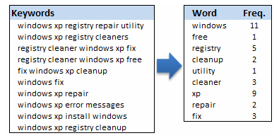
Jarad asks me in an email “how word frequency can be generated from a range of cells using excel formulas?” This got me thinking and lead to this post, where we learn how to calculate word frequency using array formulas and use it to analyze a bunch of search keywords.
Continue »Excel Links of the Week – What is really happening Edition
In this week’s excel links learn how to lookup in 2 columns, a cool charting hack using which you can depict uncertainty in predictions, an excel template that can be used to visualize social networks and much more.
Continue »The winner for our first visualization contest is decided. Curious? Read on…
Continue »Do you want to make a budget vs. actual performance chart but not sure what option to use? Check out these 14 excel charting alternatives and find the one that tells your story.
Continue »Our interview with John Walkenbach is here. Check it out and see what John has to say about Excel, spreadsheets and fun.
Continue »Here is your chance to win a copy of The Visual Display of Quantitative Information by Edward Tufte, all you need to do is visualize budget vs. actual performance of the given data. Go!
Continue »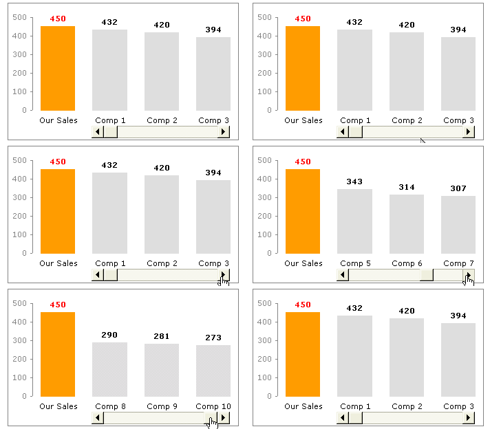
Today we will learn a little trick to compare 1 value with a set of values, For eg. our sales vs. competitor sales. We will learn how to create a chart like this.
Continue »RSS Icon using Donut Charts – Because it is Weekend
RSS Icon using Donut Charts – Because it is Weekend
Continue »Japanese Candlestick Chart – Excel Tutorial
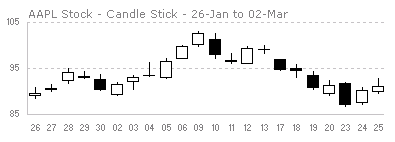
Japanese Candlestick Chart or Candlestick Chart as they are popularly known are one of the most commonly used stock charts.Today we will learn how to make a candlestick chart in Microsoft Excel in 4 simple steps.
Continue »How Many Bubbles are Too Many Bubbles?
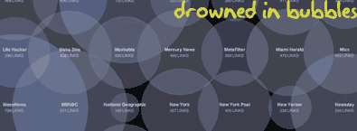
In How Many Links are Too Many Links, O’Reilly radar shows us this unfortunate bubble chart. Read the rest to see why the chart is unfortunate.
Continue »Market Segmentation Charts using Conditional Formatting
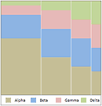
Trust Peltier to come up with solutions for even the most impossible looking charts. Today he shares a marimekko chart tutorial. I couldn’t sit still after seeing his post. So here comes market segmentation charts or marimekko charts using,


