All articles with 'bubble charts' Tag
Happy Diwali [Animated Chart inside]
![Happy Diwali [Animated Chart inside]](https://img.chandoo.org/c/animated-diwali-chart-in-excel.png)
My heartiest Diwali wishes to all our readers.
The spirit of Diwali is to encourage people to spread joy, celebrate good things and throw away darkness (evil). These ideas are universal. So let me wish you a very happy Diwali.
Diwali, festival of lights, is celebrated in the month of October / November. It is one of my favorite festivals since childhood. A time when all family members get together, celebrate all the good in their life, laugh and light a few fire crackers (fire works).
This year, our kids (Nishanth & Nakshatra) too are excited about the festival. They are eager to light diyas (small lamps), watch the fire works and enjoy. Naturally I do not feel like opening Excel.
But then…,
Sometime during my morning coffee, I thought “hey, why not create a small Diwali greeting using Excel?”
So here we go.
Continue »Growing a Money Mustache using Excel [for fun]
Mustache and Excel?!? Sounds as unlikely as 3D pie charts & Peltier. But I have a story to tell. So grab a cup of coffee and follow me.
Today, lets talk about how to construct a dynamic chart that can show us how much progress we have made against a financial goal (in this case, accumulating a big chunk of money). I call this growing mustache chart, inspired from the wonderful Mr. Money Mustache.
Continue »Make a Bubble Chart in Excel [15 second tutorial]
![Make a Bubble Chart in Excel [15 second tutorial]](https://chandoo.org/img/l/bubble-chart-excel-tutorial.png)
A Bubble chart displays circles (or bubbles) at given X and Y co-ordinates. Bubble chart is a very good way to show 3 dimensional data (for eg. Region-wise product sales) without confusing users. In this tutorial, we will learn how to create a bubble chart using excel.
Continue »Charting Lessons from Optical Illusions

The other day while doing aimless roaming on the dotcom alley, I have seen some cool optical illusions. There are so many valuable lessons optical illusions can teach us – chart makers. Don’t believe me? Look at the bubble chart illusion on the left and tell me which orange circle is bigger? What is your answer? Right or left. Well, my friend, the answer is both are of same size. Read the rest of this post to find some cool optical illusions and what they can teach us – chart makers.
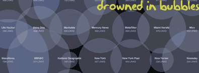
Continue »How Many Bubbles are Too Many Bubbles?

In How Many Links are Too Many Links, O’Reilly radar shows us this unfortunate bubble chart. Read the rest to see why the chart is unfortunate.
Continue »
9 charting tricks you can use to make your pie charts likable
Continue »If your reports include hourly distribution of data like, Customer footfalls in your store Page views of your site Customer service calls to your toll free numbers here is an interesting charting idea to show the data around the clock (literally) Update: Visualization pros Jon Peltier and Jorge Camoes took a critical look at this, […]
Continue »

