All articles with 'bar charts' Tag
Waterfall Charts using Excel

Learn how to create waterfall charts in Excel in this tutorial. Our guest author, Aaron, explains how to create cool looking waterfall charts with connectors. Waterfall charts are great, especially for visually showing the contribution of parts to a whole.
Continue »Charting Lessons from Optical Illusions

The other day while doing aimless roaming on the dotcom alley, I have seen some cool optical illusions. There are so many valuable lessons optical illusions can teach us – chart makers. Don’t believe me? Look at the bubble chart illusion on the left and tell me which orange circle is bigger? What is your answer? Right or left. Well, my friend, the answer is both are of same size. Read the rest of this post to find some cool optical illusions and what they can teach us – chart makers.
Continue »Use burn down Charts in your project management reports [bonus post]
![Use burn down Charts in your project management reports [bonus post]](https://chandoo.org/img/pm/burn-down-chart.png)
A burn down chart is a good way to understand the progress of a project. It is like a run chart that describes work left to do versus time. In this tutorial we will learn how to make a burn down chart using excel. This is a bonus installment to the project management using excel series.
Continue »![Project Management: Show Milestones in a Timeline [Part 3 of 6]](https://chandoo.org/img/pm/project-timeline-chart-excel-th.png)
Learn how to create a timeline chart in excel to display the progress of your project. Timelines are a good way to communicate about the project status to new team members and stake holders. Also, download the excel timeline chart template and make your own timeline charts.
Continue »![Fix this chart [excel homework #1]](https://chandoo.org/img/cb/axis-mixup-chart-fix.gif)
This column chart shows daily, weekly or monthly data depending on the user’s choice. In daily the columns are displayed properly, but in weekly & monthly mode the columns are a fraction of the width they should be – why, and how can this be avoided? Bonus points if you can describe how to use an INDIRECT formula on the x-axis labels which is another problem. Go fix it.
Continue »Asset Allocation Chart Turns Zombie [ChartBusters #1]
![Asset Allocation Chart Turns Zombie [ChartBusters #1]](https://chandoo.org/img/cb/bad-asset-allocation-chart-donut.png)
In this installment we take a look at Asset Allocation Chart that looks like it is hexed. Our reader DMurphy submitted this.
Continue »Bonavista Chart Tamer Kicks ass.

Over the last few days I have been using Bonavista Chart Tamer tool and I found it pretty neat. Read my review of this wonderful tool.
Continue »Web Analytics Dashboard by Percent Mobile is Fun [Dashboard Reviews]
![Web Analytics Dashboard by Percent Mobile is Fun [Dashboard Reviews]](https://i287.photobucket.com/albums/ll133/pointy-haired-dilbert/web-analytics-dashboard-th.png)
Take a look at the web analytics dashboard from percent mobile. It is well executed and provides good quality information at a glance.
Continue »Do you want to make a budget vs. actual performance chart but not sure what option to use? Check out these 14 excel charting alternatives and find the one that tells your story.
Continue »How Many Bubbles are Too Many Bubbles?

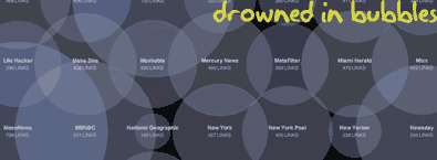
In How Many Links are Too Many Links, O’Reilly radar shows us this unfortunate bubble chart. Read the rest to see why the chart is unfortunate.
Continue »
This week, check out the updated excel downloads page and 5 interesting excel articles from around the web. Read more to learn about a mouse trick to paste values, how you can tweet from excel using user forms, an intuitive charting principle and more.
Continue »Review of PTS Clustered Stack Chart

My Friend and long time Microsoft Excel MVP, Jon Peltier has released a wonderful little excel charting utility called Cluster Stack Chart Utility. Out of curiosity I have mailed Jon and asked him if he could send me a copy of it so that I can review the product and recommend it to PHD reader community. He is kind enough to mail the add-in to me and here goes my review of the tool.
Continue »Do you know how to KISS, Wall Street Journal Does!

Do you know the “KISS” principle of chart design ?
Continue »[Reader Poll] Stacked, Seperated or Mirrored ?
![[Reader Poll] Stacked, Seperated or Mirrored ?](https://chandoo.org/img/a/bar-charts-ways-to-stack.gif)
Stacked bar charts are a popular way to depict 2 more series of related data, like sales of 2 products.But there are several ways to stack the bars in a bar chart. Here is a list of 6 ways to stack them
Continue »
9 charting tricks you can use to make your pie charts likable
Continue »

