All articles with 'advanced excel' Tag
What is Power Pivot – an Introduction [video]
![What is Power Pivot – an Introduction [video]](https://img.chandoo.org/power-pivot/introduction-to-power-pivot-excel.png)
Today, lets talk about Power Pivot & understand it.
What is Power Pivot?
Power Pivot is an Excel add-in to connect, analyze & visualize massive amounts of data..
Lets take a closer look at the definition.
Connect: You can use multiple tables of data & set up relationships between them using Power Pivot. For example, you can connect customer details to sales transactions so that you can summarize sales by customer location or gender easily.
Analyze: You can create simple pivot table style reports or create something exceedingly complex by defining your own calculated fields for values area of the pivot. There is a whole set of formulas defined for exactly this purpose, called as DAX formulas.
Visualize: Instantly filter your reports using slicers, time lines (Excel 2013 or above only), conditional formats, pivot charts etc. You can even define KPIs and see the performance in bands.
Massive Amounts of Data: Although your typical Excel worksheet contains a million rows, if you tried to load even half of those with any data, Excel would quickly become slow & lazy. Power Pivot can take a million rows for breakfast and would be hungry for more. It can processes millions of rows of data very quickly and easily, all from the comfort of a standard desktop or laptop.
Continue »
Few weeks ago, someone asked me “What are the top 10 formulas?” That got me thinking.
While each of us have our own list of favorite, most frequently used formulas, there is no standard list of top 10 formulas for everyone. So, today let me attempt that.
If you want to become a data or business analyst then you must develop good understanding of Excel formulas & become fluent in them.
A good analyst should be familiar with below 10 formulas to begin with.
Continue »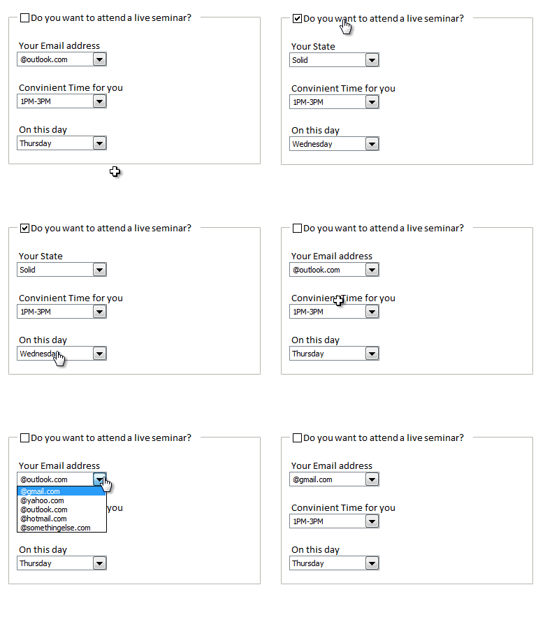
Rama, one of our readers emailed this:
I Have Many List boxes In That I need to Hide Few Of them Using Check box
Show Hide list boxes by using a check box
We can use check box and a bit of VBA to do this easily. Something like above demo.
Read on to learn how to do this using Excel & VBA.
Continue »Extract data using Advanced Filter and VBA

In this post we will learn how to use the Advanced Filter option using VBA to allow us to filter our data on a separate sheet. This has been requested by a lot of our readers and here is how we will use them.
Continue »Happy Diwali [Animated Chart inside]
![Happy Diwali [Animated Chart inside]](https://img.chandoo.org/c/animated-diwali-chart-in-excel.png)
My heartiest Diwali wishes to all our readers.
The spirit of Diwali is to encourage people to spread joy, celebrate good things and throw away darkness (evil). These ideas are universal. So let me wish you a very happy Diwali.
Diwali, festival of lights, is celebrated in the month of October / November. It is one of my favorite festivals since childhood. A time when all family members get together, celebrate all the good in their life, laugh and light a few fire crackers (fire works).
This year, our kids (Nishanth & Nakshatra) too are excited about the festival. They are eager to light diyas (small lamps), watch the fire works and enjoy. Naturally I do not feel like opening Excel.
But then…,
Sometime during my morning coffee, I thought “hey, why not create a small Diwali greeting using Excel?”
So here we go.
Continue »Show monthly values & % changes in one pivot table
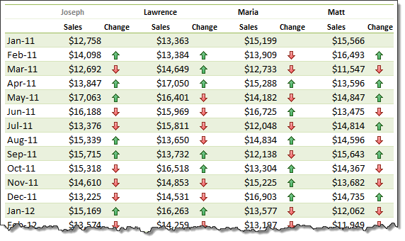
Pivot tables are great help when analyzing lots of data. One of the common questions managers & analysts ask (when looking at monthly sales data for example) is,
How is the monthly performance of our teams (or regions, products etc.)?
A pivot report can answer this question in a snap. Today lets learn how to do that.
Continue »Extract file name from full path using formulas
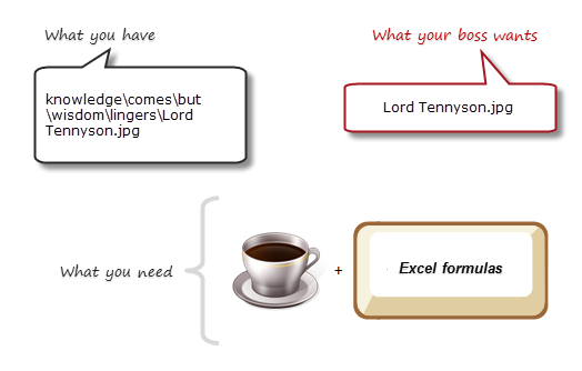
Today lets tackle a very familiar problem. You have a bunch of very long, complicated file names & paths. Your boss wants a list of files extracted from these paths, like below:
Of course nothing is impossible. You just need correct ingredients. I cannot help you with a strong cup of coffee, so go and get it. I will wait…
Back already? well, lets start the formula magic then.
Continue »
Your the production manager and have a need to schedule uneven resource across uneven requirements, how can you do that?
Well today we’ll look at Resource Allocation and Scheduling using Excel to do the hard work
Moosa, one of our readers emailed this interesting question:
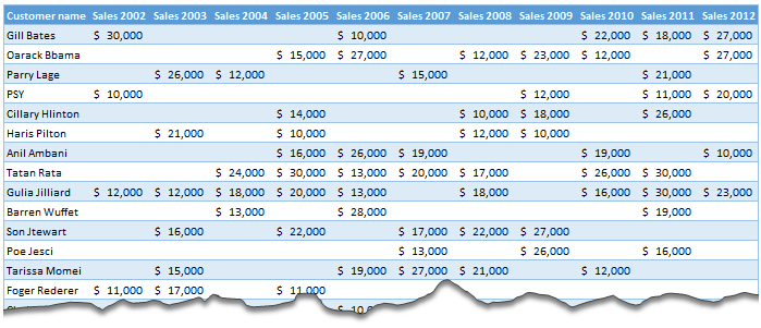
I have huge list of customers (around 1500).
Table includes following information
Customer # , Customer Name, Sales 2002, sales 2003, … sales 2012My requirements are
1. list of customer who did not have sales during all these years
2. List of customer who have not business from 2003
3. List of customer who have not business from 2004
Today, lets learn how to identify all the non-performing customers.
Continue »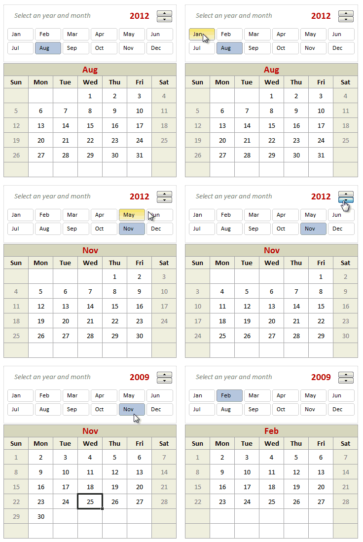
Can we make a calendar using Pivot Tables?!? Of course we can. Today let us learn a simple technique to create calendar style reports using Pivot tables. Thanks to Rob for inspiration Before making any progress, let me thank Rob from PowerPivotPro for the inspiration. Recently he wrote an article explaining how to use PowerPivot […]
Continue »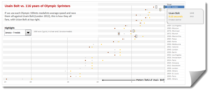
During London 2012 Olympics, Usain Bolt reached the 100mts finish line faster than anyone in just 9.63 seconds. Most of us would be still reading this paragraph before Mr. Bolt finished the race.
To put this in perspective, NY Times created a highly entertaining interactive visualization. Go ahead and check it out. I am sure you will love it.
So I wanted to create something similar in Excel. And here is what I came up with.
Continue »![Making your dashboards interactive [Dashboard Essentials]](https://img.chandoo.org/vp/grammy-bump-chart-replication-in-excel-demo.gif)
Everyone likes to be in control. Even my 2 year old daughter jumps with joy when she lays her hands on TV remote. She pushes the buttons and assumes it is working. It is another story that we rarely watch TV at home.
By adding an element of control, we can make our dashboard reports fun. Interactive elements like form controls, slicers etc. invite users to play with your dashboard, get involved and understand data by asking questions. That is why I recommend making dashboards interactive.
Today lets understand how you can make dashboards interactive.
Continue »How to make Box plots in Excel [Dashboard Essentials]
![How to make Box plots in Excel [Dashboard Essentials]](https://img.chandoo.org/dashboards/bp/box-plot-in-excel-how-to.png)
Whenever we deal with large amounts of data, one of the goals for analysis is, How is this data distributed?
This is where a Box plot can help. According to Wikipedia, a box plot is a convenient way of graphically depicting groups of numerical data through their five-number summaries: the smallest observation (sample minimum), lower quartile (Q1), median (Q2), upper quartile (Q3), and largest observation (sample maximum)
Today, let us learn how to create a box plot using MS Excel. You can also download the example workbook to play with static & interactive versions of box plots.
Continue »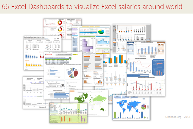
Ladies & gentleman, put on your helmets. This is going to be mind-blowingly awesome.
See how many different ways are there to analyze Excel salary data. Look at these 66 fantastic, beautifully crafted dashboards and learn how to one up your dashboard awesomeness quotient.
Continue »Visualizing Roger Federer’s 7th Wimbledon Win in Excel
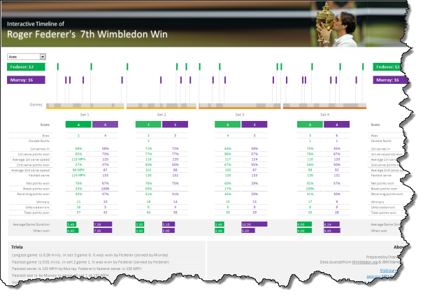
Did I tell you I love tennis? Some of my personal heroes & motivators are tennis players. And as you can guess, I admire Roger Federer. Watching him play inspires me to achieve more. So last night when he lifted Wimbledon trophy for 7th time, I wanted to celebrate the victory too, in my style. So I made an interactive timeline chart in Excel depicting his victory.
Continue »

