Over the weekend I spent some time to update the Excel Dashboards page. It now features more articles, downloads and resources for those of you making Excel Dashboards. Go ahead and check out the page here and let me know your feedback.
Moving on to this weeks excel and charting links worth checking.
Continue »![What is the most embarrassing charting mistake you made? [weekend poll]](https://chandoo.org/wp/wp-content/uploads/2008/10/making-sports-dashboards-in-excel-sml.png)
This week’s poll is very simple. What is the the most embarrassing charting mistake your made?
For me it has to be that one time when I made a sports dashboard using excel. I have adjusted the axis scale of a bar chart so that my favorite cricket player (Sachin Tendulkar, who else?)’s records are emphasized. In a matter of minutes I have received several comments from all over world pointing out the mistake. Even though, the intention was to highlight the achievements of master blaster, the axis adjustment was obviously a mistake.
Continue »Aravind (@arvindnatarajan on twitter) who works at Zoho emailed me earlier today and asked if Zoho Reports – Online Reporting and Business Intelligence Service, can sponsor our visualization challenge #2.
Continue »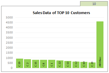
Two charting principles we hear all the time are,
- Sort your data in a meaningful order before plotting it.
- Show only relevant information, not everything – because un-necessary information clutters the chart.
Today we will learn a dynamic charting technique that will mix these two ideas in a useful way. I call this a Top X chart.
Continue »![Chart this Sales Data and get an iPod Touch [Visualization Challenge #2]](https://chandoo.org/img/cb/ipod-touch-8gb.png)
Here is a challenge many people face. How to make a chart visualizing sales data with several dimensions like product, brand, region, sales person name, year (or month or quarter) and one or two values like sales, # of units sold, profits, # of new customers.
In visualization challenge #2, all you have to do is a make a chart or dashboard to visualize this sales data effectively.
Continue »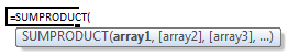
Today we will learn a new and exciting excel formula – the all powerful SUMPRODUCT.
At the outset SUMPRODUCT formula may not seem like all that useful. But once you understand how excel works with lists (or arrays) of data, the SUMPRODUCT’s relevance becomes crystal clear.
Continue »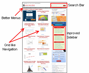
Folks, I have an announcement for you. Our little site, Pointy Haired Dilbert got yet another face lift. Over the weekend, I have made some changes to the site layout and navigation to make it better. The key changes are, On archive pages (that is category, tag and monthly pages) you can see 15 posts […]
Continue »
