fbpx
Search
Close this search box.

Welcome to Chandoo.org.
My mission is to make you AWESOME in your work.

Hello, Namaste & Kia Ora. Welcome to Chandoo.org. 

My name is Chandoo. My mission is to make you awesome in Excel and Power BI.
I do this by sharing Excel & Power BI tutorials, examples, tips, videos and articles on this website. I live in Wellington, New Zealand with my beautiful wife Jo & our twins Nishanth & Nakshatra. Take a minute to browse various topics of the site to see how I can help you.

Thank you and welcome.

CP022: What’s a Macro? Introduction to Excel VBA, Macros & Automation

In the 22nd session of Chandoo.org podcast, lets do some macros.

What is in this session?

VBA (or macros, automation) is a mystery for many of us. So in this podcast, lets unravel the mystery behind it and get you started with the awesome world of automation.

In this podcast, you will learn,

  • What is a macro?
  • What is VBA then?
  • Reasons for using VBA Macros
    • Automation
    • Extending Excel’s capabilities
    • Efficiency
    • Applications
  • How to get started with VBA Macros?
  • Using Recorder
  • Example Macro
  • Going beyond recorder – Learning VBA
Read This »

A better chart to visualize “Best places to live” – Top 100 cities comparison Excel chart

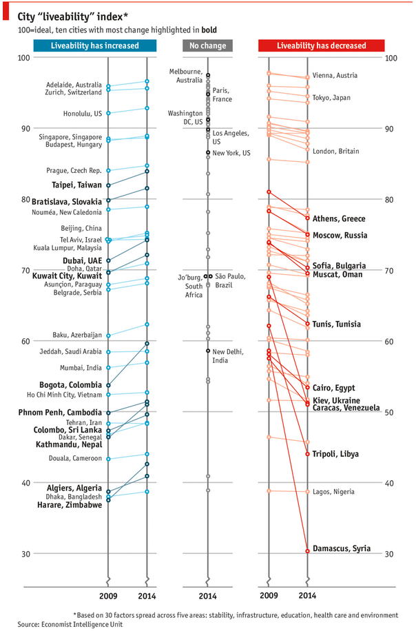
Recently, I saw this chart on Economist website.

It is trying to depict how various cities rank on livability index and how they compare to previous ranking (2014 vs 2009).

Best cities to live - Chart from Economist.com

As you can see, this chart is not the best way to visualize “Best places to live”.

Few reasons why,

  • The segregated views (blue, gray & red) make it hard to look for a specific city or region
  • The zig-zag lines look good, but incredibly hard to understand % changes (or absolute changes)
  • Labels are all over the place, thus making data interpretation hard.
  • Some points have no labels (or ambiguous labels) leading to further confusion.

After examining the chart long & hard, I got thinking.

Its no fun criticizing someones work. Creating a better chart from this data, now thats awesome.

Read This »

Charmed Price Problem

Here is a charming little problem to kick start your day.

Lets say you run a cute little bakery around the corner. Since you want your prices to look charming, you have a policy to round them down or up based on below rule.

If the price ends with 0, 1 or 2 cents, round it down to 9 cents.

If the price ends with 3, 4 or 5 cents, round it up to 5 cents.

If the price ends with 6, 7, 8 or 9 cents, round it up to 9 cents.

For example,

So how do you round to nearest charmed price? You could do it manually. But you would rather bake a few more of those Tiny Cup Cakes than waste time rounding the prices. So you want an automatic way to round prices. This is where Excel helps.

Read This »

CP021: How to quickly compare 2 lists in Excel

In the 21st session of Chandoo.org podcast, lets compare lists. Quickly

What is in this session?

Comparing things is a favorite pastime for analysts all over the world. Sadly, it is also an area where we waste hours. So in this episode, I share my top secret comparison techniques to save you time.

Note: This is a short format podcast. That means you spend less time listening to it, while becoming more awesome.

In this podcast, you will learn,

  • Why I sound like I am on a secret mission at a mafia hideout.
  • 5 ways to compare 2 lists
    • Manual method
    • Conditional Formatting
    • Row Differences
    • LOOKUP formulas
    • COUNTIF formulas
  • Bonus tip: Removing duplicates
  • Conclusions
Read This »

ABC Inventory Analysis using Excel

ABC analysis is a popular technique to understand and categorize inventories. Imagine you are handling inventory at a plant that manufactures high-end super expensive cars. Each car requires several parts (4,693 to be exact) to assemble. Some of these parts are very costly (say few thousand dollars per part), while others are cheap (50 cents per part). So how do you make sure that your inventory tracking efforts are optimized so that you waste less time on 50 cent parts & spend more time on costly ones?

This is where ABC analysis helps.

We group the parts in to 3 classes.

  • Class A: High cost items. Very tight control & tracking.
  • Class B: Medium cost items. Tight control & moderate tracking.
  • Class C: Low cost items. No or little control & tracking.

Given a list of items (part numbers, unit costs & number of units needed for assembly), how do we automatically figure which class each item belongs to?

And how do we generate above ABC analysis chart from it?

Read This »

Drag to multi-select slicer items [quick tip]

Hola folks…

My trip to Houston & Dallas was very successful, fun & awesome. I got back home on Friday and instantly I am in another fun, awesome & happy place with my kids, Jo (my wife), rest of the family & friends.

Today, I want to share a very simple yet super awesome trick with you. I learned this from Augie, one of the Houston Masterclass participants.

You can drag slicer items to multi-select them.

Selecting multiple items in a slicer quickly

We know that slicers are powerful, friendly and fun way to filter the pivot tables, pivot charts, power pivot tables and regular tables (only in 2013). They are visual filters that can be used to instantly filter the data (or report). But when it comes to selecting multiple items, slicers can be hard. We must hold CTRL key and tap multiple slicer items one at a time to select them. At least that is how I used to do it.

Do you know we can drag to multi-select?

See this demo:

Read This »

CP020: Top 10 time saving strategies for business analysts

In the 20th session of Chandoo.org podcast, lets save some time.

What is in this session?

We all want to save time and stay productive. The obvious answer seems like using keyboard shortcuts. But they can only get you so far. So what about the real productive strategies? That is what we address in this podcast.

In this podcast, you will learn,

  • Announcements
  • 5 key areas of business analyst work – tracking, analysis, reporting, data management & modeling
  • Time saving strategies for tracking
  • for analysis
  • for reporting
  • for data management
  • for modeling
  • Conclusions
Read This »

Thank you, Houston meetup & Bonus tip

My mom will be very unhappy with this post. She always told me to focus on one thing at a time. But in this post we are talking about 3 things, not one. Sorry mom.

1. Thank you

I want to thank you for visiting chandoo.org & supporting us.

As I am about to leave to USA for attending Excelapalooza conference, I couldn’t help but be amazed at how much you have given me & my family. Almost 4.5 years ago, when I left my plush corporate job to work full time on Chandoo.org, I had no clue how the future will unfold. Today my heart is full of happiness, my family is secure, my site has grown by heaps and our community (especially you) is awesome.

Without your enthusiasm to learn and keen desire to become awesome, I would not have a job (of running this website). You inspire me to learn new things everyday so that I can share them with you.

Thank you for all the visits, clicks, comments, emails, tweets, likes, signups, purchases & love.

Thank you.

Read This »

Latest Video

Play Video

for more videos…

Learn Excel Step by Step

Everything from Power Query to Dashboards, Shortcuts to Formulas, Pivots to Charts in one course.

Topics

Power BI

Excel & Power BI for you

What people say about Chandoo.org

A relative told me about your website since I need help creating pivot tables, I learned how to do it in a matter of minutes thanks to your tutorial. Where have you been all of my excel troubled life, I look forward to viewing your videos on youtube as well as on your site. You are going to make me EXCELLENT at Excel!
Soulful Sista
Excel Sister
Hi Chandoo, I just want to say I really appreciate your Excel tutorials and all your hard work that it took to compile the huge library of content. Your site has helped me gain a better understanding of Excel which has helped me in my job. You are helping the world!
Felix H
Accountant
Throughout my life as an administrative assistant; your site has been invaluable to me. And now that I’m a recruiter; it’s still an amazing resource for when I need to teach someone something quickly. You are a friggin’ Rock Star!!! Thank you for everything you do.
Jason S
Recruiter

Courses for you

Excel School

Learn how to work with data, make calculations, pivots, create amazing charts and powerful dashboards from scratch using Excel School + Dashboards program. Suitable for analysts, managers or professionals who need to use Excel often.

VBA Classes

Use VBA to automate your tasks and build powerful spreadsheet based apps. In this course, learn all about how to program with VBA, how to use the language and object model to your advantage. Suitable for people who build a lot of things with Excel.

Power BI

Power BI, the newest technology from Microsoft is a game changer. You can build rich, interactive and informative displays for your audience using Power BI. In this course, learn all about Power BI, Power Query and Power Pivot and how to combine them to achieve awesome results.

=XLOOKUP(chandoo, on_social_media)