
In the 21st session of Chandoo.org podcast, lets compare lists. Quickly
What is in this session?
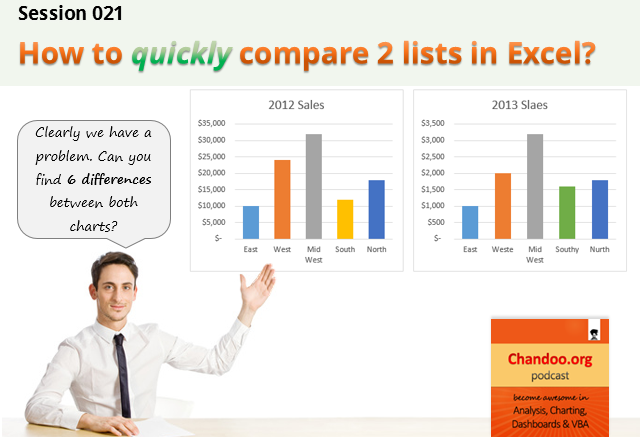
Comparing things is a favorite pastime for analysts all over the world. Sadly, it is also an area where we waste hours. So in this episode, I share my top secret comparison techniques to save you time.
Note: This is a short format podcast. That means you spend less time listening to it, while becoming more awesome.
In this podcast, you will learn,
- Why I sound like I am on a secret mission at a mafia hideout.
- 5 ways to compare 2 lists
- Manual method
- Conditional Formatting
- Row Differences
- LOOKUP formulas
- COUNTIF formulas
- Bonus tip: Removing duplicates
- Conclusions
Listen to this session
Podcast: Play in new window | Download
Subscribe: Apple Podcasts | Spotify | RSS
Links & Resources mentioned in this session:
Please go thru below links for example workbooks on each type of comparison.
- Comparing 2 lists in Excel using conditional formatting
- Comparing 2 lists using row differences
- Comparing 2 lists using various formula techniques
- Special case: Comparing 2 lists with conditions
- Special case: Comparing 2 lists of first & last names
- Special case: Compare 2 files side by side
- Removing duplicates in Excel
Transcript of this session:
Download this podcast transcript [PDF].
How do you compare? Tell us quickly
So how do you compare? My favorite methods are conditional formatting & COUNTIFS formulas. What about you? Please share your tips using comments.


14 Responses
I did not know about using row differences from the Goto Special. That is truly awesome. Thank you for sharing. I tend to compare two rows of dates and this is perfect, and way better than eye-strain.
To compare two lists showing differences I use
=ISNA(MATCH(A1,H:H,0)) in conditional format using formula
Column A been the list with the extra data and H been the column to compare
If I have two sets of data, I paste them underneath each other, give a criteria in a variable (e.g.: list 1, list 2). And then pull a pivot table over the whole dataset. Then you can compare both datasets on each criteria in your source data.
I have a tip to add: Using the Sort dialog box you can change the “Sort On” from sort by Values (which is the default) to sort by Cell Color, sort by Font Color or sort by Cell Icon.
So here is the awesome application: If you have many many rows and you need to check for duplicate entries in a column, of course you can apply conditional formatting. You still have the problem of scrolling through many many rows to look for the highlight color. But if you sort the data by the cell color or font color after applying conditional formatting, you can get all the duplicates to sort to the top!
Hi Chandoo
Please advise when we do use =+ formula in Excel???
How a Formula can Start with =+ and what is the use of this formula.
thanks
You could ask this in http://chandoo.org/forum/ where the probability of getting an answer is higher. Blog posts, in general, have limited audience.
Good topic! I recently also posted about data comparison on the Daily Dose of Excel at http://dailydoseofexcel.com/archives/2014/09/22/data-comparison-tricks/.
Here’s an array formula from that post for comparing two identically-sized lists. If they match cell-for-cell it returns TRUE:
=AND(A2:C10=E2:G10)
Hi Chandoo
Grt listening to your sessions. My favourite method of doing comparison of two data done with Vlookup in excel.
I do use the advanced filter to remove duplicates from the lists.
Hi Chandoo
Grt listening to your sessions. My favourite method of doing comparison of two data done with Vlookup in excel.
I do use the advanced filter to remove duplicates from the lists.
Hi Chandoo Sir,
This is srikanth from Andhra Pradesh,
I designed some vba projects in excels,
I 100% Google student,
Then I want a best job in vba, I seeing
For best package like 8 lakh per annum, I am ready to share my projects to you,
Pl suggest me if u have any jobs.
My contact no: 9948199009
My mail I’d : sri09948199009@gmail.com
Thanking you,
Hi Chandoo,
Thanks a lot for the wonderful blog. I got many useful stuffs from this blog. This blog is too good. One thing if possible try to add some tips on Microsoft Project (MSP), S-Curve etc for project management professional. It would be help full for us.
Here i required some help, i prepared an excel sheet which contain my project status like many activities( which are directly related to my project). I want to put automatic tick when one activities got completed and at same time the status must got changed. I tried through conditional formatting but i didn’t get the required result.
Can please guide me in this matter.
that is a good masterpiece
cool, many of my question hanging over me solve. thanks anyway
I have two lists of email addresses and I’m wanting to compare both lists and identify and duplicates. The only catch is the comparison is only the @companyname.com
Is this possible