
Excel table is a series of rows and columns with related data that is managed independently. Excel tables, (known as lists in Excel 2003) is a very powerful and super-cool feature that you must learn if your work involves handling tables of data.
What is an Excel table?
![]() Table is your way of telling excel, “look, all this data from A1 to E25 is related. The row 1 has table headers. Right now we just have 24 rows of data. But I can add more later!”
Table is your way of telling excel, “look, all this data from A1 to E25 is related. The row 1 has table headers. Right now we just have 24 rows of data. But I can add more later!”
When you make a table (more on this in a sec) you can easily add more rows to it without worrying about updating formula references, formatting options, filter settings etc. Excel will take care of everything thus making you a data guru.
How to create table from a bunch of data?
To create an excel table, all you have to do is select a range of cells and press the table button from Insert ribbon in Excel (or use the shortcut CTRL+T).
See this simple tutorial:

Today we will learn 10 excel data table tricks that will make you a data guru, no let’s make that DATA GURU.
The most important thing after you create a table – Give it a name
Once you have a table, go to design ribbon and give your table a name. If you don’t name it, Excel will call it Table2 or whatever. But once you name it, you can write meaningful formulas thru sweet sweet structural references feature. So name your tables.
1. Change table formatting without lifting a finger
Excel has some great predefined table formatting options. Just select any cell in your table and change the table formatting by going to “format as table” button in the home ribbon.

If you are bored with the predefined formats, you can easily define your own table formatting color schemes and apply them.
2. Add Zebra Lines to Tables without doing Donkey Work
When you create a table, zebra lines come as a bonus. And when you add new rows to the table, excel takes care of zebra lining or banding automatically. You can turn on / off the banded rows feature from “design ribbon tab” as well.

That means you don’t need to use conditional formatting or manually format alternative rows in different color.
3. Tables come with Data Filters and Sort Options by default
Each data table comes with filters and sorting options so that you can filter and sort the data in that table independently. That also means, if a worksheet has 2 tables, they each get their own data filters (usually excel wont allow you to add more than one set of filters per sheet, but when it comes to tables, all exceptions are made, just for you)

4. You can also Slice your tables with slicers
![]() That is right. When you have a table of data, you can insert a slicer (either from design ribbon or insert ribbon) and use that to filter your table data intuitively.
That is right. When you have a table of data, you can insert a slicer (either from design ribbon or insert ribbon) and use that to filter your table data intuitively.
Learn all about Excel Slicers.
5. Bye, bye cell references, welcome structured references
The most important advantage of tables is that, you can write meaningful looking formulas instead of using cell references. When you create and name the table (you can name the table from design tab), you can write formulas that look like this:
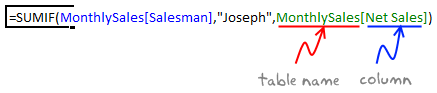
The beauty of structured references is that, when you add or remove rows, you don’t need to worry about updating the references.
Learn all about structural references in Excel.
6. Make Calculated Columns with ease
Any tabular data will have its share of calculated columns. Excel tables make having calculated columns very easy. With structured references, all you need to know is English to make a calculated column. The beauty of calculated columns in table is that, when you write formula in one cell, excel automatically fills the formula in the rest of cells in that column. That would make you an instant data guru.

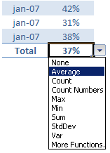
7. Total your Tables without writing one formula
 The ability to summarize data with pivot tables is extended to excel tables as well. You can add total row to your table with just a click.
What more, you can easily change the summary type from “sum” to say “average”.
8. Convert table back to a range, if you ever need to
If you ever wanted to go back to a normal range of data, you can easily convert the tables back to named ranges.
Excel will take care of the formulas and change the references to cell references.
9. Export Tables to Pivot Tables, Woohoo
What good is a bunch of data when you can’t analyze it? That is where Pivot tables come in to picture [pivot table tutorial]. Thankfully, you don’t need to do much. Just click a button and your table goes to pivot table.

10. Push the table data to Sharepoint Intranet Site
If you have a corporate intranet Sharepoint portal, you can easily publish the excel tables as share-point lists. This can be handy if you want to publish, say the top 10 sales persons of the quarter on the intranet.

11. Print Tables Alone, with out all the other stuff around

Select the table, hit CTRL+P and in settings area, select “Print Selected Table” option to print your beautifully formatted Excel table.
12. Change, reshape or clean your table data with Power Query
When you have data in a table, you can easily load it to Power Query (Get & Transform Data) using the “From Table” button.

Here is an an example of what Power Query can do for you.
13. Got multiple tables? Connect them to make a multi-table pivot

When you have more than one table, you can also connect them using Excel’s relationship feature. This way, you can build multi-table pivots to create powerful analysis of your data.
Learn all about Excel Table Relationships.
So, What do you think about Excel tables?
I say, give them a try. They have been around for more than a decade, but I still see people not using them. Setting up your data as a table is the easiest and most awesome thing you can do it. You can find some cool uses for tables in your day to day work. They are intuitive, easy to use and provide great power without added complexity.
Related Material
- Beginner:
- Advanced:
- More sources about tables:


49 Responses to “Interactive Pivot Table Calendar & Chart in Excel!”
Excellent post again from awesome chandoo.org
This is one of the post to evident, without using macros we can create excellent charts using available excel options.
Slicer is one of the useful option in excel 2010 .. excited to see more options in excel 2013.
Regards,
Saran
http://www.lostinexcel.blogspot.com
Nice one chandoo............... great work done.....
Cool article. Only downside was that I didn't see at first that I needed 2010. Guess I still have to wait awhile before getting to try this out myself.
I consider myself an Excel expert, but you constantly amaze me with posts like this. Fantastic calendar!
Good post, like this little trick!!
How to not show the value in the cell
format the cell to custom with the below
;;;
Could you add lists of holidays to be transferred to the calendar days?
Two lists would be needed: 1) for the holidays that stay fixed (eg, CHristmas), and 2) for the holidays that move around (eg, Thanksgiving).
Such lists would be prepared externally, and the program would transfer their information to the appropriate days.
Wow! This is something amazing. I am going to do some practicals with this and show a sales trend on this. As we have our sales plans weekly basis, this should impress by boss when put in dashboard. Cool.
And thanks1
Chandoo you have a knack of getting on to these great looking very creative ideas!
One thing with calendars I have seen before is not catering for able to enter notes or appointments or project milestones. But with this one it's easy enough to add the extra lines as you have done for the chart concept and link to this other type of info.
For 2003 we could replace slicers with a validation style dropdown couldn't we?
Chandoo, you are awesome;) i was using calender to show my reports, but i had made all months and then underneith date shows the value, man its really awesome . i am going to use this format for my reports.. only draw back for me is i am using 2007. hence no slicer.. may be have to modify with out slicer.
Why not use =weeknum() for the weeknum column?
Great tricks! I love trying to reproduce the charts myself to get the hang of 'em. This one was great.
My only issue is getting the VBA in the year object to refresh the data. I used the VBA provided at the link, and, I can see it in the Macros tab, but, when I click the spinner the data does not update. Any tips?
Thx!
3G
^^Ignore this! NOT ENOUGH COFFEE YET.
I forgot about the "Assign Macro" option
:-s
Just started at chandoo - this is great!
I opted to use the formula =IF(F6>F5,G5,G5+1) for my weeknum - worked for me (I didn't get all the way through the example, since I'm running Excel 2007 - so don't know if that'll affect anything later in the example). I'm open to comments on this alternative approach.
Thanks for creating this website!
VC (Excel student).
Very cool - but now I'm even more excited for the new time controls for Excel 2013!
Great calendar...
I wonder whether we can make a school calendar (Class, subjects, teachers) using this calendar, assuming the weekly plan is duplicated across the year.
I would love to be a part of creating a class schedule...I'm attempting to help a friend (gratis) to do just that - can you point me in the right direction or provide a sample of sorts?
[...] Wow – what do you think of the interactive calendar chart demo above? To achieve this impressive effect you must have Excel 2010 because it utilises slicers, which is a feature introduced in Excel 2010. Find out how this treasure was created on Chandoo’s page. [...]
Hello Chandoo,
Great works! I learn a lot from this website. Here is the problem I met when I follow your tutorial: once I run and save this cool pivot calendar chart , the size of excel file will increase every time. Could you let me know how to figure it out? Thank you for your time in advance.
An excel chart-fan from China.
I already figured it out.
wow, love the calendar, i'm a newbie, found this site and it's amazing.
Got it mostly figured out, but could do with help with your named range 'tblchosen'
I can build the pivots, link the calendars together but can't see how to use index(tblchosen...) to pull through the productivity figures
appreciate any help
thanks
Great. Miss the Today button. Will try and figure a way to add this to the file.
I want to start the week on Monday, not Sunday (MTWTFSS). Re-arranging the calendar tab works however, any month where the 1st is a Sunday starts on the second and totally omits Sun 1. I have been tinkerign for a while, but can't seem to figure this out.
Changing F2 on the 'Calcs' tab to 2 so that the week starts on Monday works.
Cutting & pasting Sunday on the 'Pivot Calendar' tab and moving all cells up 1 row works.
However, using April 2013 for example, you lose the 1st off of the pivot calendar so that the month starts on 2 April. What should happen is the first row should only show Sun 1 April and then the next row starts Mon 2 April. Still can't fugure out where the problem lies.
"Further Enhancements:
Adjust week start to Monday: Likewise, you can modify your formulas to adjust weekstart to Monday or any other day you fancy."
I have tinkered with this previously with no success, does anyone know which formulas require tinkering, I have only succeeded in breaking this in an effort start a week on a Monday.
[...] Interactivo Artículo original var dd_offset_from_content = 50; var dd_top_offset_from_content = 0; Tags: 2013, calendario, [...]
Completely off topic, but how do you create those animated pictures in your tutorials? It is not a movie (like the Youtube movie), so what software do you use to create such high quality "animated" pictires? Thanks
Jeroen
the animated pics are called Animated Gifs
they are made using Camtasia
Refer: http://chandoo.org/wp/about/what-we-use/
This is fairly easy to do just using calendar formulas, which would be quicker, and doesn't need VBA? Am I missing something?
[...] on how to generate an interactive calendar using pivot tables. Please check out Chandoo’s Interactive Pivot Table Calendar & Chart in Excel before reading this, as I want to go through how I used his method to adapt a calendar which was [...]
Great tip shared by you... howevr would appreciate if you could mention in your tricks about excel version. The example above would work only in excel 2010 and above I believe. Please help me if there is any way we can use the tip in excel 2007 as well..
Many Thanks,
Regards,
FK
Hi, I'm going to give this a shot, but one small question before I do. Can a linked cell be updated based on the date that is selected from the calendar? The calendar is really cool and this would make is especially good to use (and easy and fast).
Regards,
swissfish.
This post is awesome, and using your instructions, I was able to get this to work with a pivot table that pulls directly from a Project Server database. It was a bit complicated to get the day to sum correctly, but I managed to finagle it. I hope you don't mind if I link back to you when I post my instructions.
Thanks for giving me a starting point for this!
[...] http://chandoo.org/wp/2012/09/12/interactive-pivot-calendar/ [...]
This is great, and pretty much everything I was looking for.
However, I already have a large spreadsheet, and I want to include your worksheets in it. I copied all the worksheets and the Module 1, but I can't get it to work. What else do I need to transfer / update please?
Hello there, is it possible to use this pivot to produce a calendar style chart, with returns multiple data per date, which on the calendar then, when clicked links to the data to provide more background information? What do you think? I'd love if I could pivot when i need. thanks, m
Hi, did you ever figure out how to do this? I would love to find a way...
This is amazing and will work well for my calendar project! My question is, how can I expand the calendar to fit a standard sheet of paper?
Wow - this is so creative. I'm taking the basic idea and building a reservation calendar.
Question: How do you get the month and year slicers on a different page than the pivot tables? I'd like to have my final calendar on a separate page from the pivot.
[…] http://chandoo.org/wp/2012/09/12/interactive-pivot-calendar/ […]
This is perfect...is there a way to add notes/tasks to the individual days?
Excel will not let me insert blank rows between lines in the pivot table. I am use Excel 2013 - is there a pivot table tools command that must be used?
I can create the pivot table calender with a year spinner & month slicer but I do not see how to display the the attendance information that I have in the original data table.
Thank you for the wonderful post and I am sorry for my lack of understanding...
Excellent!
Please show me how to add an alternative calendar to this calendar, Chinese or lunar calendar (and by lunar I don't mean phases of the moon), like what they still use in Asia
Thanks
Christopher
[…] Wow – what do you think of the interactive calendar chart demo above? To achieve this impressive effect you must have Excel 2010 because it utilises slicers, which is a feature introduced in Excel 2010. Find out how this treasure was created on Chandoo’s page. […]
Hello my name is Maurice, excuse me for my further request, but believe me, without your help priprio not know how to solve this problem.
So: always using a chart positioned on an excel sheet I wanted to match each square (series) to a single cell, to create a perpetual calendar.
Now everything works fine; except that for a fact, and it is this: In the calendar as you well know some numbers may not be apparent until certain conditions, which I solved by writing this "= O code (AA5 = DATE ( $ H $ 1; MONTH ($ AD $ 12) +1; 1)) and the game and done.
Now I would like to achieve the same thing using the Chart; How can I do to make this happen! let me also just a practical example so that I can understand all the rest then I'll do; Thanks Greetings from A.Maurizio
Link Program : Link: https://app.box.com/s/lhqva3eji0xcf2nmk8lxyki88tt1mi5t
Great info, thanks for sharing
Hi,
I love your calendar however I am modifying it for use in displaying employee performance metrics on a day by day basis.
I see where tblChosen and tblDates are named ranges however I cannot find them anywhere.
Are they assigned to specific cells because I cannot tell.
I see both of them in the Name Manager, which tells me what they refer to but does not give a value or cell location.
@Mike
With the Names in the Name Manager
Simply select the name
Then click in the Refers To: box at the Bottom
Excel will take you to where the Named Range is referring to
[…] Wow – what do you think of the interactive calendar chart demo above? To achieve this impressive effect you must have Excel 2010 because it utilises slicers, which is a feature introduced in Excel 2010. Find out how this treasure was created on Chandoo’s page. […]
Hi, Chandoo
This Pivot Calendar is an excellent idea. I’ve done one for myself using your guidelines. I just need something I’m not being able to do. I need that when I open the file the default date is set to today’s date. I know how to do it with conditional formatting. But I think I’ll need some vba coding for this. Can you please help me with this. Thanks in advance