Excel Charts, Graphs and Templates
Tutorials, Examples and explanations on Excel charting. You can learn how to create almost any chart type in this section. Also learn how to create effective charts, make them interactive and add automation thru VBA
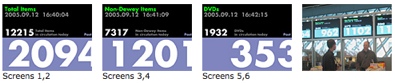
Visualizations at Seattle Public Library – What Community is Reading? |
|
|
Seattle Public Library’s Central branch not only boasts unique architecture but also world class visualizations of library data. On the level 5 of the building they have six large LCD display screens dedicated to provide visualizations of data like what people are reading, which books are checked out in the last hour etc. See them […] |
Visualizing Sex & Love – 10 Infographics You Must See |
|

|
Dont think of me as a perverted spreadsheet user, I like visualizations in any form or shape. There is so much data even about human relationships like love and sex. This article shows 10 of the most visually beautiful and insightful of the infographics on sex and love. Click on the titles above images to […] |
Weekly Excel Links – Moved to Seattle Edition |
|
|
As mentioned earlier we have moved to Seattle this Sunday. It seems like a great place already. Just that everything is more expensive than we are used to in Columbus. But I guess that is the premium we have to pay for being in a big city. On to this week’s edition of excellent excel […] |
You are NOT spider man, so why do you use radar charts? |
|

|
There are few charts in excel that are as revolting as a radar chart. The purpose of a radar chart is to compare m options across n parameters so that audience can be convinced that option A is better than say option B. But, I am yet to come across a radar chart that tells […] |
Visualization Challenge – How to show market share changes? |
|
|
One of our readers Jennifer mailed me with this excel charting problem she is having. I thought why not ask other readers for their advice on this. So here it goes: The Charting Challenge – Visualizing Changes in Market Share Here is an excerpt from her email: The gist of my problem is how to […] |
Excel KPI Dashboards – Adding Micro Charts [Part 4 of 6] |
|
![Excel KPI Dashboards – Adding Micro Charts [Part 4 of 6]](https://chandoo.org/wp/wp-content/uploads/2008/09/kpi-dashboard-excel-thumb.jpg)
|
This is 4th part of Creating Management Dashboards in Microsoft Excel 6 post series by Robert. This 6 Part Tutorial on Management Dashboards Teaches YOU: Creating a Scrollable List View in Dashboard Add Ability to Sort on Any KPI to the Dashboard Highlight KPIs Based on Percentile Add Microcharts to KPI Dashboards Compare 2 KPIs […] |
Hack together a Gauge Chart in Excel without sweat |
|

|
Gauges are a familiar metaphor, everyone can understand them, you can see them everywhere – near your stove, ac, car, gaming console, pc – you name it. So, when you are preparing a chart to tell a point, gauge chart like the one above can be effective. (I know charting pros like Jon Peltier wouldn’t […] |
Cool Info-graphics of the Week [Sep 5] |
|
![Cool Info-graphics of the Week [Sep 5]](https://chandoo.org/wp/wp-content/uploads/2008/09/anatomy-of-a-great-speech-obama-acceptance-dnc.jpg)
|
Once every week Pointy Haired Dilbert celebrates the art of chart making by sharing 4-5 of the best info-graphics featured in various web sites. Click here to see the visualizations featured earlier. Anatomy of a Great Speech – Obama’s acceptance speech at DNC Presentation Zen captures Obama’s symphony like acceptance speech in a graph shown […] |
Microcharting in Excel – 7 Alternatives Reviewed |
|

|
With each passing day the amount of information contained in a single spreadsheet, slide, document is growing. Thanks to demanding bosses, clients and colleagues, we are now supposed to provide all the relevant information in as much less space as possible. This is where micro charting or light weight data exploration has become a rage. […] |
KPI Dashboards – Highlight KPIs Based on Percentile [Part 3 or 6] |
|
![KPI Dashboards – Highlight KPIs Based on Percentile [Part 3 or 6]](https://chandoo.org/wp/wp-content/uploads/2008/09/kpi-dashboard-3-thumb.jpg)
|
Creating KPI Dashboards in Microsoft Excel is a series of 6 posts by Robert from Munich, Germany. This 6 Part Tutorial on KPI Dashboards Teaches YOU: Creating a Scrollable List View in Dashboard Add Ability to Sort on Any KPI to the Dashboard Highlight KPIs Based on Percentile Add Microcharts to KPI Dashboards Compare 2 […] |
6 charts you will see in hell |
|

|
Often it is easy to get carried away with a tools features. Excel is no exception. But here is a list of grotesque charts that you should never make, not even on your last day at work. 1. Leave the radar charts for Spidermen why? You can hardly conclude anything by looking at them They […] |
Cool Visualizations of the Week [Aug 29] |
|
![Cool Visualizations of the Week [Aug 29]](https://chandoo.org/wp/wp-content/uploads/2008/08/infographics-aug29-thumb.jpg)
|
Once every week Pointy Haired Dilbert celebrates the art of chart making by sharing 4-5 of the best info-graphics featured in various web sites. Click here to see the charts featured earlier. How to does Love, Anger, Joy and other emotions look like? Have you ever wondered how your emotions look like? That is exactly […] |
Creating KPI Dashboards in Microsoft Excel [Part 2 or 6] – Adding One Click Sort |
|
|
|
Creating KPI Dashboards in Microsoft Excel is a series of 6 posts by Robert from Munich, Germany. This 6 Part Tutorial on KPI Dashboards Teaches YOU: Creating a Scrollable List View in Dashboard Add Ability to Sort on Any KPI to the Dashboard Highlight KPIs Based on Percentile Add Microcharts to KPI Dashboards Compare 2 […] |
5 wonderful visualizations you must see [Aug 22] |
|
![5 wonderful visualizations you must see [Aug 22]](https://chandoo.org/wp/wp-content/uploads/2008/08/5-awesome-charts-thumb-aug22.jpg)
|
Every week Pointy Haired Dilbert celebrates the art of chart making by sharing 5 of the most beautiful, innovative and effective infographic ideas from various sites. Click here to see the visualizations featured earlier. Pop, Soda or Coke? – Countywise terms used for sweetened carbonated water The pop-vs-soda map tells how marketers have been effective […] |
Display symbols in excel chart axis |
|
|
|
Here is a quick excel tip to make your charts look professional by showing symbols in the axis labels instead of text. Just follow these 4 simple steps: First identify the symbols you want to show on the axis or as data label from symbol fonts like webdings, wingdings or a custom dingbat font like […] |
Creating KPI Dashboards in Microsoft Excel [Part 1 of 6] |
|
![Creating KPI Dashboards in Microsoft Excel [Part 1 of 6]](https://chandoo.org/wp/wp-content/uploads/2008/08/kpi-dashboard-scroll-excel-thumb.png)
|
Creating KPI Dashboards in Microsoft Excel is a series of 6 posts by Robert. This 6 Part Tutorial on KPI Dashboards Teaches YOU: Creating a Scrollable List View in Dashboard Add Ability to Sort on Any KPI to the Dashboard Highlight KPIs Based on Percentile Add Microcharts to KPI Dashboards Compare 2 KPIs in the […] |
It is show time baby! – better designer clocks to display time in your spreadsheets |
|
|
|
My polar clock using donut charts in excel started a conversation and readers have been awesome enough to download the excel and create their own clocks to show time. Even though the idea of this blog is share the little that I know with you, it is amazing how much I have learned from you […] |
Polar clock using donut chart [Excel Visualization fun] |
|
![Polar clock using donut chart [Excel Visualization fun]](https://chandoo.org/wp/wp-content/uploads/2008/08/donut-clock-in-excel-thumb.png)
|
Smashing Magazine is one of daily hangouts for new design ideas, inspiration and ogle fun. When they featured Pixel Breaker’s Polar clock last Friday on Top 10 creative ways to display time, I knew this could be an interesting visualization to do in excel. So I have created a donut chart in excel that can […] |
Charts of the Week [Aug 15] |
|
|
|
Every week, this blog features 5 of the best visualizations from the last week around the web. Average gas prices in US regions from 1993 plotted in dynamic bar Flowing data takes a look at the historical gasoline price data and provides us this eye candy. My friend Jon takes a look at this and […] |
Plot your data around the clock [Excel charting idea] |
|
|
|
If your reports include hourly distribution of data like, Customer footfalls in your store Page views of your site Customer service calls to your toll free numbers here is an interesting charting idea to show the data around the clock (literally) Update: Visualization pros Jon Peltier and Jorge Camoes took a critical look at this, […] |

