Did Jeff just chart?
How do you segment customers by revenue easily in Excel, so that you can see which customer groups to focus on. Find out, and download this handy template.
In this charting example, Jeff, our guest author, occasional charter and Excel wizard shows us how to segment customers based on revenue and depict the result using Excel charts.
42% of the world goes to polls around a pie chart – Like it or hate it?
Today lets have a poll. Lets debate if this pie chart about world elections in 2014 is good or bad.
First lets take a look at the chart
This chart, published by The Economist talks about how 42% of the world population is going to vote this year. Take a look and read on to learn how you can re-create this in Excel.
Bar chart with lower & upper bounds [tutorial]
Bar & Column charts are very useful for comparison. Here is a little trick that can enhance them even more.
Lets say you are looking at sales of various products in a column chart. And you want to know how sales of a given product compare with a lower bound (last year sales) and an upper bound (competition benchmark). By adding these boundary markers, your chart instantly becomes even more meaningful.
Lets learn how to create a column chart with lower & upper bounds in this tutorial.
Top 10 things I learned using Excel for a decade
Sometime during the 2nd half of 2013, I finished 10 years of Excel usage. In the last 10 years, I completed my studies, got my first job, married, had kids, visited 15 different countries, quit my job to start a business, bought first car, first house, made dozens of new friends, read 100s of books, wrote a book and learned 1000s of new things. And all along, Excel stayed a true companion. Right from MBA entrance exam preparation in 2003 to making my summer internship project reports in 2005 to planning my wedding expenses in 2007 to getting a promotion in 2009 to planning my kids feeding schedule in 2010 to running a successful business in 2014, Excel helped me in every step.
So today, I want to tell you the top 10 things I learned using Excel in last decade. Grab a hot cup of coffee, buckle your belts and get ready for time travel.
Creating Triangular Plots using Excel
Triangular plot…! What is it?
Recently, a Chandoo.org forum member asked this,
‘I want to be able to make a graph that, in some aspects, looks like below, but I have no idea how to do it at all.’
After seeing it, I said to myself in Barney Stinson’s tone, ‘Challenge Accepted!‘
The final plot looks like above. Read on to learn how this is made.
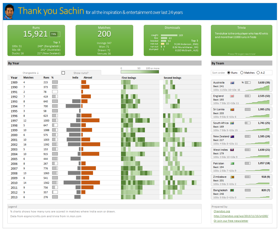
Thank you Sachin [a small tribute]
Lets talk about people who inspire us. People who show us that anything is possible. People who prove that commitment, hard work and perseverance are true ingredients of a genius.
I am talking about Sachin Tendulkar. Those of you who never heard his name, he is the most prolific cricketer in the world. He is the leading scorer in both tests (15,921 runs) and one day matches (18,426 runs). Read more about him here.
Tendulkar has been an inspiration for me (and millions of others around the world) since I was a kid. The amount of dedication & excellence he has shown constantly motivates me. It is a pity that the great man is retiring from test cricket. He is playing his last test match (200th, most by any person) as I am writing this.
So as a small tribute, I have decided do something for him. Of course, I have never been a cricketer in my life. Once in college I was reluctantly asked to be a stand-by player in a game with seniors. I did not get a chance to pad up though. That is the closest I have been to a cricketer. So I did what I do best. Create an Excel workbook celebrating Sachin’s test career.
Thank you Sachin – his test career in a dashboard
Here is a dashboard I made visualizing his test cricket statistics. It is dynamic, fun & awesome (just like Sachin).
(click on the image to enlarge)
Closing gaps in this Gender Equality Gap chart…
Today lets close some gaps.
Recently I saw this interesting chart on Economist Daily Charts page. This chart is based on World Economic Forum’s survey on how women compare to men in terms of various development parameters. First take a look at the chart prepared by Economist team.
So what are the gaps in this chart?
This chart fails to communicate because,
- All country charts look same, thus making it difficult to spot any deviations.
- We cannot quickly compare one country with another on any particular indicator.
- It does not provide a better context (for eg. how did these countries perform last year?)
But criticizing someone’s work is not awesome. Fixing it and making an even better chart, that has awesome written all over it. So that is what we are going to do. You can see the improved chart above. Click on it to learn how you can create it.