Excel Charts, Graphs and Templates
Tutorials, Examples and explanations on Excel charting. You can learn how to create almost any chart type in this section. Also learn how to create effective charts, make them interactive and add automation thru VBA
Interview With Presentation Zen’s Garr Reynolds on Charting & Telling Stories |
|
|
As mentioned earlier, I have met Garr Reynolds of presentation zen fame in Malmo, Sweden last Friday. What was to be a quick 15 minute interview became a 2 hour lengthy discussion on presentations, charting, excel, data, Japanese culture and of course our pointy haired dilbert blog. Read the entire interview in the post. |
Bring out your bad charts, the ChartBusters are here… |
|
|
|
Imagine having two annoying little bloggers looking over your shoulder and trying to mess up with the chart you are making… I am still waiting, go ahead, imagine… Now come back, that is exactly what “ChartBusters” is all about. Read more… |
Interviewing Garr Reynolds on this Friday, send me your questions |
|

|
Ok, this is *totally* exciting. I am big fanboy of Garr Reynolds of Presentation Zen. His blog is one of the very first blogs I have started reading and I still read it whenever there is a new post. Few days back I saw on his blog that he is coming down to Malmo, Sweden for a keynote presentation at FBTB Conference. I am interviewing him on this friday. Please send me your questions by commenting or tweeting me on @r1c1. |
Incell Dot Plots in Microsoft Excel |
|

|
Dot plots are a very popular and effective charts. According to wikipedia “Dot plots are one of the simplest plots available, and are suitable for small to moderate sized data sets. They are useful for highlighting clusters and gaps, as well as outliers.” Today we will learn about creating in-cell dot plots using excel. We will see how we can create a dot plot using 3 data series of some fictitious data. |
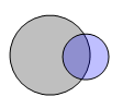
Venn Diagrams in Excel |
|
|
This post is a testament that readers of this blog are way cooler and enterprising than I am. Justin, who I must say, has some really amazing excel skills, contacted me in April with a VBA Script he made that can draw two circle venn diagrams in excel. |
Tweetboard Implementations – Download and make your twitter style dashboard today |
|
|
Check out two fabulous implementations of tweetboards in excel. Download the workbooks and play with them yourself. Thanks Fernando and Lee for sharing these workbooks with us. |
Intraday Candlestick Charting [Stock Charts] |
|
![Intraday Candlestick Charting [Stock Charts]](https://chandoo.org/img/n/intraday-candlestick-chart-thumb.png)
|
Gene asks me in an email, “I’m trying to graph candlestick charts in Excel for 10 minute candles. Excel seems to allow daily only with its stock templates. Can you point me to any resources for creating intraday candle charts?”. Of course, you can create intraday candlestick charts just the way you would create normal candlesticks, just change the axis options once you are done. Read the post to find more. |
Create a Dynamic Chart in Excel in 2 Minutes [spreadcheats] |
|
![Create a Dynamic Chart in Excel in 2 Minutes [spreadcheats]](https://chandoo.org/img/n/dynamic-charts-excel-demo.gif)
|
Here is a really fun and simple way to create dynamic charts in Excel. It uses data filters in an innovative way and creates the dynamic effect. To create the dynamic charts, just follow these 5 steps: (1) Prepare your charts: Make as many charts as you want. Lets say 3. |
Excel Tips Submitted by You [Part 2] |
|
|
|
In today’s installment of “your week @ PHD” we will learn how to use array formulas to refine text search, a bunch of very useful keyboard shortcuts, and a very simple tip on how to get ready when you want to make a chart. All really juicy tips, so read on. |
A Good Chart is a Story [Charting Principles] |
|
![A Good Chart is a Story [Charting Principles]](https://chandoo.org/wp/wp-content/uploads/2009/05/obesity-vs-eating-time.png)
|
A good chart tells a story. Here is a fantastic example of what a good chart is. The chart itself is very simple and easy. But it brilliantly juxtaposes two interesting pieces of data : Obesity rates in countries and Time spent eating per day, to tell a story. |
Tweetboards – Alternative to traditional management dashboards |
|
|
|
Here is a fun, simple and different alternative to traditional dashboards. Introducing…. |
Bonavista Chart Tamer Kicks ass. |
|

|
Over the last few days I have been using Bonavista Chart Tamer tool and I found it pretty neat. Read my review of this wonderful tool. |
Web Analytics Dashboard by Percent Mobile is Fun [Dashboard Reviews] |
|
![Web Analytics Dashboard by Percent Mobile is Fun [Dashboard Reviews]](https://i287.photobucket.com/albums/ll133/pointy-haired-dilbert/web-analytics-dashboard-th.png)
|
Take a look at the web analytics dashboard from percent mobile. It is well executed and provides good quality information at a glance. |
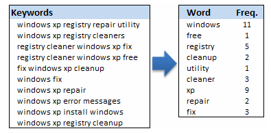
Analyzing Search Keywords using Excel : Array Formulas in Real Life |
|
|
Jarad asks me in an email “how word frequency can be generated from a range of cells using excel formulas?” This got me thinking and lead to this post, where we learn how to calculate word frequency using array formulas and use it to analyze a bunch of search keywords. |
and the Winner is… |
|
|
|
The winner for our first visualization contest is decided. Curious? Read on… |
Budget vs. Actual Charts – 14 Charting Ideas You can Use |
|
|
|
Do you want to make a budget vs. actual performance chart but not sure what option to use? Check out these 14 excel charting alternatives and find the one that tells your story. |
Visualization Challenge – Budget vs. Actual Performance |
|
|
|
Here is your chance to win a copy of The Visual Display of Quantitative Information by Edward Tufte, all you need to do is visualize budget vs. actual performance of the given data. Go! |
Hot or Not – McKinsey’s Innovation Heatmap |
|

|
Take a look at the innovation heat map published by McKinsey and tell us what you think – Hot or Not? |
Us vs. Them – Compare Sales Performance using Charts & Form Controls |
|
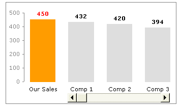
|
Today we will learn a little trick to compare 1 value with a set of values, For eg. our sales vs. competitor sales. We will learn how to create a chart like this. |
How to use Excel Chart Templates and Save Time |
|

|
Learn how to use excel chart templates in this installment of spreadcheats. Save time. |

