All articles in 'Pivot Tables & Charts' Category
CP047: Best Excel tools for Entrepreneurs

Podcast: Play in new window | Download
Subscribe: Apple Podcasts | Spotify | RSS
In the 47th session of Chandoo.org podcast, let’s see how Excel can make you an awesome entrepreneur.
What is in this session?
In this podcast,
- Why Excel for entrepreneurs
- Key areas of a business owner’s work
- Projects & to dos
- Finances
- Customers & marketing
- Planning & strategy
- Processes & workflows
- 5 features of Excel that help
- Conclusions
Unpivot data quickly with Power Query [tutorial]
![Unpivot data quickly with Power Query [tutorial]](https://chandoo.org/wp/wp-content/uploads/2015/09/unpivot-data-using-power-query.png)
Power Query (Get & Transform data in Excel 2016) is a must have tool, if you wrangle with data every day. Here is a quick introduction, in case you are new.
Let’s learn how to use Power Query to unpivot data.
Essentially, we are trying to go from left to right in the above picture.
Doing something like this thru either formulas or VBA can be very complex. But Power Query can get you unpivoted data in just a few clicks. Sounds interesting? Read on.
Continue »How to use GETPIVOTDATA with Excel Pivot Tables

Pivot tables are very powerful analysis tools. They can summarize vast amounts of data with just few clicks. But they are lousy when it comes to output. Imagine the horror of putting a pivot table right inside your beautiful dashboard. One refresh could ruin the layout and create half-an-hour extra work for you.
How to combine the power of pivot tables with elegance of your dashboards?
The answer is: GETPIVOTDATA()
Continue »How to create dynamic sparklines for latest 30 days [video]
![How to create dynamic sparklines for latest 30 days [video]](https://chandoo.org/wp/wp-content/uploads/2015/08/dynamic-sparklines-v2.png)
Sparklines are fun and very insightful. They are easy to create, easy to maintain and fit into any dashboard.
But there is one tiny problem with them. Usually we have a lot of data, but we don’t to visualize all of it. We just want to visualize latest 30 days trend or last 12 months trend or QTD or something similar. What then?
In this video, learn a powerful and very simple way to create dynamic sparklines using Excel.
Continue »Introduction to Slicers – What are they, how to use them, tips, advanced techniques & interactive reports using Excel Slicers

Slicers are one of my favorite feature in Excel. And here is a quick demo to show why they are my favorite.
Slicers – what are they?
Slicers are visual filters. Using a slicer, you can filter your data (or pivot table, pivot chart) by clicking on the type of data you want.
For example, let’s say you are looking at sales by customer profession in a pivot report. And you want to see how the sales are for a particular region. There are 2 options for you do drill down to an individual region level.
- Add region as report filter and filter for the region you want.
- Add a slicer on region and click on the region you want.
With a report filter (or any other filter), you will have to click several times to pick one store. With slicers, it is a matter of simple click.
Read more to learn all about slicers
Continue »![Who is the most consistent seller? [BYOD]](https://chandoo.org/wp/wp-content/uploads/2015/02/who-is-the-most-consistent-seller-data.png)
Who is the most consistent of all?
Imagine you are a category manager at a large e-commerce company. Your site offers various products, but you don’t really make these products. You list products made by other vendors on your site. Every day, these vendors would send you invoices for the amount of product they have sold. Above is a snapshot of such invoices.
Looking at this list, you have a few questions.
- Who is the best seller?
- Who is the most active seller?
- Who is the most consistent seller?
- Which seller has fewest invoices?
Let’s go ahead and answer these using Excel. Shall we?
Continue »![How to consolidate data that is different shapes [BYOD]](https://chandoo.org/wp/wp-content/uploads/2015/02/consolidating-data-in-different-shapes-excel-problem.png)
Last week, I asked my email newsletter readers to submit “one data analysis problem you are struggling with”. We called it BYOD – Bring your own data. More than 100 people have emailed various interesting (and often very difficult) problems. This week (between 16th of February to 20th of February), let’s take a look at some of these problems and solve them.
Consolidating data in different shapes
We can use either VBA or Excel’s consolidation features to combine data that has same shape (ie same number & type of columns). Here is one way to do it.
But what if we need to consolidate data that is in different shapes?
Something like above.
In such cases, we can use 3 powerful tools.
- Multiple Consolidation Ranges – Pivot Tables
- VBA
- Power Query
So let’s examine how to use these approaches to consolidate data in different shapes.
Continue »Howdy folks. Jeff here, bringing you a Public Service Announcement: Thanks to the magic of VBA , Structured PivotTable References are coming to a PivotTable near you! Structured References for PivotTables? So what? Well, because PivotTables are the best bit of ‘old’ Excel, and Tables are the best thing about ‘new’ Excel, and it’s about […]
Continue »CP018: Dont be a Pivot Table Virgin!
Podcast: Play in new window | Download
Subscribe: Apple Podcasts | Spotify | RSS
In the 18th session of Chandoo.org podcast, lets loose your Pivot table virginity.
Note: This is a short format episode. Less time to listen, but just as much awesome.

What is in this session?
Pivot tables are a very powerful & quick way to analyze data and get reports from Excel. But surprisingly, not many use them. Today, lets bust your pivot table virginity and understand the concepts like pivoting, values, labels, filters, groups and more.
In this podcast, you will learn,
- Announcements
- What is a Pivot Table?
- Example of business data & reporting needs
- Key pivot table terms to understand
- Creating your first pivot table
- Learning more about pivot tables
Top 10 things we struggle to do in Excel & awesome remedies for them

Recently we asked you, what do you struggle doing in Excel? 170 people responded to this survey and shared their struggles. In this post, lets examine the top 10 struggles according to you and awesome remedies for them.
Continue »Matching transactions using pivot tables [video]
Last week, we learned how to use formulas to reconcile (match) transactions in Excel. Today, lets take a look at even faster and simpler way to do this:
Using Pivot Tables
Here is a short video explaining the technique and why it works. See it below
Continue »How to use Excel Data Model & Relationships

Have you ever been in a VLOOKUP hell?
Its what happens when you have to write a lot of vlookup formulas before you can start analyzing your data. Every day, millions of analysts and managers enter VLOOKUP hell and suffer. They connect table 1 with table 2 so that all the data needed for making that pivot report is on one place. If you are one of those, then you are going to love Excel 2013’s data model & relationships feature.
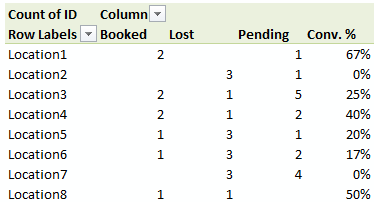
Continue »Finding Conversion ratio using Pivot Table Calculated Items

Today, lets understand how to use Calculated items feature in Pivot tables. We will use a practical problem many of us face to learn this feature – ie calculating conversion ratio from a list of sales calls.
Continue »Highlight Quarters, Weekends in pivot reports using styles [quick tip]
![Highlight Quarters, Weekends in pivot reports using styles [quick tip]](https://img.chandoo.org/pivot/monthly-pivot-reports-with-quarter-highlighting.png)
Here is a quick pivot table tip.
When reporting summaries by month, it would be better to highlight 3 months at a time (Jan, Feb, Mar in one color, Apr, May, Jun in another color) than showing all in one color. Today, lets learn how to do this in easiest possible way.
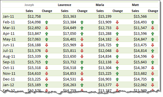
Continue »Show monthly values & % changes in one pivot table

Pivot tables are great help when analyzing lots of data. One of the common questions managers & analysts ask (when looking at monthly sales data for example) is,
How is the monthly performance of our teams (or regions, products etc.)?
A pivot report can answer this question in a snap. Today lets learn how to do that.
Continue »

